
Mathematical Modeling 16 - Dimension Reduction and Clustering

The regression lesson used predictors whose meanings we could explain one by one. What if a city dataset has dozens of highly correlated indicators? Crime, income, services, transport, pollution, and education can all move together. Can we describe the dominant patterns without pretending every column contains a completely new fact? That question leads to dimension reduction.
We will walk through PCA as a change of coordinates, then ask a different question: whether cities form useful groups at all. K-means will not discover “true city types” by magic; it depends on scale, distance, the number of groups, and our purpose. A smaller representation may help us see structure, but we will test stability and interpretability before turning it into a story about real places.
High-dimensional data often contain redundant measurements and hidden groups. Dimension reduction compresses variables; clustering groups observations. They solve different problems and are often used in sequence.
Why dimension reduction works
Suppose ten city indicators all partly measure economic scale. Treating them independently repeats information and can distort distances or weights. A low-dimensional representation seeks a few directions that retain most systematic variation.
Standardize variables when units and variances should not determine importance. Examine correlations and outliers first; PCA can be dominated by one extreme observation.
The opening question was how to describe many variables without repeating the same information. PCA offers one geometric answer. We will build it from centered data, directions of variation, and projected scores instead of treating a library call as the explanation.
PCA step by step
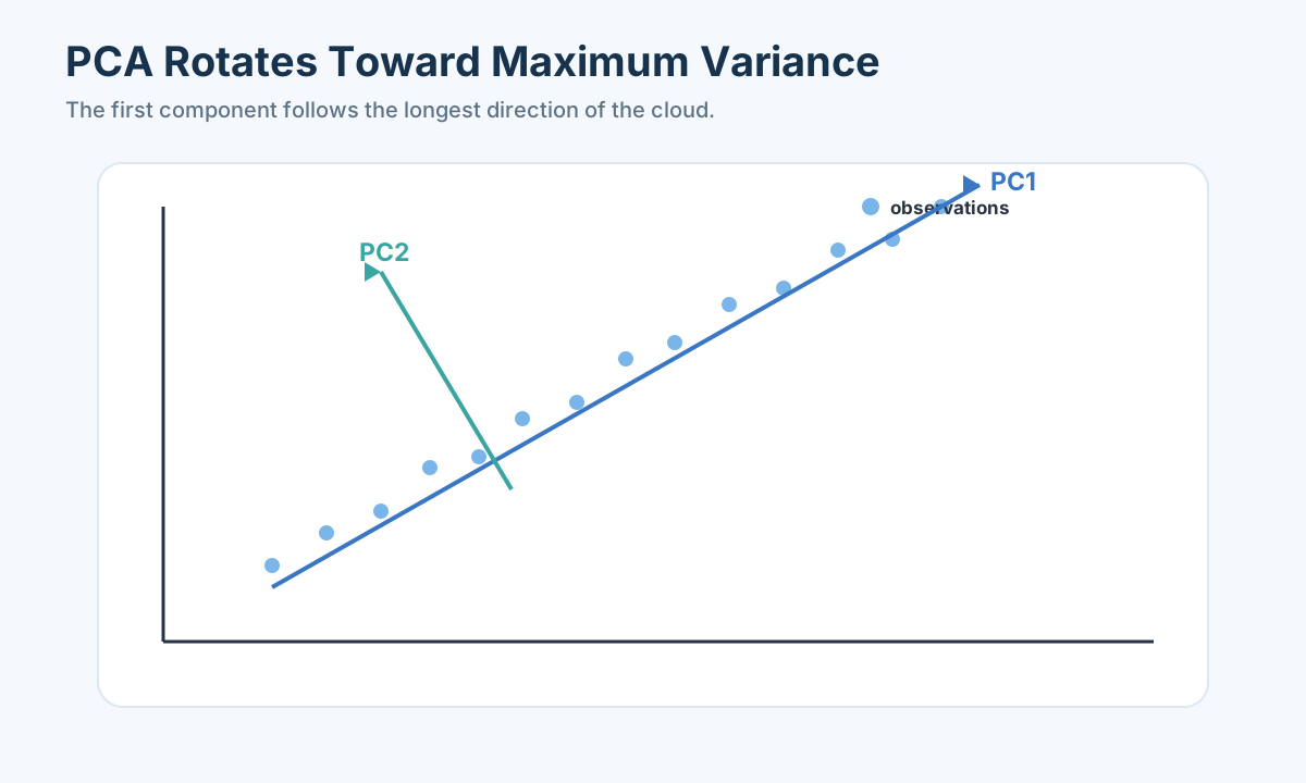
For centered matrix
Solve
with eigenvalues ordered from largest to smallest. Component scores are
The explained-variance ratio is
Loadings describe how original variables contribute to components. Signs can flip without changing the component. Name a component only when its high-magnitude loadings support a coherent interpretation.
Three cities, two columns, one direction of information
Take a deliberately simple city matrix. Cities A, B, and C have first indicator values 1, 2, and 3, while a second indicator records exactly twice those numbers: 2, 4, and 6. Perhaps the columns are the same underlying expenditure reported in two units, or two measures that happen to move together in this toy example. If we standardize each column by its own sample mean and standard deviation, both become values -1, 0, and 1. The standardized matrix has rows
We can find its directions without a black box. Along the diagonal direction
This is what “PCA rotates axes” means concretely. The original axes describe indicator one and indicator two. The new first axis follows the long direction of the city cloud; the second axis follows the short perpendicular direction. If a library returns
Real data are not perfectly redundant. Education, transit service, and income may share a broad prosperity pattern while pollution and housing cost move partly differently. PCA orders directions by observed variance under the chosen centering and scaling. It does not know whether a high-variance direction is important for policy. A rare but serious pollution hazard could sit in a low-variance component because most cities have similar pollution values; discarding it to reach 85% cumulative explained variance may erase the exact signal the decision needs. Retain components with an eye to reconstruction, interpretability, and downstream purpose, not one sacred percentage.
Standardization is itself a modeling choice. If one column is total city budget in millions and another is pollution in micrograms per cubic metre, raw-budget numerical scale may dominate the first component. Standardizing can give them comparable variance weight, but that is not the same as saying they have equal ethical or policy importance. For an evaluation score, criterion directions and chosen value weights belong in a later explicit model. PCA can describe patterns or compress predictors; it cannot decide what the city should prioritize. A high PC1 score means a city lies far along a data-variance direction, not automatically that it should win an award.
Before computing PCA, audit duplicated units, missingness, and extreme rows. If one city accidentally reports income 1,000 times too large, its point can determine the long direction of the cloud. If remote cities lack pollution data and we fill all with the same mean, we suppress one dimension of variation. Fit imputation and scaling within training or resampling folds when later prediction or stability tests use them. The algebra of eigenvectors is precise; its meaning still depends on what went into
When two principal directions are nearly tied
In the toy matrix, PC1 eigenvalue was 2 and PC2 zero: one direction is unmistakably stronger. Real city data may have two leading eigenvalues close together, say 1.8 and 1.7 after a particular scaling. A small change in sampled cities or one corrected indicator can rotate which displayed arrow is named PC1 versus PC2. The two-dimensional subspace may remain fairly stable even while individual axes move. If we attach strong social labels to PC1 and PC2 based on one sample, those names can look unstable after an innocent data update. Compare loading patterns across resamples and consider discussing the joint two-dimensional gradient rather than overinterpreting one axis.
This also affects cluster plots. If two directions nearly tie and rotate, plotted cities may seem to move in the plane even though their pairwise distances within that retained subspace change little. A map colored by hard K-means labels can invite a false story about a city “crossing a boundary.” Check membership stability in the original or retained-score geometry and return to original indicator profiles. A coordinate rotation is not a policy change. Eigenvectors are mathematical descriptions of sample covariance, not permanent geographic compass directions.
One can test this with a practical rerun. Remove a few cities, refit scaler and PCA, compare cumulative variance and the span of the first two components, then inspect whether high-loading original variables still form a coherent pattern. If PC1 and PC2 swap roles but together explain about the same amount and downstream grouping remains similar, the representation may be useful even though individual one-word axis labels are fragile. If grouping changes greatly, ask which cities or indicators drove it. This is a stability lesson, not a reason to abandon PCA entirely.
PCA versus factor analysis
Factor analysis assumes
where common factors
Use PCA for compression and visualization; use factor analysis when latent constructs are part of the scientific question.
PCA produces a smaller coordinate description; it does not tell us that natural groups exist. To investigate groups, we now need a different question and a different objective: what would it mean for points to belong to the same cluster?
Compression is not the same claim as a hidden cause
The toy PCA just rotated two observed columns into one informative coordinate and one empty coordinate. It did not say there is a hidden social force causing both indicators. Factor analysis asks a more model-based question: could a smaller set of unobserved factors explain why observed variables covary, with each variable also having its own specific noise or variation? In
Imagine four questionnaire items about access to public services. If answers move together across cities, a researcher might hypothesize an underlying “service accessibility” factor. Factor analysis can test whether one common factor plus item-specific variation accounts for their covariance under its model. PCA might simply report that one direction explains most total variation. Both can reduce a long item list, but naming a PCA direction “true accessibility” would overclaim. Even a factor-analysis fit does not prove the hypothesized construct exists in the social world; wording, sampling, and omitted conditions can generate shared responses.
Loadings are the bridge back to original variables. If one component loads positively on income, school coverage, and transit frequency while negatively on pollution, we might call it a “resource-access gradient,” but that name is a human interpretation of a pattern. If large loadings combine unrelated units without a coherent mechanism, do not force a poetic label. Rotations such as Varimax can make factor loadings more concentrated and easier to read, but rotation changes coordinate description under a model; it does not reveal a unique natural set of labels. Show loading values and their stability across reasonable choices.
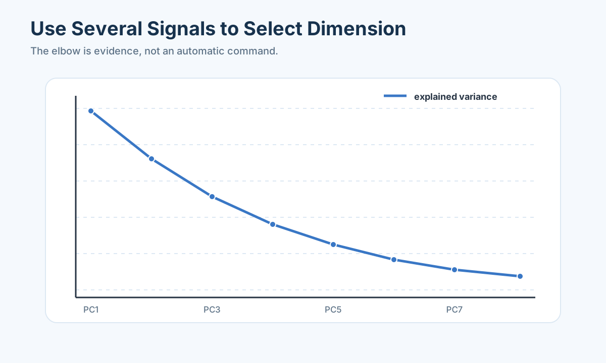
The scree plot’s bend is a clue about diminishing variance gain. Parallel analysis compares observed eigenvalues with those expected from noise-like reference data; reconstruction error tests how much information a reduced representation loses; downstream stability asks whether cluster memberships change when component count changes. An “85% explained variance” threshold is a convention that may be convenient for compression but may miss a policy-relevant low-variance feature. A factor model also has choices about number of factors, extraction, and rotation. We should state these choices before showing a tidy two-dimensional scatter plot.
This prepares a critical distinction for the next section. PCA and factor analysis reduce or interpret columns. Clustering groups rows—the cities or households. One can cluster on PCA scores to reduce noise or redundant coordinates, but the PCA fit and cluster fit then form a combined model with their own assumptions. A pair of nearby points in a two-PC plot might still differ greatly on a discarded feature; if that feature is pollution hazard, the apparent closeness is dangerous for policy. Always return to original variables before calling cities “similar.”
A questionnaire can look one-dimensional for two reasons
Suppose residents rate four services from one to five: bus reliability, clinic access, school access, and park access. Cities with high bus ratings often also have high clinic and school ratings. PCA may find a first component with strong positive loadings on all four and call it a broad “service rating” gradient. Factor analysis might posit a latent “public-service access” factor explaining shared covariance, plus item-specific variation. But there is another story: respondents in well-off neighborhoods may rate everything favorably because of general satisfaction or survey response style, not because one public-service mechanism drives all four systems. The covariance alone does not distinguish these interpretations.
Inspect the question wording and sampling. If all four items were answered by the same respondents in the same session, a common response style can produce a shared factor. If bus reliability was measured objectively from schedules while clinic access came from travel time, the shared pattern has a different evidential basis. A factor name should be grounded in how variables were collected and what external measures support it. Factor analysis can summarize an assumed latent structure, but it does not make that structure causally real merely because rotated loadings look clean.
Suppose a two-factor solution loads bus and clinic strongly on factor one, school and park on factor two after rotation. We might tentatively call them “mobility/health” and “community amenities,” but show loadings, cross-loadings, and communalities rather than only labels. A small cross-loading can move with rotation, item removal, or sample changes. If the factor story disappears when remote neighborhoods are added, the original names described a narrow sample. Validate measurement structure across relevant groups if the team wants to compare cities; a score whose meaning changes by region is a poor basis for allocation.
PCA is useful even when latent-factor claims are too strong. It can compress 30 correlated indicators for a visualization or stabilize a subsequent model. If the goal is to explain what residents mean by “access,” a factor model and external validation are more aligned. Either way, return to original questions and units when communicating results. A component score of 2.1 is not 2.1 more clinics or a guaranteed improvement in access. It is a coordinate under a fitted representation with arbitrary sign and scale choices.
This questionnaire case helps students see why the two methods live in the same lesson but answer different claims. PCA tells us what directions of observed variation are large. Factor analysis asks whether an assumed smaller common-factor structure accounts for covariance. Clustering might then group cities based on scores, but it inherits all measurement and naming uncertainty. We should not stack three methods and let each layer make the previous layer seem more certain than it was.
K-means from zero
K-means minimizes within-cluster squared distances:
The algorithm alternates assignment to the nearest center and recomputation of centers. Because initialization matters, use K-means++ and multiple restarts. K-means prefers spherical, similarly sized clusters and is sensitive to scale and outliers.
Choose
Four points show exactly what K-means is trying to do
Take four two-dimensional toy points: A
K-means alternates two simple moves. Given centers, assign every point to its closest center under the chosen distance. Given assignments, recompute each center as its group’s mean. Repeating these moves decreases or maintains the within-cluster sum of squares, but can settle at a local solution depending on starting centers. K-means++ selects separated initial centers more carefully than arbitrary starts, and multiple restarts compare resulting objectives. A fixed random seed makes one implementation reproducible; it does not prove the partition is stable under new data or feature changes.
The toy groups are so visibly separated that the algorithm seems obvious. Real city indicators may form one long continuum rather than two islands. K-means will still cut a continuum into
Scale changes can create different groups. Suppose one city has 10 bus lines and 100,000 residents while another has 20 bus lines and 2 million residents. Raw Euclidean distance in a feature vector can be dominated by population count’s numerical size. Standardization equalizes variance contributions, but it might still give redundant income columns two votes if we include several near-duplicates. PCA compression can reduce that redundancy, yet it might discard a low-variance safety criterion. Try sensible alternative feature sets and scales; show how assignments change. A cluster label is a result of chosen geometry and features, not a property tattooed on the city.
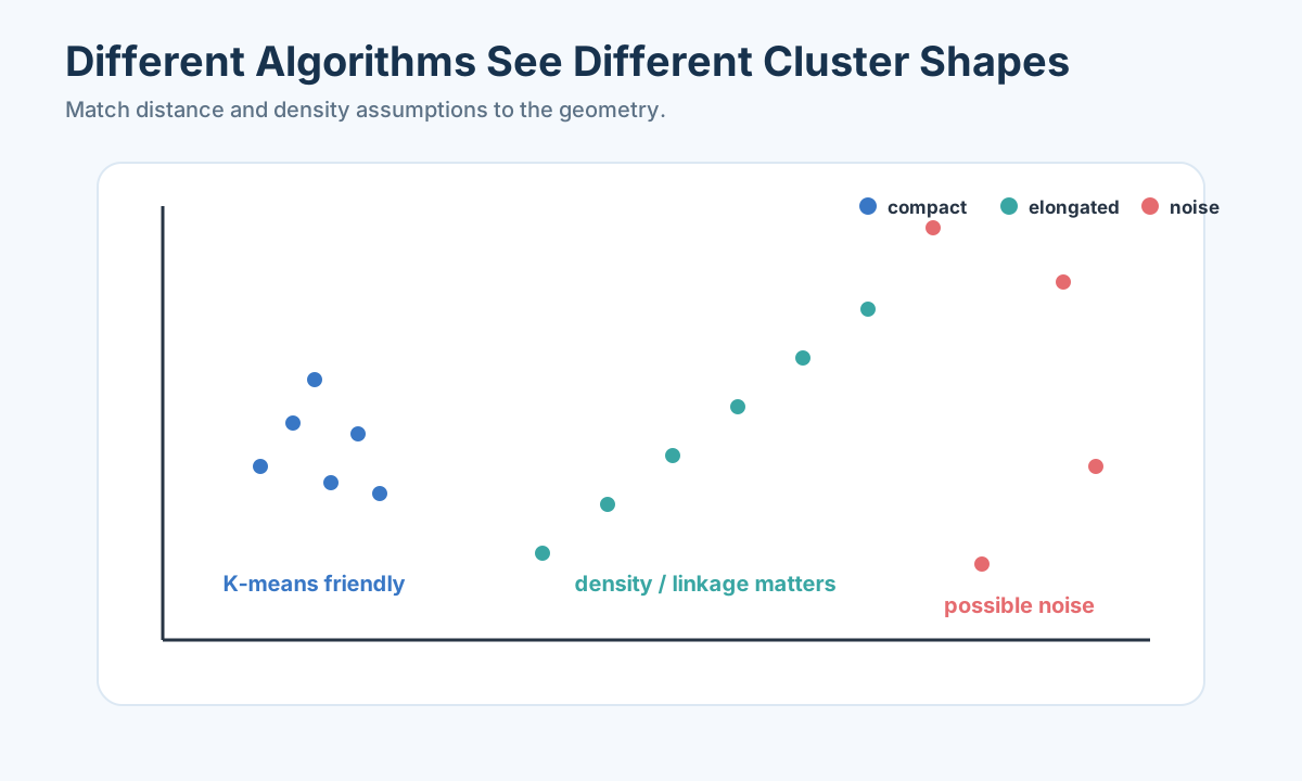
Outliers can pull centers. If one city has a verified unusual transportation system, it may form a one-point cluster or shift a center; if its data contain a unit error, clustering that row as a “special city type” merely legitimizes bad data. Audit flagged records and inspect group sizes. K-means is most comfortable with compact roughly spherical groups of similar spread; elongated, nested, or density-varying patterns motivate other methods. The next figure illustrates that geometric difference. We should choose a method whose geometry matches the observed structure, not expect one objective to find every kind of group.
Other clustering geometries
Hierarchical clustering repeatedly merges clusters and produces a dendrogram. Linkage determines whether “near” means nearest members, farthest members, average distance, or Ward variance increase.
DBSCAN defines dense regions using neighborhood radius
Gaussian mixture models assume data arise from multiple Gaussian components and return membership probabilities. They can represent elliptical clusters and uncertainty, but are sensitive to component count and covariance specification.
The scikit-learn user guide compares clustering algorithms and their assumptions, and separates clustering from matrix factorization such as PCA (official guide ).
No labeled answer key means clustering cannot be judged by ordinary accuracy. We will ask whether the groups are stable, interpretable, and useful for a declared purpose, and whether preprocessing created an apparent pattern.
One drawing, several answers to “near”
Imagine points lying along two curved roads. Each road forms a long bent band, with empty space between the bands. K-means uses distance to a mean center and prefers compact blobs; it may cut each road in half instead of identifying the two road-shaped groups. Hierarchical clustering merges nearby points or groups step by step. Single linkage can chain along a road by nearest pair, but may also bridge groups through one stray point. Complete linkage judges farthest members and prefers compact groups. Average linkage uses average cross-group distance. Ward linkage chooses merges that add little within-group squared variation, often sharing K-means’s compactness preference. A dendrogram reveals nested merge heights, but cutting it at one height remains a choice, not a natural truth certificate.
DBSCAN approaches the road drawing as density. Give it a neighborhood radius
Gaussian mixtures answer a softer question. Suppose city points form overlapping elongated clouds, perhaps one set of industrial cities and one set of service-focused cities with no sharp boundary. A mixture model treats data as arising from several Gaussian components with specified covariance shapes and returns membership probabilities. A boundary city may be 55% in one component and 45% in another under the fitted model, which is more honest than declaring it absolutely type A. But the probabilities depend on the number of components, Gaussian shape, covariance constraints, and preprocessing. A soft assignment can represent uncertainty under a model; it is not a posterior probability that a city has an eternal social essence.
Method choice follows the action. If the city wants three compact service packages, K-means may be an appropriate simple segmentation method if groups are stable. If it wants a nested classification for progressively fine planning, a dendrogram could be useful. If it wants to flag geographically unusual neighborhoods in an irregular feature space, a density method may help. If it wants to assign overlapping policy packages with uncertain boundaries, a mixture model can express soft membership. Compare them on the same cleaned and meaningfully scaled features, then validate whether group profiles and policy outcomes differ in a way that matters.
Distance itself is a modeling choice. Euclidean distance works with comparable continuous features under a straight-line geometry. Manhattan distance adds absolute coordinate differences. Mixed numeric and categorical features may need a suitable mixed-data distance rather than coding city names as numbers and applying Euclidean distance. For time-series shapes, a shape-based or time-warped distance can answer a different similarity question from comparing level. The algorithm does not decide what “similar city” should mean; the analyst and domain must define which differences the decision regards as meaningful.
The figure above has compact, elongated, and noisy arrangements to remind us that no single method finds every geometry. The most responsible output may also be “there is one continuum and a few outliers” rather than a neat set of groups. If every method changes labels when one feature or scale changes, that instability is a finding. Do not force a cluster count for the sake of a colorful map.
Validate unsupervised results
There is no true label in most clustering problems. Use:
- internal separation metrics such as silhouette and Davies–Bouldin;
- bootstrap or subsample stability;
- alternative scaling and feature sets;
- external variables not used to fit clusters;
- domain coherence and actionability.
Profile each cluster with size, medians, distributions, and representative cases. Avoid naming clusters before seeing the profiles. If small preprocessing changes completely reorganize groups, report instability rather than presenting the labels as facts.
Beginner workflow
Standardize the data, visualize the first two PCA scores, run K-means for several
1 | from sklearn.cluster import KMeans |
Do not choose
What the short code does not tell you
The demonstration fits StandardScaler and PCA on all rows of X, then computes PCA scores for a plot. It runs K-means on the full standardized matrix Z, not on the two plotted scores. Therefore two cities that appear close in the PC1–PC2 picture can still be placed in different clusters because their other standardized features differ. The plot is a projection. If the intent is specifically to cluster on retained PCA components, use the selected scores[:, :m] after choosing
For a purely descriptive analysis of the fixed 200 cities, fitting scaler and PCA on all 200 can be an appropriate definition of the displayed coordinate map. For a stability or transfer test, refit preprocessing inside each resample or training subset. Otherwise the held-out feature distribution has shaped the axes before we ask whether new cities fit the structure. A bootstrap analysis that resamples labels after a globally fitted PCA may understate how much component directions themselves move. Document whether the purpose is describing the current set, grouping new cities, or evaluating a later policy outcome; the fitting boundary differs.
The printed cumulative variance tells how much sample variance the PCA representation retains under this scaling. It does not tell whether the first two components preserve a low-variance health hazard. The printed silhouette values compare separation forZ under Euclidean distance, but do not show tiny cluster size, city profiles, resampling stability, or downstream policy impact. If
One reproducibility check selects two named cities and manually compares their standardized coordinates on a few original indicators, their first retained scores, and their assigned labels. If the displayed axes hide a large pollution difference, annotate it. If a label changes when an income unit is corrected, record the correction and rerun. If a new city has a category or indicator outside the original data dictionary, do not silently map it to zero and assume the old centroids remain meaningful. A clustering pipeline needs an input and fallback contract just as the regression pipeline did.
The purpose of code is to execute a question we can explain: what differences are meaningful, what redundancy do we compress, what geometric groups might exist, and what decision would improve if they did? A chart and metric can help answer those questions, but they cannot define them. One hand-transformed city row and one profile table are often better teaching artifacts than a screen of silhouette numbers.
Without labels, what counts as a successful grouping?
Suppose K-means divides 200 cities into four groups with a respectable silhouette score. Silhouette asks whether points are closer to their own group than to the next-nearest group under the chosen distance. It is useful but not a proof that four policy types exist. A few far-out cities can make groups appear well separated while most cities lie on a continuum. A score can be high after a unit error stretches one axis. Inspect group sizes, original-variable profiles, maps, and the cleaned source data. A grouping is a proposal about useful similarity, not a discovered answer key.
Stability gives another view. Resample cities or perturb a few indicators, refit scaling and PCA inside each version, then cluster again. Because numerical cluster names can swap—what was “cluster 1” in one run may be “cluster 3” in another—compare whether pairs of cities remain together or align labels before computing an agreement score such as adjusted Rand index. If 150 of 200 cities keep similar companions but 50 boundary cities frequently switch, report stable cores and uncertain boundaries. A single label map hides that uncertainty. Different scaling choices may be especially revealing when original units varied widely.
External validation can use variables not used to create groups. If we clustered on socioeconomic and mobility indicators, compare later policy outcomes or pollution hazards that were not inputs, with proper time and data availability. If groups show different responses to a proposed service package, segmentation may be actionable. If they differ only on the same variables used to create them, saying “high-income cluster has high income” is circular. If cluster-specific policies do not outperform one common policy in held-out contexts, the groups may still be descriptive but not necessary for decision-making.
Profile each group as a distribution, not one label. Report size, medians, spreads, and representative and boundary cases on original variables. A city can have a high PC1 score from income and education but a very different pollution profile from another city with similar PC1 score. If pollution was discarded as low variance, returning to original columns is mandatory before calling them equivalent. A small “special” group may consist of data errors or legitimate unusual cities; inspect source records. Name groups only after these profiles, and choose names that describe observed gradients rather than praise or stigmatize places.
There is no need to demand a discrete type when data show continuity. If a city falls halfway between two mixture components or repeatedly changes K-means group across resamples, assign a soft policy tier, examine its original values, or treat it individually. The policy should not change abruptly because a centroid moved by one decimal. Forcing every city into one of four hard categories can create brittle decisions; uncertainty-aware segmentation can be more honest. The value of clustering is to organize comparisons and test differentiated actions, not to create permanent identities.
We should also check whether preprocessing created the pattern. If missing income is filled with exactly the same value for many remote cities, they may form an artificial tight group. If one region’s cost indicators were not reversed, it can be plotted on the wrong side of the PCA space. If several redundant economic columns are kept, economic scale may dominate all distances. Refit under plausible cleaning alternatives and document which memberships change. The preceding lesson’s data audit is part of unsupervised validation, not a separate preliminary task that can be forgotten once the plot looks polished.
Discover structure without inventing it
Suppose 200 cities are described by 30 socioeconomic, mobility, health, and environmental indicators. The goals are to summarize dominant dimensions and identify groups that may require different policies. Standardization, PCA, and clustering form a workflow, but each step contains modeling choices.
Prepare the matrix
Remove identifiers and variables that directly encode the answer. Transform severely skewed positive measurements, orient variables consistently when interpretation requires it, and standardize units. Impute before PCA inside a reproducible pipeline. If missingness is informative, add indicators or use methods that model it rather than silently filling all gaps.
PCA diagonalizes the sample covariance or correlation matrix. If
Scores
Prepare one city row before it becomes a point
Imagine a city row with annual income, transit coverage, education access, air pollution, and a district-type category. Income may be in thousands of currency units, coverage a fraction, education a percentage, and pollution micrograms per cubic metre. If we place raw numbers directly in a Euclidean space, one column can dominate distance simply because of its numerical unit. First audit definitions and convert units, then decide whether the task calls for standardized continuous features. One-hot encoding a categorical district type adds dimensions that need deliberate weighting; coding type as 1, 2, 3 invents false numerical distances. The city becomes a point only after these choices.
Missing pollution is not a harmless blank. If the remote cities are exactly those with no sensors and we fill all remote pollution with the citywide mean, PCA may see them as identical on pollution and K-means may create a tight remote group. The group could be a missing-data artifact. Preserve a missingness indicator, compare plausible pollution scenarios, or use an appropriate imputation method with uncertainty. If the city project has a train/test or resampling evaluation, fit imputation and scaling inside each training sample and apply them to the held-out sample. A PCA loading learned from all 200 cities before the bootstrap split can also leak or understate variability in component estimation.
Cost indicators need an interpretation before “reverse direction.” For a composite evaluation, high pollution is usually a cost and high service coverage a benefit; reversing pollution makes score direction consistent. For exploratory PCA, however, reversing a column changes component sign relationships but not its variance magnitude in simple linear scaling. Whether to orient all features “larger is better” depends on whether we are preparing a value-based score or merely describing covariance. Do not smuggle policy values into an unsupervised plot without stating them. The later evaluation lesson will make such value judgments explicit.
Skewness and outliers can shape distance. A city with ten times the population of every other city may sit far from all others if total population is included, even when the policy question concerns per-capita service. Use rates or log transforms when they correspond to the substantive question; show raw and transformed distributions. If a verified unusual megacity is in scope, its uniqueness may be real and worth separate handling. If its value comes from a unit mismatch, repair it before PCA. A robust scaling or alternative clustering method can be tested, but one preprocessing choice should never be used simply to make the map produce attractive islands.
The most useful check is to transform one city by hand. If training income mean is 40 thousand and standard deviation 10 thousand, an observed 50 becomes z-score 1. If pollution mean is 20 with standard deviation 5 and observed level is 30, pollution z-score is 2 before any direction reversal. Explain whether a high pollution coordinate is kept as high exposure or negated for a benefit-oriented evaluation. Then inspect the PCA score from its loadings. A numerical point in a two-dimensional plot should remain traceable to real units and choices. If we cannot explain why one city lies far to the right, naming the axis is premature.
Select dimension with several signals
Use cumulative explained variance, a scree plot, reconstruction error, parallel analysis, and downstream stability. “Retain enough components for 85% variance” is a convention, not a theorem. A low-variance direction may be important for prediction, while a high-variance direction may represent nuisance scale.
Factor analysis models covariance using latent factors plus variable-specific noise, whereas PCA is a variance-preserving transformation. Rotation can improve interpretability but changes the loading representation. State extraction and rotation methods.
How many components would you keep for a real city question?
Suppose a standardized 30-column city matrix yields explained-variance ratios 45%, 25%, 12%, 6%, and smaller values. The first two components together carry 70% of sample variance; the first three carry 82%. An “80% rule” would keep three, but that is a threshold convention, not a theorem. If the fourth component loads strongly on a safety-related pollution measure and the policy concerns environmental hazards, keeping it may be valuable even though it adds only 6% to total variance. If a later clustering is almost identical with three or four components and the fourth merely tracks noisy one-off measurements, three may be enough for segmentation. The choice is evaluated against reconstruction and purpose.
A scree plot displays eigenvalues or explained variance by component. An elbow after component three can suggest diminishing gains, but a smooth descending curve may have no clear elbow. Parallel analysis compares observed component strength with what might arise from noise-like data of similar shape; it can warn against retaining directions that are not stronger than chance structure. Reconstruction error tells how far original standardized rows are from their approximation using retained components. Low reconstruction error is useful for compression, but a small average error can still hide a large error in one rare important feature. Check reconstructed original-variable values for policy-critical indicators.
Downstream usefulness is another test. If clustering on two PCs creates apparently neat groups but adding PC3 causes half the cities to switch, report that instability and inspect PC3 loadings. Perhaps PC3 captures mobility patterns relevant to service-package choice. If a prediction model later uses PCA as preprocessing, fit PCA within each training fold and select component count on validation folds, not after seeing final test error. Unsupervised preprocessing can leak feature-distribution information into test data even though it never sees target labels. The entire pipeline should be evaluated at the same deployment split.
Interpretation needs a loading table. A PC1 with strong positive income, school access, and transit loadings can be described as an observed resource gradient. But if it also has a large negative pollution loading, the name should make that combination explicit. Signs can flip, and different resamples can rotate nearly equal-eigenvalue components within a subspace; a fragile one-word label may not be stable. Show the variables most responsible for each retained direction, their original units, and whether the direction persists under reasonable preprocessing changes.
For the 200-city policy case, one can keep a two-PC plot for visualization while clustering on three or four retained scores if they contain decision-relevant variation. A plot is a projection, not the whole model. Two cities drawn near each other on the page may differ in PC3 or original pollution, and one city far from others may be an authentic exception. Use the plot to ask questions, then return to full profiles before designing policies. The best dimension is the smallest representation that preserves the distinctions the actual question needs, not necessarily the first number crossing an arbitrary cumulative percentage.
Match clustering to geometry
K-means minimizes within-cluster squared Euclidean distance and prefers compact, roughly spherical groups. Hierarchical clustering exposes nested merges but depends on linkage. DBSCAN discovers dense shapes and labels sparse points as noise, but scale and varying density are difficult. Gaussian mixtures provide soft probabilities and elliptical clusters under distributional assumptions.
Choose distance deliberately. Euclidean distance on standardized continuous features differs from Manhattan distance; mixed numeric/categorical data may require Gower distance. For time series, shape or dynamic-time-warping distances may be meaningful. The distance function is part of the model.
Two cities can be close under one distance and far under another
Suppose city A and city B have standardized transit and income coordinates A
Mixed data create another problem. City type might be “coastal,” “mountain,” or “inland,” and a housing-policy category might be ordinal. One-hot encoding these into many binary columns can make one category mismatch count differently from one unit of a continuous feature, depending on scaling and number of categories. A mixed-data distance such as Gower’s can handle numeric and categorical similarities under its own choices, but the analyst still has to justify feature weights, missing values, and what categorical match means. We cannot simply replace city type with 1, 2, 3 and let Euclidean distance assume coastal is one step from mountain and two from inland; those steps were never observed.
Temporal profiles offer a different similarity. Two cities may have the same average electricity load but one peaks each morning and the other each evening. Distance between average levels says they are similar; distance between hourly shapes may say they differ for scheduling. Dynamic time warping can compare shapes with shifted timing under a specific objective, but it can also align events that should not be considered equivalent. If the policy concerns peak-hour transformer capacity, the hour of the peak matters and should not be freely warped away. Similarity is task-dependent even before clustering starts.
For the city service-package example, I would first describe in words which differences matter: current transit shortage, resident-weighted pollution risk, budget capacity, and policy feasibility. Then make a feature and distance choice that reflects that statement, show one pair of cities whose ordering changes under a plausible alternative, and test whether proposed packages remain useful. If the result is extremely sensitive to metric choice, report the uncertainty or move to explicit criteria rather than pretending one geometry is canonical. Clustering is a model of similarity, not a free discovery of similarity’s meaning.
Measure stability
Repeat preprocessing and clustering on bootstrap or subsamples, align labels, and measure agreement such as adjusted Rand index. Perturb feature sets and scaling. A high silhouette score with unstable membership is not persuasive. Separate a small “cluster” that exists only because of data errors or extreme scale.
Turn clusters into decisions
Build profile tables using variables not solely those that forced the clustering. Report size, uncertainty, representative cases, and overlap. Policy should not treat an uncertain boundary as a natural law. Use soft membership or tiers when appropriate, and test whether cluster-specific policies actually outperform a common policy.
A boundary city should not change policy overnight
Imagine city E has transit coverage between a stable low-transit core and a stable medium-transit core. Under one reasonable scaling it falls 0.02 distance units closer to the low-transit K-means centroid; under another reasonable scaling it falls 0.01 closer to the medium-transit centroid. If we treat the label as a hard natural fact, the recommended bus budget could jump sharply even though E’s measured services barely changed. That is a policy discontinuity created by the algorithm, not a discovered social boundary.
For E, show its original indicators, distance or soft membership to nearby groups, and the result of both policy packages under plausible assumptions. If a mixture model gives 55% versus 45% component membership, we can say E is near the modeled boundary; we cannot say it is “55% a low-transit city” in an ontological sense. A manager might test a blended package, choose the policy from E’s specific transit and pollution needs, or request additional measurement. The cluster suggests analogies to other cities, but local criteria and constraints should decide the action.
Suppose E’s pollution measure was missing and filled with a group mean. Under a plausible high-pollution alternative it moves strongly toward the environmental-risk group. Then the most valuable next step may be installing a sensor, not rerunning K-means 500 times. This is where stability analysis becomes a data-acquisition tool: it identifies which uncertain input causes a decision to switch. If membership remains stable across reasonable pollution levels, we can be more comfortable with the profile, though the chosen policy still requires external outcome evidence.
The lesson should make readers comfortable with a non-neat ending. Perhaps 150 cities form two stable policy-relevant cores, 30 are boundary cases, and 20 are unusual or poorly measured. A “four clusters for all 200” slide is visually cleaner, but the core/boundary/uncertain picture is more faithful and useful. The next lesson’s explicit criteria and weights can handle individual decisions where segmentation is too fragile. Unsupervised analysis is valuable when it reveals gradients, redundancy, and possible peer groups; it fails when we turn tentative geometric assignments into unquestionable identities.
The complete unsupervised pipeline
Standardize continuous indicators, encode categories deliberately, and handle missing values inside resampling. PCA diagonalizes the covariance/correlation matrix. For standardized
PCA explains variance; factor analysis attributes covariance to latent factors plus unique noise. Rotations can improve interpretability but do not create objective “true” factors. Report loading tables, communalities, factor naming rationale, and sensitivity to the number of factors.
K-means minimizes within-cluster squared Euclidean distance and therefore favors spherical, similar-scale groups. Hierarchical clustering exposes nested structure but depends on linkage. DBSCAN finds dense irregular groups and noise but depends on distance scale and
Test a proposed segmentation against one common service package
Suppose planners have two service packages: P1 adds bus frequency and P2 adds air-quality monitoring. A city cluster with poor transit might seem a candidate for P1, and a cluster with sparse sensors near industry might seem a candidate for P2. But those profile names are built from the same variables used to create clusters; saying “the low-transit group has low transit” adds no external evidence. We need to ask whether applying P1 to that group produces more benefit per cost than a common package or individually chosen alternatives, and whether P2 improves decisions in the environmental group. That requires outcome observations, pilot studies, or transparent scenarios with assumptions. A silhouette score cannot answer it.
Imagine a small illustrative pilot: in comparable low-transit cities, P1 reduces average commute time by eight minutes under a specified follow-up; in cities with already frequent buses, it reduces commute by one minute. That difference could support differentiated allocation, but the pilot may be confounded by funding level, road work, or city selection. If the most motivated cities received P1, their improvement might not be caused by the package alone. Report a baseline and comparison design. Unsupervised clustering organizes candidates for a study; it does not turn an observational pilot into a causal experiment by itself.
Group-specific policies can also fail at boundaries. City E may be near both cores; hard assignment to P1 could ignore its pollution hotspot, while hard assignment to P2 could ignore transit gaps. The policy team might allocate a blended pilot, use explicit city-specific criteria, or collect missing sensor information before action. Compare expected outcome and cost under those options with the uncertainty that makes E ambiguous. If segmentation works well for stable cores but not boundary cities, say exactly that. A differentiated scheme can coexist with individualized handling rather than one brittle label for all 200 cities.
Held-out validation must reflect policy transfer. If we use later policy outcomes to choose features, name clusters, and evaluate on the same cities, the outcome has indirectly shaped the segmentation. Reserve different cities or later periods for checking the proposed packages when feasible; document which information was used to form groups and which was used to judge them. If no external outcome exists yet, the conclusion can be a hypothesis and a pilot plan, not a claim that four clusters have optimized national policy. The uncertainty statement is part of the result.
The practical criterion is simple but demanding: differentiated actions should outperform a common action for a declared goal under realistic data, costs, and constraints. If K-means groups are stable but one common bus package performs just as well, the groups may describe variation yet not justify extra administrative complexity. If a soft mixture assignment guides a trial that learns about boundary cities, that is a useful role even without a final hard classification. A modeling result is strongest when it tells the planner both where the grouping helps and where it should not be trusted.
Validation without labels
Use silhouette, Calinski–Harabasz, and Davies–Bouldin as views, not verdicts. Bootstrap rows, vary preprocessing and hyperparameters, align cluster labels, and calculate pairwise co-clustering stability. Profile clusters with variables not solely those that created them. If tiny preprocessing changes destroy groups, the honest result may be a continuum rather than discrete types.
The pipeline gave us tests for dimension reduction and grouping. The city case puts them together, so you can see how correlated indicators become components, how cities are clustered, and why an attractive map is not proof of meaningful types.
Ten equally spaced cities have no natural islands
Imagine ten cities with one standardized service-need score at positions 1, 2, 3, …, 10 along a line. There are no big gaps. If we ask K-means for
City 3 and city 4 are only one score unit apart yet receive different K-means labels; cities 4 and 7 are three units apart yet may receive the same label. If the service package assigned by label changes sharply at the 3/4 boundary, our policy is more discontinuous than the evidence. A smooth resource-allocation rule based on the score, an explicit threshold justified by budget or service capacity, or individualized review for boundary cities may be better. Clustering is not wrong for summarizing the line; it becomes misleading when a convenient partition is mistaken for a deep social distinction.
What would genuine grouping evidence look like? If points were concentrated near 1–3 and 8–10 with a wide empty interval, two cores might be visually and statistically stronger. Yet even then, one should inspect original indicators and sampling. Perhaps the empty interval is caused by a survey design that sampled only rich and poor cities, leaving middle cities unmeasured. A gap in observed data is not necessarily a gap in the population. Stable groups across representative samples and feature choices are more persuasive than one gap in a biased sample.
This toy line also clarifies why cluster-number metrics are views rather than verdicts. Within-group loss decreases as
City example: service packages, not city identities
Suppose a national planning team has 200 cities and 30 indicators spanning income, transit, health, education, environment, and housing. It wants to design a few service packages: one might emphasize public transit expansion, another pollution monitoring, and another housing access. The team does not need to discover the “true type” of each city; it needs to know whether differentiated packages perform better than a generic package under budget and uncertainty. That goal controls which indicators belong in the geometry. Total city budget may mostly reflect population size; per-resident coverage may be closer to service need. Pollution direction matters for action, but a PCA score by itself cannot say how much pollution reduction the team values relative to transit improvement.
Begin by auditing 200 rows and 30 columns. Check one city per intended year, duplicate IDs, units, missing sensor coverage, skewed megacity totals, and pairs of nearly identical indicators. Convert inconsistent units and keep an unresolved-data log. Build several defensible feature representations: standardized continuous indicators, perhaps per-capita versions, and a reduced PCA score set. Show loadings so readers can tell whether a dominant component is mainly economic scale, mobility, or a mixture. Try three and four retained components if the fourth captures environmental risk. The resulting two-PC picture is useful for viewing the gradient but not sufficient to declare cities similar on all 30 original criteria.
Next compare K-means, a hierarchical method, DBSCAN, and a Gaussian mixture on the same meaningfully scaled representation. Suppose K-means divides cities into four groups, but 60 cities near boundaries change label when we alter one income scaling rule. Do not hide the 60. A mixture model may assign those cities mixed membership; a density method may treat some as isolated rather than force four groups. Profile stable cores using original indicators: a group with low transit and high commuter delay, another with high pollution near industrial activity, and perhaps a high-service but costly-housing group. These are observed profiles, not moral labels. Small groups should be checked for data errors and legitimate unusual systems.
Then test policy usefulness. For each historical city or pilot context where a service package was implemented, compare outcomes and cost under a common policy versus group-specific policies, with appropriate matching or experimental caution. If different packages are not observed, create transparent scenarios or a small pilot rather than claiming cluster labels prove one policy will work. If a transit package benefits the stable low-transit core but boundary cities show uncertain benefit, treat boundary cities individually or use soft membership. The analytical claim is “this segmentation might support differentiated allocation under these evidence and assumptions,” not “city A inherently belongs to category 2 forever.”
One example can make the decision effect concrete. Imagine two cities with similar PC1 resource scores. City A has low transit coverage and modest pollution; city B has reasonable transit but a poorly monitored pollution hotspot. On the two-dimensional plot they may be neighbors, yet sending the same bus expansion package to both could waste B’s opportunity for environmental measurement. Original-variable profiles and a low-variance pollution direction reveal the difference. A cluster is useful only if it preserves such decision-relevant distinctions or guides where additional data are needed. Returning from PCA space to the real city table is mandatory.
Report group sizes, assignment stability, important original-variable differences, boundary cases, and how performance of proposed packages compares with one shared baseline. If the grouping is too unstable to improve allocation, an honest continuum or criteria-based individualized score may be preferable. The next lesson will make evaluation criteria and weights explicit. Unsupervised structure can organize a discussion; it cannot quietly supply the value judgments required to rank cities or distribute resources.
Show a cluster result in a paper without making it sound inevitable
A modeling paper about the 200 cities should begin with the purpose of segmentation: different service packages might be more efficient than one standard package. It should not begin with “K-means found four true city types.” Define the row and year, the 30 indicators and their units, missing coverage, and which redundant or skewed variables were transformed. Show one original-variable table for a few representative cities and one loading table for the retained PCA directions. If a two-PC plot appears, state whether clustering was performed on those two scores, on three retained scores, or on all standardized columns. A reader should not have to guess which space produced the colors.
Then explain the geometric choice. If K-means was used, say that it minimizes within-group squared Euclidean distance, why those features and scaling make Euclidean closeness meaningful, what restarts were used, and how
Profile the groups in original units. “Group A has median bus wait 25 minutes and median resident-weighted pollution 18 micrograms per cubic metre, while group B has median bus wait 12 minutes and poorly measured pollution near industry” is interpretable if those medians are calculated and sourced in the real project. Our article has no real city measurements, so these are illustrative wording examples rather than empirical findings. Report spreads and sizes too. A group median can hide one highly polluted boundary city. Give a map or profile table that makes stable cores and uncertain assignments visible without praising or stigmatizing real places.
Finally bring evidence external to the grouping. If later transit-service pilots exist, compare response and cost by group under a design that addresses why cities were chosen for pilots. If no pilots exist, label group-specific service recommendations as hypotheses or scenarios and propose where to test them. One common-service baseline is essential: differentiation has administrative cost and should earn its place. A boundary city can receive an individualized or blended plan; a soft 55/45 membership is not a command to split its budget 55/45 unless a policy model justifies that mapping. Geometry suggests analogies; value and action need an explicit bridge.
The conclusion should include one thing the representation preserves and one thing it might lose. Perhaps PCA retains a broad resource/mobility gradient but a low-variance pollution hazard remains outside the plotted two axes. Perhaps K-means stable cores support two service packages, but 30 cities switch label under reasonable scaling. Those are not embarrassing caveats. They tell a planner where the method is strong and where individual data or criteria-based evaluation should take over. A paper with only a four-color map may look decisive but be harder to trust than one that shows the boundary.
All numeric points, eigenvalues, city profiles, questionnaire responses, and pilot outcomes in this lesson are invented to illustrate the mathematics. The PCA, factor, and clustering topics come from the course deck, while the technical comparison link is to official library documentation. No toy city label or service package is an actual national recommendation. The portable skill is to trace original measurements through scaling and PCA into a group, test whether that group persists, and ask whether it changes a real decision under evidence outside the clustering variables.
Names can change what people think the data proved
Suppose the analyst names one group “advanced cities” and another “backward cities.” Those phrases turn a geometric partition into a judgment about people and places. Perhaps the first group merely has larger budgets and dense public transport, while the second contains rural cities with different geography, cheaper housing, and low sensor coverage. The feature set and scaling could have given economic size multiple votes and ignored service quality relative to population. Neutral profile descriptions such as “high transit coverage with high housing cost” and “sparse transit with uncertain environmental measurement” are more faithful. They still need source numbers and uncertainty, but at least they do not pretend the cluster is a moral rank.
PCA axes can be similarly oversold. If PC1 loads on income and education, calling it “human worth” or “overall success” adds values the covariance calculation never contained. A first component is the direction of greatest observed variation under our selected and scaled indicators. A low PC1 score might reflect different size or data availability, not a policy failure. Names should point back to high-magnitude loadings and their definitions, and they should be tested across samples. If the loading story shifts after one unit correction, rename the axis or describe the numbers without a strong label.
Clustering can also hide who is missing. If remote cities have few sensors and many blank environmental fields, an imputed tight group might be named “low-risk remote cities” even though risk is simply unmeasured. Use missingness flags and coverage maps; do not equate absence of high measurements with evidence of safety. When recommendations affect residents, uncertainty about measurement is itself an allocation issue. A planner might prioritize monitoring before ranking risk. This is not merely ethical rhetoric; it is a concrete statistical difference between observed value, interpolated value, and unknown value.
Finally a city can change. New buses, a factory closure, population movement, or updated sensors alter its indicators. A hard cluster assignment from 2025 should not determine a permanent 2030 policy. If we deploy a segmentation workflow, monitor original indicators, refit or revalidate geometry when data definitions change, and record how boundary assignments move. A city label is a time-stamped model output under a chosen feature set, not an identity. The next lesson’s explicit evaluation criteria can adapt actions more directly when the policy goal is ranking alternatives rather than describing peer groups.
Five cities make a profile easier to read than a colored map
For one last illustrative profile, take cities A and B with bus waits 25 and 30 minutes and pollutant estimates 10 and 12 micrograms per cubic metre. Cities C and D have bus waits 8 and 9 minutes but pollutant estimates 30 and 35. City E sits between them at bus wait 17 minutes and pollutant estimate 22. If one segmentation groups A/B and C/D as two stable cores, their median waits are 27.5 and 8.5 minutes, while median pollutant estimates are 11 and 32.5. A/B suggest a transit-focused question; C/D suggest an environmental one. Those are prompts for service-package evaluation, not conclusions about what would causally improve each city.
E does not fit a simple either/or story. A hard nearest-centroid rule might put it in one group, but its original 17-minute wait and 22-unit pollution indicate both concerns are moderate. If pollution for E came from a poorly located sensor, its true environmental condition could move it toward C/D; if its bus-wait value describes only one route, transit need could differ too. Before assigning a large budget by cluster, look at measurement coverage, local constraints, and how service packages perform for cities with similar original profiles. A blended pilot or targeted new measurement can be more rational than insisting E has one “true” label.
The numbers also show how profiles are different from scores. A PCA plot may combine waits and pollution into axes, and K-means may produce colors, but the median values in minutes and pollutant units are what a planner can discuss. If we flip pollution direction for an evaluation score, the standardized coordinates change interpretation; the measured 30 micrograms per cubic metre does not. Keep a path from every point and label back to original data. If we later learn the pollution estimates were in inconsistent units, the clusters and policy prompts should be revisited. Toy examples teach the reasoning, but real decisions require sourced, calibrated measurements.
This is the lesson’s core transfer: describe redundancy with PCA, hypothesize latent structure only under factor-model assumptions, form candidate peer groups with an explicit geometry, and validate whether those groups stay together and support differentiated action. At every stage, a human name or recommendation adds a claim beyond the algebra. Showing original profiles and uncertain cases keeps that added claim visible. A two-dimensional scatter plot is a useful doorway into the city data, not the last word about them.
There is one more limitation a beginner should be able to state aloud. PCA does not use a target variable; it can discard a small-variance column that later proves highly predictive or ethically important. K-means does not use service outcomes; it can group cities by features without showing that the same policy helps them. Factor analysis does not verify that a named construct causes measured responses; it fits a latent-covariance story under assumptions. DBSCAN’s noise label does not invalidate a rare city; it only marks sparse placement under chosen density parameters. A Gaussian mixture’s soft assignment does not remove uncertainty from source measurements. Each technique gives a particular kind of structure, and each leaves a particular kind of decision unanswered.
The way to work responsibly is to keep those unanswered questions beside the attractive figure. If a low-variance pollution hazard was lost, bring it back as an explicit criterion. If groups have no observed policy benefit, call them descriptive peer groups and propose a pilot. If one boundary city has poor sensor coverage, collect measurement before ranking it. If PCA loadings shift with one corrected unit, report the unstable interpretation. Mathematical modeling gains strength when the analyst knows which part of the result is computed, which part is named, and which part is recommended. That distinction will be central in the next lesson’s evaluation methods.
Groups and low-dimensional views can reveal structure, but a decision among competing alternatives needs criteria and a declared value judgment. The next lesson makes those criteria and weights visible rather than smuggling them into a score.
- Title: Mathematical Modeling 16 - Dimension Reduction and Clustering
- Author: Gavin0576
- Created at : 2026-09-14 19:59:03
- Updated at : 2026-09-15 07:06:54
- Link: https://jiangpf2022.github.io/blog/2026/09/14/Mathematical-Modeling-16-Dimension-Reduction-and-Clustering/
- License: This work is licensed under CC BY-NC-SA 4.0.