
Mathematical Modeling 14 - Data Foundations

Forecasting exposed how easily a mislabeled date can contaminate a result. The same issue appears in ordinary tables. Imagine a city file where one row is a neighborhood, another is a household, and a third is a monthly summary. What does one “observation” even mean here? Before we average, impute, or train a model, we must settle that question.
We will treat missing values, implausible extremes, units, categories, and spatial coordinates as clues about how the data were collected. I will show you how to follow one row from the raw file into a cleaned feature table without secretly using test data during preprocessing. A clean-looking table is not automatically a truthful one; the decisions that produced it need evidence and a reproducible order.
Most datasets are not immediately model-ready. They contain ambiguous fields, mixed units, duplicates, missing records, extreme observations, and sampling choices that can change the conclusion. Data preparation is therefore part of the mathematical argument.
Identify the observational unit
First ask what one row represents: a person, city, city-year, transaction, sensor-time, or experimental run. Then classify the dataset:
- cross-sectional: many objects measured at one time;
- time series: one object observed across time;
- panel: many objects across time;
- spatial: observations connected by location, distance, or adjacency.
This decision controls splitting, visualization, and valid assumptions. Random train/test splitting may be reasonable for independent rows but invalid for time series or grouped panel data.
Create a data dictionary with field name, definition, unit, type, valid range, missing code, and source. If a variable’s meaning is unknown, it is not ready to enter a model.
Choosing the observational unit tells us what one row should mean. The next task is to find out whether the file actually follows that rule: duplicate rows, mixed units, strange codes, and mismatched timestamps can change the question without warning.
A row is not automatically one independent example
Suppose a city gives us a spreadsheet about public transit. One file has a row for each neighborhood in 2025, another has monthly ridership totals for the whole city, and a household survey has several members from the same household. If we paste these together and call every row “an observation,” we have mixed geographic areas, time intervals, and nested people. Even an average is unclear: average ridership per neighborhood, per month, per household, or per person? Begin by stating the decision. If we want to choose which neighborhoods receive new bus service, a neighborhood-year may be the analysis unit; household responses can be summarized within neighborhoods with uncertainty, while monthly ridership may need a temporal mapping. We should not duplicate the citywide monthly total into every neighborhood row and later act as though it were independent local evidence.
Cross-sectional data compare many units at one moment: neighborhoods in the same year, for example. Time series track one unit over time: monthly ridership for the whole city. Panel data combine units and times: every neighborhood each year. Spatial data include location and neighborhood relationships. These categories can overlap, but the distinction controls how we split and validate. Randomly putting a 2024 neighborhood row in training and its 2025 row in test can let the model learn that neighborhood’s stable identity while claiming to predict a new place. If the goal is future-year forecasting, split by time; if the goal is transfer to unseen neighborhoods, hold out whole neighborhoods; if nearby areas influence one another, consider spatial blocks too.
Pick a primary key and test it. For neighborhood-year rows, (neighborhood_id, year) should identify one intended record. If the same pair appears twice, it might be a duplicate upload, an updated statistical release, or two sources with legitimately different definitions. Do not delete one because a software function says duplicated=True. Trace source and publication version. A household survey similarly needs a household identifier and person identifier if several people share one address; treating all household members as independent for uncertainty calculations can make sample size look much larger than its effective information.
The data dictionary is our bridge from a name to a measurement. A column income=50 could meanaccess_score could be already normalized on 0–100 or a raw count. For each field, write what it measures, unit, interval, valid range, source, time, and missing code. This may feel slower than plotting a histogram, but it prevents the histogram from being a picture of mixed units. A modeling competition paper can be very sophisticated and still fail because nobody settled what a row and a value meant.
There is also a sampling issue before any algorithm. The household survey may cover households near bus stops more heavily because those residents were easier to contact. A mean of their responses estimates the sampled respondents’ average, not automatically the whole city’s view. We will return to sampling later, but note its connection to observational unit now: choosing “person” as unit and counting 3,000 rows cannot cure the absence of distant neighborhoods. Effective evidence depends on how rows entered the file, not simply on df.shape.
The duplicate that changes the city average
Take three neighborhood pollution readings of 10, 20, and 30 micrograms per cubic metre. If each neighborhood contributes one row, their unweighted neighborhood mean is
There is a second, more subtle distinction: neighborhood-equal mean 20 is not necessarily resident-weighted mean. If A contains 80% of residents and B and C each 10%, resident-weighted mean is
The same duplicate can contaminate prediction. If rows from neighborhood A are split randomly, one copy can enter training and another test. A model may learn A’s features and target from the training copy, then “predict” its duplicate accurately in test, giving an optimistic score. Deduplicate before splitting and, if several years of A legitimately exist, hold out whole neighborhoods for transfer-to-new-area evaluation or later years for future forecasting. Group identity and time order are part of validation. A low score from a random row split can be an artifact of repeated units.
How do we know the three A rows are true duplicates? Compare their keys, date, source release, coordinates, and measurement meaning. Three separate sensor readings within A may legitimately be different observations, in which case averaging them to one neighborhood estimate with uncertainty could be appropriate, not simply dropping two. Three identical re-uploads are another matter. The data dictionary and provenance log tell us whether repetition means “same record copied,” “multiple measurements,” or “larger sampling weight.” That distinction is a scientific decision, not a default software option.
This counterexample also helps with visualization. A histogram of five rows would show three low readings and suggest a low-pollution city; a map would reveal all three sit in the same neighborhood. Plotting or summarizing by the intended unit can expose duplication and spatial imbalance. An ordinary table can hide those relationships. Before the next lesson estimates a regression slope, ensure its rows represent the intended independent or clustered units; otherwise both slope and uncertainty may be driven by repeated entries rather than a real city pattern.
Audit the raw table
Compute table shape, data types, unique counts, missing rates, minima, maxima, means, medians, and quantiles. Then investigate:
- impossible values such as negative age or percentages above 100%;
- dates outside the study period;
- duplicate primary keys;
- inconsistent spellings and category labels;
- totals mixed with per-capita quantities;
- currencies or physical units that change across rows.
Keep an audit log: issue, detection rule, number of affected rows, action, and reason. Never silently delete observations.
A blank cell is not a nuisance to erase by default. We need to ask why it is blank: instrument failure, nonresponse, a field that did not apply, or a value below detection. Each explanation licenses a different treatment.
A city-year audit you can verify by hand
Imagine five city-year rows with income_thousands values 40, 42, 41, 430, and blank. A simple maximum check spots 430 as unusual relative to the rest, but that does not prove it is wrong. Perhaps the fourth row’s unit is dollars rather than thousands, perhaps a zero was added, or perhaps it represents a very different affluent district. The column name says “thousands,” so 430 would mean 430,000 in the stated currency. Look at source records and the district identity. A median of the four recorded values,
Suppose the five rows also contain one year 2036 even though the study period is 2020–2025, and one duplicate (city_id, year) pair. The out-of-period date may be a typo or a forecast mistakenly mixed into observations. The duplicate may be a correction rather than an independent measurement. Record the issue, detection rule, affected rows, and proposed action in a small audit log. “We corrected 2036 to 2023 after checking the original publication” is different from “we assumed 2036 meant 2023.” For the latter, preserve the uncertainty or obtain the source; do not quietly convert a guess into an observed fact.
Count missing values by field and by group. If income is blank mostly in one district, a global missing rate of 5% can hide a district-specific 40% problem. Compare other observed fields for rows with and without income. Check whether missing codes appear as blank, NA, -999, zero, or a string such as not disclosed; different import settings may treat some as ordinary numbers. A minimum of -999 for income is not evidence of negative household wealth if -999 is a sentinel. Conversely a genuine zero outcome should not be turned into a missing value merely because zeros seem inconvenient for a log transform.
Descriptive statistics are starting clues. A histogram can reveal a second subgroup; quantiles show how extreme a flagged value is; unique-count inspection can reveal a city name spelled three ways; a date range catches records outside scope. But summary outputs can be misleading when observational units are mixed. A citywide total row alongside neighborhood rows may dominate the maximum and duplicate information. Before running describe, filter to the intended row type or label types explicitly. The data audit should be a narrative of what was collected, not a dump of every statistic the software can print.
The final result of this audit is not a pristine table. It is a table whose corrections are sourced, unresolved issues are labelled, and valid extremes are retained for analysis. If cleaning removes all high-income neighborhoods because they were flagged by a generic rule, the transit recommendation may become biased. If it leaves a proven unit error untreated, a later PCA or regression may let that one row set the scale. Audit discipline protects the later mathematics from both mistakes.
Missingness is a mechanism
Let
- MCAR: missingness is unrelated to observed and unobserved values;
- MAR: missingness depends on observed variables;
- MNAR: missingness depends on the missing value itself.
Mean imputation is simple but reduces variance and weakens relationships. Median imputation is more robust for skewed variables. Groupwise imputation can respect regions, years, or product types. Model-based imputation uses other fields but can introduce model bias.
For ordered data, interpolation may be appropriate. Always add a missingness indicator when the fact of being missing could be informative. Fit imputation rules on training data only.
Ask who had a chance to be recorded
Suppose a survey asks households for annual income. If a few forms are destroyed at random by a scanner, unrelated to the households’ characteristics, missingness might be close to MCAR. If younger respondents are more likely to skip the question and age is recorded, missingness depends on an observed variable and resembles MAR conditional on age. If the highest-income households are the most reluctant specifically because of their high income, missingness depends on the unobserved value itself and resembles MNAR. We seldom know the true mechanism with certainty from the blank cells alone. Comparing observed age, neighborhood, and survey channel between missing and nonmissing rows can test whether a plausible MCAR story survives, but cannot by itself prove MAR rather than MNAR.
The mechanism changes what an average means. Imagine recorded incomes 30, 40, 50, and a blank, in thousands of a stated currency. Mean imputation inserts 40, making the four-row mean 40. But if the blank household actually earned 100 and declined to answer, the true mean is 55. The imputed dataset not only underestimates level; it also creates an artificial central value, reducing observed spread. A regression can then see a weaker relationship between income and neighborhood quality than truly exists. Median imputation can be more resistant to one extreme recorded value, but it does not cure systematic nonresponse by high earners.
Groupwise filling can respect known structure: if incomes differ across districts or years, filling with each group’s training-period median may be better than one global value. Yet a small group of three rows can have an unstable median. Model-based imputation borrows other features, which may help under a plausible MAR story but introduces its own model uncertainty. Instead of pretending each filled number was observed, preserve a missingness flag and, when the conclusion is sensitive, show results under several plausible high-income values or a bounded scenario. Multiple imputation is one formal approach to propagating uncertainty, but even a simple sensitivity table can reveal whether a policy ranking changes.
Consider a sensor that goes offline on days with heavy rain. The missingness is not about an unobserved pollution value alone; it is related to observed weather, so a weather-conditioned imputer might be useful. But if rainfall itself changes pollutant concentration sharply, copying the mean from dry days is wrong. A linearly interpolated value between two dry observations can hide the wet-day peak. Keep the sensor outage and rainfall marks; if the risk decision depends on peak pollution during rain, seek another sensor or a physical model. A blank peak period should not be turned into evidence of low exposure.
Deletion can be defensible when few rows are missing and their loss does not change the sampled population, but that is an empirical claim to check. Compare region and age distributions before and after deletion. If all remote villages lack one field, deleting those rows erases remote residents. A low overall deletion percentage may still remove an entire important subgroup. The lesson’s source deck correctly says missing-rate thresholds are not universal rules: variable importance, sampling design, mechanism, and decision sensitivity matter more than a fixed 5% or 30% cutoff.
For prediction, fit any imputer inside each training fold only. If future test-set incomes influence a training median, information crosses the evaluation boundary. For descriptive estimation of a current population, splitting may not be relevant in the same way, but sampling bias and imputation uncertainty still are. We must be clear whether the cleaned table supports description, forecasting, ranking, or causal interpretation. The same blank cell may have different stakes for each task; data cleaning is part of the argument, not a neutral keyboard operation.
Errors versus real extremes
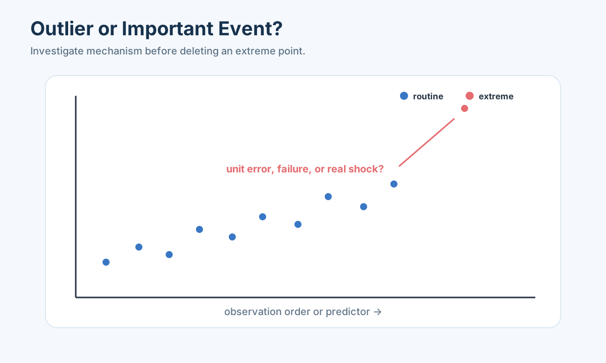
An outlier can be a data error, a rare but genuine event, or evidence of a missing subgroup. The interquartile rule flags candidates outside
It does not prove those observations are wrong. Compare robust statistics such as median and median absolute deviation,
Possible actions are source correction, deletion with justification, winsorization, transformation, robust modeling, or separate analysis. Preserve shocks that the model is supposed to explain.
What an IQR flag actually says
Take a small illustrative list of household commute times: 10, 12, 13, 14, 15, 16, 18, and 90 minutes. The 90-minute commute looks extreme. A quartile rule may flag it, depending on the quartile convention used for such a small sample. But the flag only says “this value is far from the central spread under this calculation.” It cannot tell us whether the household lives far from the city center, travels during an unusual traffic period, entered 90 instead of 9, or combines two trips into one. The median commute is a robust summary of a typical household; the mean is much more influenced by 90. If the transit decision is specifically about long-commute households, the extreme value may be the most important row to retain.
Check plausibility against domain constraints. A 90-minute commute can happen. A commute_minutes=-20 value cannot represent ordinary elapsed travel time; it might be a code, timezone subtraction error, or typo. A percentage of 140% might be impossible if it is a share of one fixed whole, but a “growth percent” could legitimately exceed 100%. Range checks need field definitions. A robust regression might reduce one extreme row’s effect without deleting it; a separate subgroup analysis might show that remote residents have a different travel mechanism. Winsorizing 90 down to a central cutoff would hide the very access problem the city seeks to solve.
MAD is another robust scale measure: take absolute distances from the median and find their median. It is less dominated by 90 than standard deviation on this little list. But a MAD-based cutoff is still a screening rule, not a source correction. If we decide a row is a recording error, keep the raw entry, corrected value, source evidence, and impact on final results. If the source cannot verify it, show results with and without the plausible correction as sensitivity. Readers should know whether the city ranking changes because one uncertain commute was altered.
An anomaly can also be a regime. Suppose commutes in one neighborhood jump from about 20 to about 60 minutes after a bridge closure and stay high for months. Clipping every 60-minute row as an outlier destroys the effect of a real transport intervention. A temporal annotation and before/after comparison may be more useful. Similarly a pollution sensor peak during a fire or a sales surge during promotion is not noise if the decision concerns stress conditions. The difference between error and event is evidence about the world, not a mathematical threshold.
This lesson should leave a student with a specific order of thought: screen unusual values, check units and source, decide whether the mechanism makes them valid, choose an analysis that matches the objective, and report sensitivity. The outlier formula helps us find questions quickly. It does not grant permission to erase difficult facts.
Direction, scale, and encoding
Convert units before comparison. Use rates or per-capita quantities when object size would otherwise dominate. For features on incompatible scales, standardize
or normalize to
For evaluation, convert indicators to a common “larger is better” direction. Cost indicators can be reversed; target and interval indicators require a score based on distance from an acceptable target or interval.
Encode unordered categories with one-hot variables. Do not encode city names as 1, 2, 3: that invents an order and distance. Ordered ratings may use an ordinal encoding if equal spacing is defensible.
A city comparison can reverse when the unit is wrong
Suppose a city table lists annual transit spending as 20 million for a small city and 100 million for a city five times as large. Ranking by total spending says the large city invests more. Ranking by spending per resident could say they invest equally if populations are 1 million and 5 million: both are 20 currency units per resident under these invented values. Neither quantity is universally “better.” Total spending may matter for infrastructure scale; per-capita spending may matter for equity or resource intensity. State the question before standardizing numbers. If one row’s currency is dollars and another’s is thousands of dollars, neither ranking is meaningful until units are converted.
Direction matters in evaluation. More service coverage may be a benefit; more air pollution or commute time may be a cost. A target indicator differs from both: for an operating temperature, 20 degrees may be desirable while 5 and 35 are undesirable, so “larger is better” fails. An interval target such as acceptable pH may score values inside a range equally or according to distance from its center, depending on the decision. Before min-max scaling or PCA, make the criterion’s meaning explicit. If we accidentally treat pollution as a benefit, a mathematically consistent weighted sum will recommend the more polluted city. The algebra will not detect the semantic reversal.
Standardization
Min–max normalization places training values between zero and one by using training minimum and maximum. It is intuitive for a ranking table but extremely sensitive to one extreme. If one city accidentally reports commute time 900 minutes, other cities’ normalized commute scores may collapse near one end. If future test cities have values outside the training range, their transformed value can be below zero or above one; clipping without explanation changes meaning. For descriptive comparison within one fixed set of cities, the range itself can be defined on that set; for predicting new cities, it must be learned from training history to avoid leakage. The task determines the scale rule.
Category encoding should respect whether a category has genuine order. City names coded 1, 2, 3 do not imply city 3 is twice city 1 or closer to city 2. One-hot encoding creates separate indicators for unordered labels. An ordered quality rating from poor to excellent may be encoded ordinally, but equal spacing between poor and fair versus good and excellent is an extra assumption. If categories are rare, collapsing them may erase a small but important subgroup. The original labels and category counts should be shown before modeling.
The most important beginner check is to take one transformed row and translate it back. “This neighborhood has standardized transit score 1.2” means its value is 1.2 training standard deviations above that training mean; it does not mean 1.2 bus stops, 120% service, or automatically “excellent.” A composite score from several such columns has another layer of chosen direction and weight. Document those choices before using the score to allocate public resources. A clean standardized matrix is useful only when its coordinates still correspond to real measurements and stated priorities.
Explore before choosing a model
Exploratory data analysis should answer specific questions:
- histogram, ECDF, and box plot: what is the distribution?
- grouped summaries: how do populations differ?
- scatter plot: linear, curved, saturated, or segmented relationship?
- correlation heatmap: redundant variables or candidate associations?
- line plot: trend, seasonality, break, or anomalous interval?
- map: spatial clusters or boundary effects?
Pearson correlation measures linear association; Spearman measures monotone rank association. Neither proves causality. A high correlation may result from a common trend or hidden group.
Draw the plot that tests a belief
Suppose the city believes longer commutes occur where transit coverage is low. A scatter plot of neighborhood commute time against service coverage can reveal whether that relationship looks linear, curved, or split into subgroups. Add one point per intended neighborhood, label axes in minutes and service units, and mark neighborhoods with missing or corrected fields. If the points form two clusters—dense central areas and remote outer areas—a single correlation may be misleading. It can combine within-group and between-group patterns. Grouped plots or colors for geography help ask whether the alleged relationship survives within comparable neighborhoods.
A histogram or ECDF tells us about one distribution. The ECDF is the fraction of observations at or below each value, so it can answer “what fraction of sampled neighborhoods has commute under 30 minutes?” directly. A box plot summarizes median and spread by district, but it should not turn flagged extreme values into “errors” just because they fall beyond whiskers. A map can reveal that missing sensors cluster in one corner of the city and that pollution peaks near roads; a regular histogram cannot show that geography. Choose a plot for the question, not because every course notebook must contain six chart types.
Correlation has limits. Pearson measures linear association; Spearman uses ranks to describe monotone association. Both can be high because two variables share an unobserved driver. Suppose city population grows and both total transit spending and total bus ridership rise over time. Spending and ridership correlate, but growth could drive both. Per-capita figures, a time plot, policy dates, and a more explicit mechanism are needed before claiming spending caused ridership. If data repeat neighborhoods across years, ordinary correlation also ignores repeated-measure dependence. A dramatic scatter plot is evidence of pattern, not proof of causality.
Exploration should feed model choice and reveal data defects. If a relationship curves toward saturation, a linear regression may miss it; if a few extreme points drive its slope, robust analysis or source checking is needed; if a map shows spatial clustering, validation should hold out regions. If one chart changes drastically after imputation, report that dependence. The goal is not to produce a gallery of polished graphs but to see which assumptions the later model must honor. Every figure should make a sentence in the analysis more precise.
Interpolation is not regression
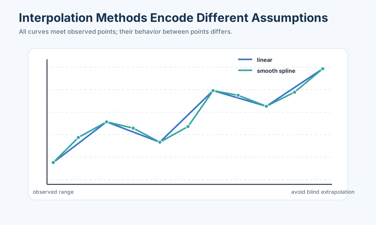
Interpolation reconstructs values between known points and normally passes through those points. Fitting estimates an overall noisy relationship.
Linear interpolation between
It is local and stable but has slope discontinuities. A global Lagrange polynomial passes through every point but can oscillate badly at high order. Newton form is easier to extend with new points. Cubic splines use low-degree polynomials on adjacent intervals and enforce smooth derivatives, making them effective for trajectories and smooth sensors.
Interpolation outside the observed range becomes extrapolation and is far less reliable. If observations are noisy, a smoothing spline or fitted mechanism may be better than a curve forced through every point.
We have discussed individual cleaning choices. A pipeline makes their order explicit and ensures any scaling, interpolation, or encoding fitted on training data is applied—without refitting—to later observations.
Two known points, one unknown middle point
Suppose a temperature sensor measured
The same two points do not justify a 14:00 forecast of 28 degrees by extending the line. That is extrapolation outside the observed interval. Temperature may stabilize, a thermostat may switch off, or outside air may cool it. A later measurement or physical heat-balance model is needed for confidence. Students often call both operations “interpolation” because the same algebra produces a number; the difference is whether
With many knots, a global polynomial can pass exactly through every reading. Lagrange form is a direct construction; Newton divided-difference form makes adding points more convenient. But high-degree exact interpolation can oscillate wildly between points, particularly near interval ends, even if all recorded values seem smooth. A cubic spline instead uses low-degree polynomials interval by interval and joins them with smooth slopes. It can follow a sensor trace without one huge polynomial, yet exact splines can still overshoot sharp transitions or fit noise as though it were truth. Compare interpolated curves with held-out observed knots or physical bounds, not only with the points they were forced to pass through.
If readings themselves are noisy, interpolation through every point may be the wrong goal. Suppose a sensor gives 20.0, 22.5, 21.5, and 24.0 over successive hours because of measurement noise around a smooth warming trend. A fitted line or smoothing spline deliberately need not hit every reading; it estimates the underlying relationship while acknowledging noise. Regression describes an average conditional association, not a guaranteed value between adjacent samples. If the decision is “was there ever an unsafe peak between readings?” neither a smooth fitted line nor an exact spline can prove no peak occurred. Sampling frequency and physical maximum-change rates matter.
Spatial interpolation adds a geometric assumption. Air-quality stations near one another may have similar readings, so inverse-distance weighting gives closer stations more influence. But a river, hill, highway, or prevailing wind can break simple distance similarity. Kriging makes a covariance structure explicit and can supply uncertainty under its assumptions, but still needs spatial evidence. Do not treat latitude-longitude degrees as equal metres or interpolate across a physical barrier simply because two coordinates look close on a flattened spreadsheet. A missing site near a busy road may differ systematically from sensors in adjacent parks.
Validation should hold out locations or times as the intended use requires. If we want an estimate for an unseen district, randomly holding out individual nearby sensor readings while leaving neighboring readings in training can be optimistic. Hold out blocks of space and show distance to nearest observed sensor. If we want to fill occasional missing hours at a well-monitored location, a time-based holdout is more relevant. Report the gap sizes over which interpolation was tested. “We used cubic spline interpolation” is not a reliability statement until the geometry, noise, and held-out gaps are described.
A reproducible preprocessing pipeline
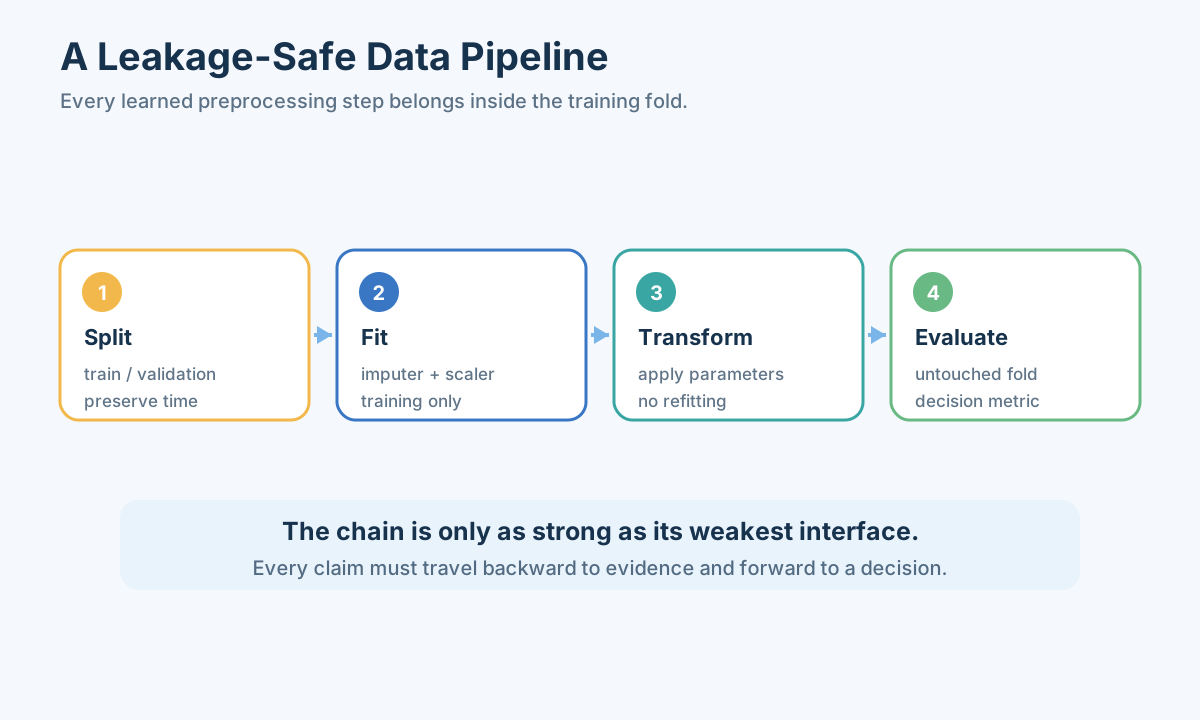
Use a fixed order:
Save raw data unchanged, make transformations in code, and record sample counts after every step. Compare key distributions before and after cleaning. The official pandas missing-data guide documents detection and filling behavior, including the distinct missing sentinels used by different data types (documentation ).
A minimal audit in Python can begin as follows:
1 | import pandas as pd |
This is only a scaffold. Each line needs a written justification, and the data lost or changed by that line should be counted.
The first page a teammate should see
If another team member joins the monitor project, their first page should not be a giant code notebook. It should state the neighborhood-year unit, pollutant concentration unit, sensor source and calibration, population-weight definition, count of missing sites, and which two unresolved data issues might change the recommendation. Then show one map of measurements and unsupported areas, one small audit summary with documented corrections, and the result of one sensitivity such as a high versus low plausible remote reading. This page lets the teammate understand the model’s evidence before they inspect functions. If they find a new source file, they can identify exactly which assumption it improves instead of rerunning an opaque “data cleaning” procedure.
Reproduce one row after cleaning
Imagine we want to predict which neighborhoods will have commute time above 45 minutes next year. We split by neighborhood or year as appropriate before fitting numerical rules. In the training portion, decide how missing income is filled, which categories are encoded, and the means and standard deviations for scaling. Then apply those same fitted rules to later test neighborhoods or years. If the test portion supplies its own median or maximum to the training transform, the model has learned something about the evaluation population before being tested. This can make accuracy appear higher and hide how new neighborhoods will be handled in operation.
The short Python scaffold in the article needs a caution. It fills missing incomes by region using every row of clean, which is fine as a descriptive exploration of one current dataset if that is all we intend. It is not leakage-safe as written for prediction with held-out rows, because regional medians would include evaluation data. For a predictive pipeline, split first and fit group medians on training rows. If a new test region was unseen in training, specify a fallback such as the overall training median or an explicit “unknown region” policy. The same issue applies to imputation, one-hot vocabulary, scaling, and feature selection.
Follow one illustrative neighborhood row with original income blank and region “north.” Suppose the north training median is 42 thousand and training income mean and standard deviation after imputation are 40 and 10 thousand. The filled income is 42, its standardized value is
The order of cleaning is conditional on semantics, not a dogma that every project must blindly apply an arrow chain. We parse types so numeric checks make sense, resolve keys and duplicates so counts are correct, investigate missingness and extremes with source evidence, encode meaningful categories, then scale features for algorithms whose geometry requires it. Outlier treatment may need to happen after unit conversion, and missingness may need separate mechanisms across groups. Preserve raw data unchanged and implement corrections as a traceable transformation. Report how many rows and values changed at each step and compare key distributions before and after.
This matters for a composite city ranking. If one data-cleaning threshold removes the poorest neighborhoods or imputes their missing access scores upward, a later weighted average may rank cities very differently. Recompute the final ranking under plausible alternative cleaning choices. If a decision flips, say which missing field or extreme row caused it and what source data could resolve the uncertainty. A preprocessing pipeline is part of the mathematical model because it defines the population and coordinates that the later model sees. Reproducibility and sensitivity are not afterthoughts.
Probability, sampling, and geography
Before using a sample, define the population and the mechanism that produced the rows. Convenience samples, voluntary responses, sensor coverage, and survivorship can create bias that no downstream algorithm removes. Randomness in a probability model is not proof that the data were randomly sampled.
Build probability intuition
For events
Bayes’ rule reverses conditioning. If a rare defect has prevalence 1%, a test with 95% sensitivity and 95% specificity still produces many false positives. Always combine test accuracy with base rate before interpreting a positive result.
Expectation is a probability-weighted average, variance measures squared deviation, and covariance measures joint movement. Correlation is standardized covariance but does not capture every nonlinear dependence and does not imply causality. Plot joint distributions and identify repeated-measure or clustered structure.
A positive test is not a 95% probability of a defect
The slide’s rare-defect example is a good place to teach conditional probability slowly. Suppose only 1% of manufactured units are truly defective. A test detects 95% of defective units—sensitivity 95%—and correctly clears 95% of sound units—specificity 95%. For 10,000 illustrative units, about 100 are defective and 9,900 are sound. The test flags about 95 of the 100 defective units. It also falsely flags 5% of 9,900 sound units, about 495. Among roughly 590 positive results, only 95 are true defects. Thus
The calculation does not mean the test is bad or that positives should be ignored. A positive result can be a useful screening signal followed by a more specific check. It means a rare condition produces many false positives even under apparently strong specificity. If prevalence rises to 20%, the same test characteristics yield a different positive predictive value because the pool of true defects is larger. For a modeling competition involving anomaly detection, health screening, or equipment inspection, report sensitivity, specificity, and base rate together. A precision metric without prevalence context can mislead decision-makers about the number of investigations a positive flag will trigger.
Expectation and variance also need tangible interpretations. If a delivery delay is ten minutes with probability 0.8 and fifty minutes with probability 0.2, expected delay is
Probability formulas do not rescue biased samples. If the defect test is administered only to units from one high-risk production line, its observed positive rate cannot be treated as prevalence across every line without a sampling adjustment. If bus riders were surveyed mostly at central stations, their satisfaction distribution may not represent remote residents. Before using Bayes’ rule or standard errors, ask which population generated the observed rows and how selection happened. A conditional calculation can be algebraically correct and still answer the wrong population question.
Quantify sampling uncertainty
The sample mean has standard error approximately
Stratified sampling ensures representation of important groups. Cluster sampling may be practical but increases dependence. Weight estimates when sampling probabilities differ. Report both raw sample size and effective design.
Ten thousand rows can still be a small sample
Imagine a city survey with 10,000 person rows from 1,000 households. If people in the same household share location, income, or transit experience, those rows are not independent draws from the whole city. A standard error calculated as though
Stratified sampling can protect representation. If remote neighborhoods hold 10% of residents but contribute only 1% of the collected surveys, an unweighted sample mean mostly describes central neighborhoods. We might deliberately sample more remote residents and then use population weights when estimating citywide rates. Conversely a convenience survey posted on a transit app reaches existing app users and may miss residents with no service. A huge convenience sample can reduce random noise around a biased sample average without moving that average toward the whole population. More rows do not fix a selection mechanism.
Consider a hand-scale example: central neighborhoods contain 80% of residents and have 70% satisfaction; remote neighborhoods contain 20% and have 30% satisfaction. Population-weighted satisfaction is
Sampling design also changes validation. If training and test rows include members of the same households, a model can exploit household-specific patterns and appear to generalize to new households. Hold out households if that is the intended deployment. If the city wants estimates for unseen neighborhoods, hold out neighborhoods or spatial blocks. If it wants next year’s values for the same neighborhoods, hold out years in chronological order. The statistical split should mirror the unit of generalization, which we chose in the first section. A random row split is not an all-purpose proof of predictive validity.
Report uncertainty from sampling and from processing separately when possible. A narrow bootstrap interval around a biased convenience estimate does not include selection bias. A sensitive imputation rule can change results even when sampling variance is small. In a modeling paper, stating both the sample design and the unresolved representativeness limit makes a conclusion more honest than one impressive but context-free confidence interval.
Use interpolation according to geometry
One-dimensional linear interpolation is appropriate between nearby ordered observations when abrupt curvature is unlikely. Cubic splines are smoother but may overshoot. Spatial inverse-distance weighting assumes nearby points are more similar; kriging adds a covariance model and returns uncertainty. Never interpolate across a physical barrier or long unsupported gap without justification.
Cross-validation for spatial interpolation must hold out spatial regions, not random neighboring points, or it will be optimistic. Plot distance to nearest observation and flag extrapolation beyond the observed domain.
Handle geospatial coordinates correctly
Latitude and longitude are angles. Project to a suitable coordinate reference system before treating them as planar distances over a city or region. Great-circle distance is appropriate on larger domains. Spatial autocorrelation means ordinary random train/test splits can leak local information. Use spatial blocks and inspect residual maps.
A road can make nearby points behave differently
Suppose two air-quality monitors are 200 metres apart, one beside a highway and the other inside a tree-filled park. A simple inverse-distance interpolation may estimate a new site between them as a smooth average. If the new site is also beside the highway, that average may understate exposure; if a sound wall blocks plume movement, geometric closeness can again mislead. A map with roads, wind direction, elevation, and monitor locations may explain why one sensor differs. Spatial modeling begins with the mechanism that makes places similar or different, not with a distance button.
Latitude and longitude are angular coordinates. Across a small city, longitude degrees correspond to a different ground distance from latitude degrees, and the longitude scale varies with latitude. A suitable projected coordinate system converts positions to locally meaningful planar distances; larger domains may need great-circle distance. If we apply ordinary Euclidean distance directly to raw degree pairs without considering domain and projection, a “nearest station” calculation can rank sites incorrectly. For a beginner project, even plotting monitors on a correct map and labeling distances in kilometres is a powerful check before interpolating.
Spatial autocorrelation changes validation. Nearby monitors share weather, emissions, and geography, so randomly holding out 20% of sensor readings while leaving adjacent sensors in training can make spatial prediction seem excellent. If the task is to estimate pollution in an entirely unmonitored district, hold out whole spatial blocks or districts and show error versus distance to the nearest training monitor. An interpolator may perform well within a dense central network and poorly at the city’s edge; report both. A residual map can reveal systematic underprediction along roads or near industrial sites that one global MAE hides.
Population exposure adds another layer. If monitors are clustered near roads, their simple arithmetic mean estimates an average of monitor sites, not what the average resident breathes. Divide the city into population cells, estimate or measure exposure in each, and weight by residents, with uncertainty for unsupported cells. If the most populated blocks have no sensors, an elegant kriging surface with a narrow-looking map may still depend heavily on assumed covariance. Show where estimates are extrapolations, where people live, and how different interpolation assumptions change the policy conclusion. The physical map and the sampling map belong together.
Kriging can model spatial covariance and provide conditional uncertainty under specified assumptions, while inverse-distance weighting uses a simpler distance rule. Neither is automatically more trustworthy; validate on held-out regions and check barriers, anisotropy, and coverage. A reasonable simple method with clear unsupported-area flags may be preferable to a complex surface that appears certain where no evidence exists. The goal is to help a city decide where to collect more measurements or act cautiously, not to fill every pixel with an unqualified number.
Use Monte Carlo for derived uncertainty
If output
For rare failure probability
Let uncertain inputs travel through the calculation
Suppose the city estimates average resident exposure from a map of air-quality readings. The result depends on monitor calibration, spatial interpolation, and population counts for each cell. A Monte Carlo analysis can draw coherent plausible versions of those inputs, compute the exposure estimate for each version, and summarize the output distribution. “Coherent” matters: if one monitor’s calibration shifts all its readings together, we should not draw independent errors for each hour as though they came from separate devices. If two nearby stations share a weather-driven error, their uncertainty may be correlated. Ignoring dependence can make the resulting interval too narrow or too wide.
Begin with a tiny hand example before a thousand draws. Two population cells contain 80 and 20 residents. Estimated pollutant levels are 10 and 30 micrograms per cubic metre, so resident-weighted mean is
For a policy threshold, a mean may not be the right statistic. If the decision is whether any heavily populated cell exceeds 35 micrograms per cubic metre, sampling only the citywide mean can hide a local hotspot. Define output as fraction of residents above threshold, maximum plausible cell exposure, or probability of threshold breach, according to the action. Then judge Monte Carlo convergence for that statistic. The average may stabilize with a few thousand draws while a rare failure probability remains noisy. A smooth histogram of mean exposure does not prove precision about extreme tails.
If failure is rare, naive Monte Carlo can be inefficient. The article’s standard-error approximation for an estimated probability
The simulation is not a cure for unknown input distributions. If we choose an unjustified narrow calibration range, many draws will produce a confidently narrow output interval. Show where each input range came from, preserve physical bounds, and vary uncertain dependence assumptions. A hand sensitivity such as the two-cell calculation should agree with the simulated direction of change. If simulated exposure falls when a cell’s pollutant level rises while population weights stay fixed, there is a coding or model-definition mistake. Uncertainty propagation is powerful when it is tied to measurements and sanity checks; it is decorative when it merely multiplies invented randomness.
The workshop tested a small table; this decision tree lets us see the entire path at once. Follow one row from raw measurement to final feature and ask at each branch what evidence justified the choice.
Follow one city file to a decision
Imagine the city council asks which two neighborhoods should receive additional air-quality monitors. We receive a city-year table, household population counts, and locations of existing monitors. First define the analysis unit as a neighborhood-year, because the decision allocates equipment to neighborhoods and historical pollution differs by year. The household file is not directly another set of neighborhood rows; aggregate residents by neighborhood with its own uncertainty. Existing monitor readings have times and coordinates, so we must align their year and convert locations to a suitable projected map before calculating distance. The three files should not be joined by name alone when names contain abbreviations or boundary changes.
During the audit, suppose one neighborhood has two 2025 rows from separate releases. Compare publication dates and measurement definitions, preserve provenance, then select or reconcile using a documented rule. Suppose two sensors report in different concentration units; convert before drawing one scale. Suppose one remote area has no sensor and some household counts are missing. The lack of sensors is itself relevant to equipment allocation, while missing population affects a resident-weighted exposure estimate. Treat each blank according to its mechanism. If we fill remote pollution with the city average, the analysis may falsely conclude the remote area is safe; show spatial uncertainty instead.
Next draw a map of monitors, population cells, major roads, and unsupported areas. A histogram of observed pollutant values describes measured sites, not every resident. An interpolation surface can estimate unmeasured cells, but validate by holding out spatial regions and show where estimates are far from monitors. For each neighborhood, summarize resident-weighted exposure with an uncertainty interval or scenario range, and a separate “measurement coverage” indicator. Those two numbers answer different questions: how much exposure is estimated and how much we actually know. One high-exposure well-measured neighborhood and one moderately estimated but almost unmeasured neighborhood may both deserve consideration for new monitors, for different reasons.
Before ranking neighborhoods, state the objective. If equipment is for reducing uncertainty, target neighborhoods where new measurements would change the resident-weighted estimate or reveal a possible hotspot. If equipment is for verifying known high pollution, use a different score. Direction and weighting choices follow that objective; normalizing pollution, population, and distance without naming a decision would just produce an arbitrary composite number. Test whether the top two neighborhoods change if the remote site’s unknown level is 20 or 40, if population count changes by 10%, or if interpolation follows roads instead of simple distance. A stable ranking is stronger; an unstable one tells us which evidence to collect first.
This case crosses most of the lecture’s data topics without a rigid checklist. Observational unit, duplicates, missingness, unit conversion, spatial geometry, visual exploration, interpolation, sampling weights, and uncertainty all appear because the same real question needs them. We can write the result for the council in plain language: which locations we recommend, what measurements support them, what is inferred, and what assumption could reverse the choice. The recommendation should point to source records and a reproducible transformed table, not to a mysterious score whose inputs were silently cleaned.
For missing
For an ordered criterion
for a benefit and
Interpolation and fitting examples
Lagrange interpolation passes through all
Interpolation estimates a missing response at a location inside the observed domain. Regression estimates a conditional relationship under noise. For polynomial fitting,
Select degree by validation and residual structure, not by in-sample
A noisy relationship should not be forced through every point
Imagine measuring pollution at distances 0, 1, 2, and 3 kilometres from a highway, with readings 30, 24, 26, and 18 micrograms per cubic metre. An exact interpolating polynomial passes through all four, including the rise from 24 to 26 between one and two kilometres. A mechanism might instead suggest pollution generally falls with distance while local wind and sensor noise create small deviations. A fitted line or low-degree curve minimizes overall residuals rather than insisting each recorded knot is the hidden truth. If our task is to estimate typical exposure at 1.5 kilometres, the fitted relationship and its uncertainty may be more defensible than exact high-degree interpolation through noisy monitors.
We can hand-check a simple two-point interpolation separately. Between the readings at one and two kilometres, exact linear interpolation estimates 25 at 1.5 kilometres. That is a local between-knot estimate based only on those two observed readings. A fitted monotone decline using all four might produce a different number. Neither is automatically correct; compare held-out stations near that distance and consider roads, wind, and barriers. If the task is to infer a distance-response law, use fitting with residual analysis; if the task is to fill one short missing point along a smooth known trajectory, interpolation can be appropriate. The target question decides what it means to honor every knot.
Polynomial least squares makes the distinction formal. For degree one, fit
Newton divided differences and Lagrange interpolation are two ways to represent the same exact polynomial through knots. Newton form is convenient when adding a knot; Lagrange form shows the construction directly. Cubic splines are local pieces joined smoothly, less prone than one enormous polynomial to some oscillations but not immune to overshoot or measurement noise. A smoothing spline relaxes exact passage in exchange for a roughness penalty. These methods become meaningful when we describe the observed geometry, the gap to fill, and how much measurement noise is plausible. Listing four method names without that context would not help a student choose.
If the estimate feeds a city ranking, propagate its uncertainty. Suppose neighborhoods A and B have estimated exposure 24 and 25, each with several units of interpolation uncertainty. Declaring B definitively worse from a one-unit difference is unjustified. Test the ranking with alternative plausible surfaces or withheld stations. If A has dense monitors and B is at the edge of coverage, we should also tell the decision-maker that B’s estimate is less certain. The correct policy might collect a B measurement before allocating a costly intervention. Interpolation and fitting are not merely ways to make a blank map colourful; they set how much evidence a comparison has.
Probability and spatial example
Suppose air-quality sensors are clustered near roads. A simple citywide mean estimates the sampled-location average, not population exposure. Define a spatial population, weight cells by residents, and validate by leaving out regions rather than random rows. For a derived exposure-risk estimate
Write the data argument so someone can challenge it
The course deck says a paper should not simply state “we cleaned the data in Python.” For the monitor-allocation case, name each source: neighborhood boundaries and year, household population totals, sensor locations and readings, road network, and any calibration record. Define the observational unit and measurement units. Then explain a few consequential corrections with counts: how many duplicated neighborhood-years were reconciled, how many sensors changed units, how many cells lacked measurements, and what we did with them. The reader needs to know whether the population and exposure pattern changed after processing. A table of before/after row counts and one before/after distribution plot can show that impact better than pages of code.
Next connect exploration to model choice. A map showed monitors clustered by roads and a remote district without coverage; that is why a global station mean was rejected and spatial interpolation was tested. A paired plot of predicted and held-out sensor values reveals whether the interpolation is biased near highways; a residual map reveals where a simple distance model fails. These are not graphics for decoration. Each gives evidence about one assumption. If the chosen method cannot handle a barrier, state the unsupported locations and widen or scenario-test their estimates.
Then report the recommendation in two layers. “Add monitors in neighborhoods B and D” is the action. “B is populous and currently has uncertain exposure near a highway; D has a possible hotspot but few measurements, so a new station would resolve a ranking-sensitive gap” is the reason. An estimated exposure number should be labelled as measured, interpolated, or scenario-based. If the choice flips when B’s unknown level moves from 20 to 40 micrograms per cubic metre, say that. A sharp ranking built from an uncertain blank is not a strong conclusion; a request for a targeted measurement may be the stronger modeling outcome.
Finally give a reproducibility route. Preserve original files, publication dates, coordinate system, correction log, split rule, imputation and scaling parameters, and one transformed neighborhood row with intermediate values. A teammate should be able to recompute the recommendation and audit whether later observations entered training. If another analyst disagrees with a cleaning rule, they can rerun the result under their proposed rule and see its effect. That is how a modeling paper turns a subjective preprocessing choice into a testable assumption rather than a hidden preference.
The numerical transit, income, pollution, survey, and two-cell exposure examples above are invented teaching cases; the data-method topics and source figures come from the course. No number in an example is evidence about a real city. This distinction is itself part of writing honestly: a method can be portable, while an estimate cannot travel without its source. Before moving to regression in the next lesson, we should know what population our rows represent, what their values measure, and which choices the final conclusion depends on.
One last source check can be more important than a new algorithm. Suppose the pollution column in one year is micrograms per cubic metre and in another is milligrams per cubic metre. The numerical value 0.02 milligrams per cubic metre equals 20 micrograms per cubic metre; treating 0.02 and 20 as directly comparable would create a thousandfold artificial drop. A time plot might then report a miracle policy improvement. Converting units and recording the year-specific measurement definition restores the real pattern before any regression, clustering, or evaluation score is fitted. If one value is below an instrument’s detection limit, it should be treated as censored information rather than literal zero; a zero may mean “not detected,” not “none exists.”
The same caution applies to percentages. A field coverage=0.8 might represent a fraction, while another file writes 80 for 80%. The two are equivalent after conversion, yet a min-max normalizer would treat them as far apart and possibly let the larger-number source dominate a score. If one year includes 120, that may be invalid for a share capped at 100% but valid for a growth percentage. The variable definition, denominator, and reference period are essential. A symbol or column name by itself does not tell us which rule to enforce.
Data analysis also has a decision about what not to use. A future outcome column added to a merged panel can be highly correlated with the target simply because it is a later measurement of the same thing. In a descriptive city ranking it may be a legitimate current criterion, but in a forecast of next year’s value it is illegal input. Feature selection based on all years can choose that leaked column even if the final model never intentionally receives future rows. Split by the intended issue time before selecting predictive features, and test one transformed row as we did with northern income. That is how a “clean” table remains honest when it enters the next lesson’s fitted relationship.
The practical lesson is cumulative: row identity controls counts, source definitions control units, missingness controls who remains visible, geometry controls interpolation, sampling controls population claims, and split rules control what could be known at prediction time. Each choice can shift a final city recommendation without changing any later regression formula. A student should therefore show at least one before/after result and one sensitivity to a plausible preprocessing alternative. That gives the reader a way to evaluate the evidence rather than simply admire the mathematics.
There is a useful test of whether this page succeeds: ask a teammate to explain, without running the code, why neighborhood B was recommended and what new observation could reverse that choice. If they cannot answer, the analysis may be technically reproducible but not yet communicable. If they can describe the evidence, inference, and uncertainty in ordinary language, our data foundation has done its job. Regression in the next lesson will then estimate a relationship on a population we can name, using measurements whose units and limitations we can defend.
A cleaning rule changes the population a model sees. The next lesson treats regression as a claim about relationships or predictions and shows why those claims require split-safe data, diagnostics, and uncertainty.
- Title: Mathematical Modeling 14 - Data Foundations
- Author: Gavin0576
- Created at : 2026-09-14 19:59:05
- Updated at : 2026-09-15 07:06:54
- Link: https://jiangpf2022.github.io/blog/2026/09/14/Mathematical-Modeling-14-Data-Foundations/
- License: This work is licensed under CC BY-NC-SA 4.0.