
Mathematical Modeling 17 - Evaluation Models

After clustering cities, someone may ask which city is “best” for a new project. But best for whom? A student may value cost and transit; a company may value skilled labor; a public-health team may value air quality. How can we rank alternatives without smuggling those priorities into a single unexplained score? First we must define indicators and make their directions and units comparable.
We will work through subjective judgments in AHP, data-derived weights in entropy and CRITIC, and a TOPSIS comparison to ideal and worst reference points. I want you to see each as an explicit modeling choice. If a tiny change in weights reverses the top two cities, a responsible conclusion reports that fragility rather than declaring one winner with false precision.
An evaluation model converts several indicators into a ranking, score, or tier. Because every preprocessing and weighting choice can change the result, the goal is transparency and robustness—not artificial precision.
Define the evaluation question
Specify objects, decision maker, time period, and meaning of “better.” A city can be better for affordability, environmental quality, business growth, or overall livability; these are different models.
Build a hierarchy from goal to dimensions to measurable indicators. Indicators should be relevant, available, comparable, interpretable, and not excessively redundant. Record whether each is benefit, cost, target, or interval type.
Before weighting anything, decide what “good” means for each indicator. A lower pollution level and a higher access score cannot be combined honestly until direction, units, and scale are made explicit.
A decision before a score
Imagine that a city has enough money to improve only one of three neighborhoods this year. North has many residents near a flood channel, East has a damaged road to the hospital, and West is expensive to protect but has a large school. A planner asks, “Which neighborhood should receive the first project?” If we answer with a score before asking what the project is supposed to accomplish, we have already made an unspoken political choice. Is the budget meant to prevent the largest expected number of injuries, to help residents with the least ability to recover, or to make emergency response possible during a flood? Each question changes the candidate indicators and sometimes changes the winner.
We therefore begin with a sentence that a person could act on: “Rank the three feasible projects by the expected reduction in human flood harm over the next five years, subject to the available budget and a minimum emergency-access standard.” The object of evaluation is a project, not a neighborhood in the abstract. The time horizon is five years, not a timeless “quality” label. The budget and access standard are hard rules. Vulnerability and risk reduction are benefits to be compared. That single sentence saves us from combining the wrong quantities.
Consider a tempting table with columns for flood exposure, number of residents, median income, road quality, construction cost, and distance to a hospital. It contains useful facts, but it does not yet tell us which are benefits or costs. Number of residents may represent people protected, whereas high flood exposure may represent urgency, not a positive quality of the neighborhood. A low median income could be a vulnerability measure; calling it “bad” and minimizing it would perversely penalize the community we intend to assist. Even the meaning of construction cost is nuanced: a cheap project can be attractive, but it may protect too few people. It is safer to write a short interpretation beside every column before touching the formulas.
One column per important concept is a good starting point. If we use both distance to a hospital and ambulance travel time, are we measuring distinct things? Sometimes yes: the hospital can be near in kilometers while a flooded bridge makes travel slow. Sometimes no: on an ordinary day they are nearly the same proxy. We should inspect the correlation and ask what mechanism each variable represents. Correlation alone cannot decide whether a duplicated proxy should be removed. A road-access measure could be deliberately retained because it matters in a storm, even if it tracks distance on dry days.
There is a second danger: constructing a score from data that happen to be available rather than data that matter. A government portal may have beautifully complete counts of parks and buses but no reliable building-level flood exposure. The polished portal columns can then dominate the score simply because they are easy to measure. A clear decision definition makes that absence visible. We may need a field survey, an explicit missing-data range, or a narrower claim. The evaluation question does not magically fill a missing column, but it stops us from treating missing evidence as zero importance.
A small table we can follow
Let us temporarily evaluate three stylized transit-improvement options, A, B, and C, using two criteria: riders helped per day and project cost in millions of dollars. These are invented teaching numbers, not Columbia or municipal observations. A helps 80 riders and costs 4; B helps 120 and costs 9; C helps 100 and costs 6. We will keep this little table alive through normalization, weighting, and ranking so you can see precisely where the numbers change meaning.
At first, B seems best on riders helped and A seems best on cost. There is no winner without a preference about their trade-off. If the city has a hard cost ceiling of 7, B is not merely “less attractive”; it is infeasible. We would drop B before ranking the feasible projects. If the ceiling is 10, all three remain and we can compare them. This is why a constraint must not be disguised as an ordinary score: no amount of riders can make an unauthorized 9-million-dollar expense fit a 7-million-dollar appropriation.
Now ask what “riders helped” means. Is it daily unique people, passenger trips, or modeled reductions in travel time? A project benefiting the same commuter twice a day may record 160 trips but only 80 people. If the policy goal is equitable access, perhaps travel-time savings among low-income residents is a more meaningful column than total trips. An indicator dictionary should state the unit, measurement rule, source, date, direction, and whether higher values actually imply the policy benefit. We can still begin with a simplified table, provided we clearly mark its simplification.
Why the candidate set matters
Evaluation often looks like a measurement of intrinsic merit: “Option C scores 0.73.” In many methods, that number is relative to the other options in the table. Add an absurdly expensive fourth project, and the min–max range of cost changes. Remove the cheapest project, and the same 6-million-dollar option may receive a very different normalized cost score. The city itself has not changed; the comparison set has. A ranking made this way is useful for choosing among current candidates, but it is not automatically a stable public rating that can be compared across years.
To build a rating that survives a changing candidate list, use fixed anchors where possible: for example, zero benefit at 0 riders, full benefit at 150 riders, unacceptable cost above 10 million, and a fixed tolerance around a policy target. Those anchors need justification, and we should preserve them when new alternatives arrive. If we use annual min–max normalization instead, explain that scores are relative to the annual cohort. A reader should know whether a “high” score means objectively good or merely better than this year’s other options.
This distinction becomes essential in course work. A team may copy a public dataset, normalize it, calculate a beautiful heatmap, and only afterward invent a story about ranking cities. That reverses the logic. Begin with the action and the value judgment, then use the data to examine candidate actions. The formulas are transparent precisely because the human choices before them are transparent.
Make indicators comparable
For a benefit indicator, min–max normalization is
For a cost indicator, reverse the numerator. For a target value
Check sensitivity to extreme values and alternative scaling. State whether weights apply to raw indicators or normalized scores.
Watch the units disappear, but not the meaning
Use our three-project table. Rider counts are 80, 120, 100, so their min–max benefit scores are 0, 1, and 0.5. Costs are 4, 9, 6 million; because cost is undesirable, their oriented scores are 1, 0, and (9−6)/(9−4)=0.6. The oriented rows are therefore A=(0,1), B=(1,0), C=(0.5,0.6). Every score now runs from 0 to 1 and “larger” means “better.” This transformation is a rule for comparison, not a discovery that half a rider benefit is equal to 0.6 units of affordability.
Notice what we lost. The original difference between 80 and 100 riders is 20 people per day; the normalized difference is 0.5. If the city values each additional rider at a particular amount of saved time, a model in physical or economic units might be preferable. Normalization is convenient when criteria cannot be converted into a common unit, but it does not create a natural exchange rate between those criteria. The exchange rate enters through weights and aggregation. A weighted sum with 70% on riders declares that one unit of normalized rider improvement is worth more than one unit of normalized cost improvement. The modeler has to defend that declaration.
The range itself may be unstable. Suppose an administrative error lists an impossible cost of 90 million instead of 9. The cost scores for real candidates become compressed near one: A=(90−4)/86=1, C=(90−6)/86≈0.977, B=(90−9)/86≈0.942. The apparent cost gap nearly disappears because the wrong outlier sets the maximum. A rank flip caused by that compression is not a subtle philosophical problem; it is a data-quality failure. Check original units and source documents before explaining the result as stakeholder preference.
For some indicators, an interval is genuinely preferable. A hospital bed-occupancy rate of 0% wastes capacity, while 100% leaves no room for an emergency. If an acceptable target band is 75–85%, a monotone “higher is better” normalization is wrong. We could assign full score inside the band and reduce the score outside it according to distance, perhaps with asymmetric penalties for overcrowding and underuse. But then the band and penalty slope are part of the value model. We should write them down in language before encoding them.
Another example is a target temperature in a greenhouse. Let 22°C be ideal and 18–26°C tolerable. A simple score might be max(0,1−|T−22|/4). At 20°C it is 0.5; at 22°C it is 1; at 26°C it is 0. This formula is easy to calculate, but it treats the penalty at 18°C and 26°C as symmetrical. If plant damage from heat is worse than from cold, two slopes are needed. The purpose of showing the formula is not to declare it universally correct; it is to make the preference inspectable.
Separate scores from admissibility
Some requirements are not compensable. In bridge selection, an option that fails a structural safety standard cannot become acceptable because it is inexpensive and visually appealing. For neighborhood resilience, a proposal that would relocate residents without a lawful plan cannot gain legitimacy from a high flood-reduction score. Evaluation begins by identifying hard constraints and filtering or revising alternatives that fail them. Only then do we rank the feasible set. This order is different from multiplying a safety score by a large weight, because any finite weight can still be overridden by sufficiently large gains elsewhere in a weighted sum.
Yet not every bad value is a veto. Two weeks of construction disruption might be traded against a meaningful improvement in access. We can decide that the discomfort is compensable while a critical access closure is not. The distinction is not mathematical folklore; it comes from the decision maker’s rules and the people affected. When the answer is disputed, make multiple scenarios rather than hiding the dispute in one supposedly objective weight vector.
With comparable, correctly oriented scores and a feasible candidate set, the next question is how to represent preferences. AHP asks people for pairwise judgments, entropy and CRITIC look at the spread and structure of the dataset, and TOPSIS combines scores geometrically. Each answers a different question. We will calculate them as tools, then ask whether their answers are useful for the actual decision.
Once indicators are comparable, someone still has to decide their relative importance. AHP records those judgments instead of hiding them, and gives us a consistency check before we use the weights.
AHP: subjective weights made explicit
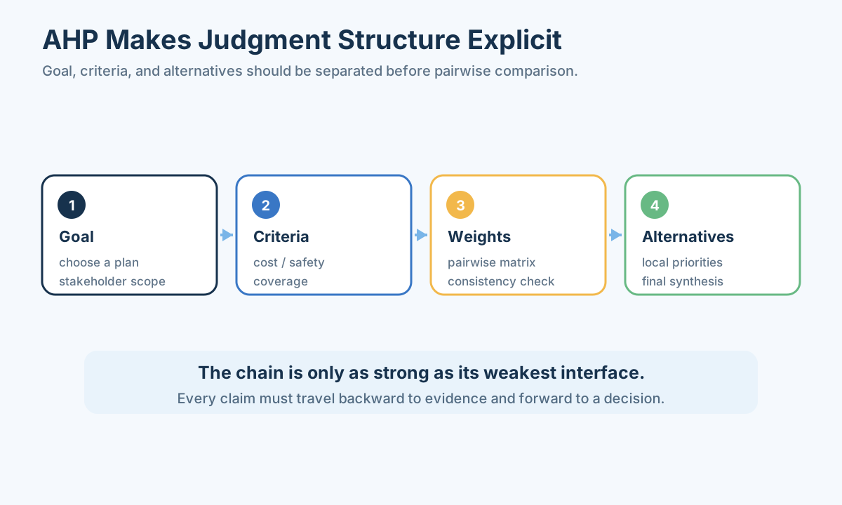
Analytic hierarchy process asks experts to compare criteria in pairs. Matrix
Perfect consistency would satisfy
If
Start with a conversation, not an eigenvector
Suppose we have three criteria for the transit projects: riders helped, construction affordability, and reliability during bad weather. Ask a transport planner to compare them two at a time. She might say that riders helped is twice as important as affordability, riders helped is four times as important as reliability, and affordability is twice as important as reliability. These judgments produce
The ratios fit together: if riders are twice as important as cost, and cost twice as important as reliability, riders are four times as important as reliability. A priority vector proportional to (4,2,1) matches the entire matrix, so normalized weights are (4/7,2/7,1/7), approximately (0.571,0.286,0.143). We did not need software to understand this example. The eigenvector method matters when the matrix is larger and real human judgments are not perfectly consistent.
Now imagine that the third judgment is “riders are only as important as reliability,” even though the first two judgments still say 2 and 2. The resulting triangle is contradictory: one path says riders/reliability=4, the direct comparison says 1. AHP’s consistency check tells us that the judgments cannot all be represented by one clean set of ratios. It does not prove that the planner is irrational. Perhaps she understood “reliability” as normal-day punctuality in one comparison and storm-day safety in another. The useful action is to return to the definitions and ask the question again.
The reciprocal rule is easy to overlook in a spreadsheet. If
In our clean matrix,
Who gets to supply the comparisons?
Our planner is not the only person affected. A neighborhood resident may put a higher weight on storm-day reliability than on aggregate rider count. An accessibility advocate may insist on step-free service even if it reaches fewer total passengers. A budget officer may focus on the cost ceiling. We can collect judgments separately and show how rankings differ before combining them. If we average all pairwise comparisons too early, a meaningful conflict about values disappears into a tidy matrix.
There are legitimate ways to aggregate group judgments, including geometric averaging of pairwise ratios and averaging individual priorities. They answer slightly different questions. Geometric averaging preserves the reciprocal structure of the comparison matrix; averaging priorities treats each respondent’s final weights as the object to combine. Either way, record whose voices were invited, whose were absent, and whether respondents understood the same criteria. If the stakeholder group is small and disagreements are consequential, publishing several weight scenarios is often more honest than announcing one “consensus” set.
The hierarchy itself can also distort priorities. Suppose “riders helped” contains separate subcriteria for daily trips, unique riders, commute time saved, and peak-hour capacity, while affordability contains only construction cost. The rider branch has more opportunities to count the same underlying benefit. AHP does not repair poor indicator design. One should first define distinct concepts, then compare them. The hierarchy image above is a map of where judgments enter; it is not a warrant that every leaf deserves a place.
Put the weights back into a decision
Return to our oriented transit table, but ignore reliability for a moment. If riders receive weight 0.7 and affordability weight 0.3, the weighted-sum scores are A=0.3, B=0.7, and C=0.7(0.5)+0.3(0.6)=0.53. B leads if all projects are feasible. If affordability receives 0.7 instead, A=0.7, B=0.3, and C=0.3(0.5)+0.7(0.6)=0.57; A leads. These are not mathematical contradictions. They reveal that the decision hinges on the trade-off between people helped and money spent.
At what rider weight does C overtake A? Let rider weight be
AHP can help elicit a plausible
Entropy weights
Entropy weighting rewards indicators that vary more across objects. Given nonnegative normalized values, form proportions
Then
Use the convention
Entropy is about distinction, not morality
If every transit project has nearly identical road reliability, that criterion tells us little about which candidate is different within this table. Entropy weighting responds by making its weight small. This can be convenient when we have many indicators and do not want flat columns to dominate a distance calculation. But a criterion may be ethically non-negotiable even when all current projects pass it. If all projects satisfy a safety standard, entropy may give safety almost no weight—which is fine as a statistical description of variation, not fine as a decision to abolish the standard. Keep the standard as a feasibility rule.
To see the formula by hand, consider an already oriented toy column (1,1,1) across three candidates. Its proportions are (1/3,1/3,1/3). The normalized entropy is exactly 1, so
Our rider scores (0,1,0.5) yield proportions (0,2/3,1/3). The entropy is
There are implementation edge cases. A column of all zeros makes the denominator in
Try replacing C’s cost of 6 million with 6.2. The entropy weight changes a little because the candidate distribution changes. Then add a fourth project with impossible cost; after min–max scaling, the proportions may change dramatically. This shows why “data-derived” does not mean “choice-free.” The candidate list, normalized scale, missing-value treatment, and indicator directions are all choices upstream of the entropy formula.
We can use entropy weights as a comparison against stakeholder weights: where do they disagree, and why? Perhaps riders have large differences but the planner thinks accessibility deserves a priority even with small variation. That disagreement is information. It suggests a conversation about goals or data, not an average taken without explanation.
CRITIC weights
CRITIC combines contrast and conflict. One common information measure is
where
When two indicators tell the same story
Suppose a city table measures both the number of bus stops and the number of subway stops. In a few districts these two columns rise almost together because dense districts receive both services. Giving each a separate 25% weight might grant transit accessibility 50% of the total score even though we intended it to be one broad criterion. CRITIC notices that strongly correlated columns supply overlapping distinctions. It combines each column’s spread with the extent to which its pattern differs from the others.
Our little transit-project table has rider scores (0,1,0.5) and affordability scores (1,0,0.6). They pull in opposite directions: the most beneficial project is the most expensive. Their correlation is about −0.99 in this deliberately tiny table. Because
The example also reveals a weakness. Three rows are too few for a stable empirical correlation. A slight change to one cost can move the result. In an actual city evaluation, plot the raw columns and ask whether the relationship has a common cause. Big cities may have both more hospital beds and more traffic congestion because of population size; calculating a correlation without adjusting for city scale may obscure the policy mechanism. We can examine rates per resident or service per square kilometer, but those denominators must also fit the decision.
The standard deviation
Consider a pollutant sensor that recorded 900 instead of 90 in one neighborhood. The exceptionally different column may look informative to CRITIC. It is actually a data-entry error, unless a source inspection confirms a true extreme. A good analysis does not announce “pollution is objectively most important” based on this accident. It traces the number back to its unit, date, and measurement instrument, then reruns the result under a justified correction or uncertainty range.
CRITIC, entropy, and PCA-based weights are called data-derived because they read variation or correlation from the observed table. Their strength is revealing data structure. Their limitation is that a table cannot itself vote on what the community values. If all options meet a critical safety threshold, the safety column may be constant and receive essentially no data-derived weight; the legal requirement still applies. Hold admissibility rules and policy values outside the “objective” weight calculation.
TOPSIS ranking
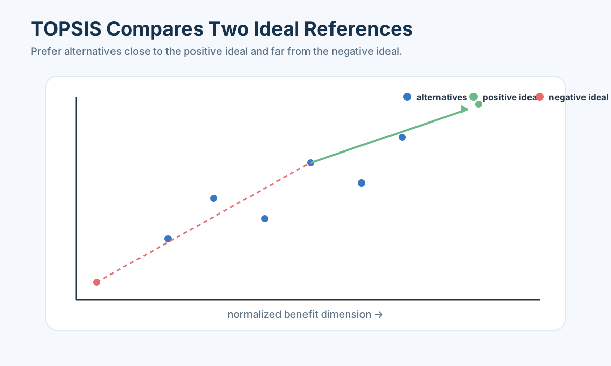
Let
The closeness score is
Larger
Construct an ideal that no contractor can build
Return to A=(0,1), B=(1,0), C=(0.5,0.6), where the first coordinate is riders helped and the second is affordability. Give the criteria equal weights. The weighted rows are A=(0,0.5), B=(0.5,0), and C=(0.25,0.30). The positive ideal is (0.5,0.5), taking B’s rider benefit and A’s low cost. It is not one of the projects. It is an imaginary combination of the best observed value in each column. The negative ideal is (0,0).
For A, both distances are 0.5, so its closeness is 0.5. B is symmetrical and also scores 0.5. For C, the distance to the positive ideal is
The computation is simple enough to audit with a pencil, and that is one of TOPSIS’s attractions. But “C has the highest closeness under these inputs” is not the same as “C is objectively optimal.” If a planner gives riders much more weight than cost, B may lead. If the budget ceiling is 7 million, B should not appear in the feasible set at all. If C’s 100-rider projection has a broad uncertainty interval, a score gap of 0.05 might not be decisive. Every one of these distinctions should appear in the recommendation, not be buried in a footnote beneath a three-decimal rank.
The short Python block below now uses the same already oriented min–max matrix as our hand example. Another common TOPSIS implementation divides each column by its Euclidean norm before weighting, but that is a different calculation and may give different scores. If we choose that variant, state it and derive the worked example under the same rule. Method names are not substitutes for a complete calculation recipe.
TOPSIS’s ideal can be unattainable when benefit and cost trade off in physical reality. That is acceptable as a comparison device, but do not call the ideal an engineering specification. If the decision maker wants to know which feasible designs are efficient, a Pareto frontier or constrained optimization model may answer more directly. TOPSIS answers a narrower question: relative closeness of candidates to a constructed benchmark under a chosen geometry.
The Euclidean distance also encodes a particular trade-off. A shift of 0.2 in one normalized criterion is treated geometrically like a shift of 0.2 in another after weighting. If two criteria are duplicates, the same shortfall may be counted twice. If one criterion has a nonlinear threshold, Euclidean distance from a linear score may understate it. We cannot repair those problems by declaring TOPSIS more advanced. We must return to indicator design and the value function.
Add a fourth, unusually expensive project and the min–max cost range changes. A, B, and C have the same raw costs as before, but their normalized positions can move, and with them the ideal point and ranks. This is another reason to report a TOPSIS score as relative to an explicit cohort and date. A stable rating across years requires fixed external anchors or an explanation of why year-by-year relative comparisons are enough.
The figure above is helpful if you read it as a geometric question: Which candidate is close to the best attainable values shown in the current table? It is misleading if you read it as a proof of social value. When two scores are close, show distances, contribution by criterion, and plausible uncertainty. That turns a ranking into an explanation a decision maker can challenge.
Entropy and CRITIC extract different information from the observed table; AHP records priorities from people. None should be treated as automatic truth. Now we compare what each weight set emphasizes and whether the final ranking survives reasonable changes.
Combining subjective and objective evidence
AHP captures priorities; entropy or CRITIC captures data structure. Combine them only with a stated rule, such as
Mixing views does not create a neutral view
Suppose the transport committee’s AHP gives weights (0.70,0.30) to riders and affordability, while our entropy calculation gives approximately (0.514,0.486). Taking
Try
The two weight vectors must describe the same indicators at the same level. If an AHP hierarchy has one weight for “transport access,” but entropy calculates separate weights for bus stops, subway stops, and travel time, adding the vectors is meaningless until we decide how those leaf indicators sit inside the access dimension. A spurious consensus can appear when unlike quantities are averaged. Align definitions, units, direction, and hierarchy first.
Sometimes separate scenarios are more honest than blending. A “community priority” scenario may emphasize access for residents who have no car; a “budget pressure” scenario may emphasize project cost; a “data-variation” scenario may reveal which columns distinguish the candidates. Each scenario should correspond to a real question somebody could ask. Generating many weights for decoration is just another form of filler.
Imagine that vulnerability is a fixed public priority in a flood-resilience program, but CRITIC assigns a low weight to median income because all three neighborhoods have similar income. The data-derived method has correctly observed low variation. It has not voted to abandon the public priority. We could keep vulnerability as a minimum standard, seek a richer measure, or discuss whether the current projects all serve similarly vulnerable people. Averaging the two weights by reflex would not resolve that judgment.
Keep uncertainty in facts separate from uncertainty in values. A forecast rider count with ±20% uncertainty can be sampled while policy weights stay fixed. Stakeholder weights can be varied while the measured table stays fixed. Both can be varied together, but label what each experiment tests. Otherwise a plot of rank changes hides whether we need better data or a clearer policy decision.
Robustness and interpretation
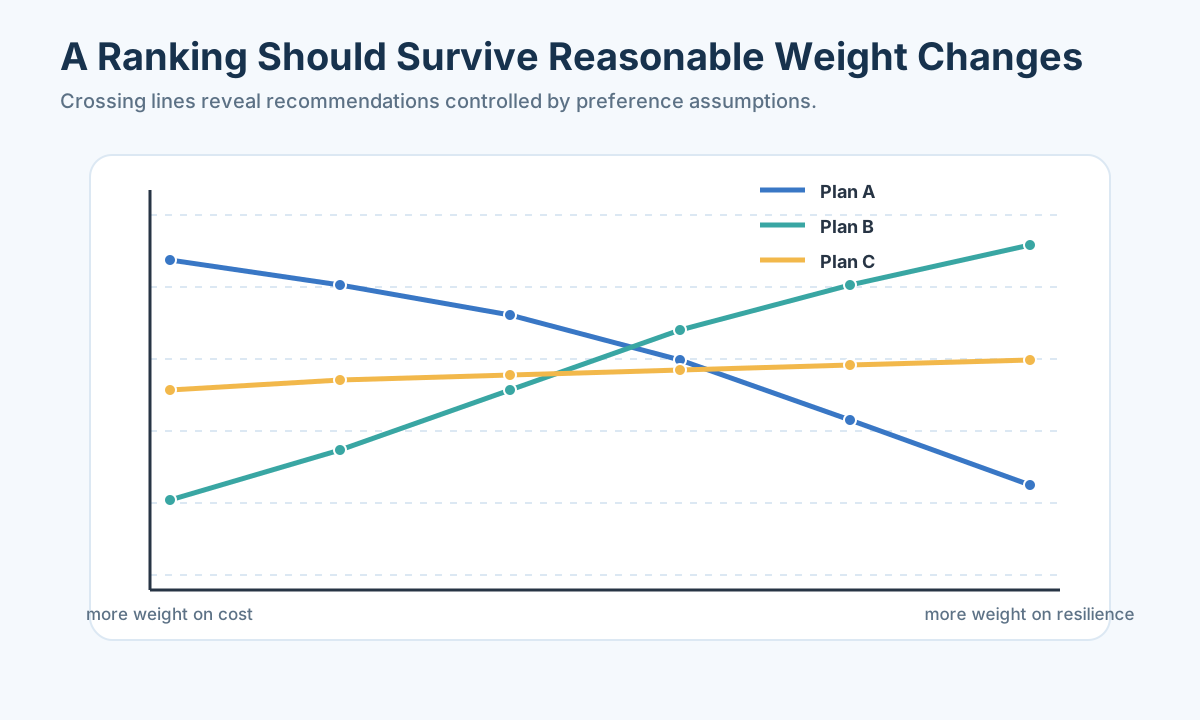
Recompute results under:
- different normalization methods;
- alternative weight systems;
or weight perturbations; - leave-one-indicator-out analysis;
- bootstrap samples;
- plausible missing-data choices.
If neighboring scores overlap across analyses, report tiers rather than a fragile exact order. Decompose each object’s score by dimension so the recommendation explains strengths and weaknesses.
Read a crossing as a policy threshold
The score lines in the rank-sensitivity image cross because the preferred option depends on the weight placed on one criterion. Our hand algebra made the threshold concrete: C beats A when rider weight exceeds 4/9; B beats C when it exceeds 6/11. If the committee believes a plausible rider weight lies anywhere from 0.45 to 0.60, a single unqualified winner is not supported. A lower part of the range favors C; its higher part favors B. The job of the model is to make this conditional claim visible.
There are several distinct causes of instability. Changing a weight alters how we value outcomes. Changing a cost estimate alters a fact. Changing min–max to fixed-anchor scaling alters the conversion from units to scores. Adding a candidate changes a relative comparison. Changing weighted sum to TOPSIS changes the aggregation rule. An arbitrary “±10% on everything” test mixes these mechanisms. Start with uncertainty that actually exists in the decision.
For our invented projects, suppose costs are A=4±0.4, B=9±1.5, C=6±0.8 million, and ridership estimates are A=80±12, B=120±25, C=100±18 people per day. If the budget cap is 7 million, B is infeasible throughout its cost range; C might become infeasible at its upper edge. That feasibility transition matters more than a fine change in TOPSIS closeness. Test hard rules for every scenario before scoring the feasible candidates.
Leave-one-indicator-out analysis is a useful diagnostic. If removing one pollution proxy flips the top two neighborhoods, ask whether that proxy is reliable and genuinely distinct. Do not delete it solely to obtain a stable rank. A critical health standard may be important even if it does not distinguish present candidates. The test reveals dependence; judgment determines whether that dependence is acceptable.
Rank acceptability reports how often each candidate occupies each position across specified scenarios. If we deliberately vary weights uniformly over a stated interval, the fraction of scenarios where B ranks first is not automatically a probability that B is “truly best.” It is a share of tested preferences under our sampling scheme. This language matters because the scenarios are often selected by analysts, not drawn from a known random process.
Suppose North and East neighborhoods score 0.641 and 0.638, with West at 0.610. If the first two swap after a minor flood-map revision, put North and East in a high-priority tier and explain what extra evidence could separate them. If West remains third across all credible runs, that tier boundary may be useful. A tier is not a refusal to decide: the funding authority can apply an explicit secondary rule or commission a targeted measurement. It is more honest than treating a 0.003 score gap as a precise ordering.
A ranking must be translated back to the original decision. “North is first” tells a resident little. “North protects the most exposed people with a relatively low-cost levee, but emergency access remains weak; East is nearly tied because road repair improves evacuation” gives a challengeable explanation. It exposes the strength, the shortfall, and the condition under which the recommendation could move. This is the difference between calculating a score and using a model responsibly.
Worked pattern
For a bridge, tunnel, and ferry decision, define benefit, construction cost, operating cost, capacity, environmental impact, and disruption. Use AHP for stakeholder priorities, data-driven weights as a comparison, TOPSIS for a transparent ranking, and scenario analysis for demand and cost uncertainty. The final result is a conditional recommendation with thresholds—not simply “alternative A ranks first.”
A transparent TOPSIS implementation can remain short:
1 | import numpy as np |
Keep the oriented matrix, weights, ideal points, distances, and final scores in the supporting material so the ranking can be audited.
When a score should not decide alone
Suppose five neighborhoods are prioritized for resilience investment using exposure, vulnerability, infrastructure condition, emergency access, project cost, and population served. A ranking is not discovered automatically by TOPSIS; it is constructed from a value model. The indicator hierarchy and direction are therefore as important as the final formula.
Define the decision and stakeholders
State whether the output is a complete ranking, funding tiers, or identification of unacceptable risk. Identify who supplies preferences and who bears consequences. An indicator may be measurable but irrelevant, or relevant but double-counted through several correlated proxies.
Build a hierarchy whose branches correspond to distinct concepts. Check coverage, non-redundancy, direction, and data quality. Document benefit indicators, cost indicators, interval-preferred indicators, and thresholds. For a cost indicator
Use AHP with consistency
Pairwise judgments form matrix
Understand objective weights
Entropy weights increase when an indicator differentiates alternatives; CRITIC combines variability with low correlation. Neither measures ethical or policy importance. A wildly noisy indicator may receive high objective weight. Screen reliability before weighting, and compare subjective and data-driven schemes rather than pretending one is neutral.
Compare aggregation models
Weighted sums allow full compensation: a very poor score on one criterion can be offset by others. TOPSIS rewards closeness to an ideal and distance from an anti-ideal but depends on normalization and distance. Grey relational analysis compares geometric similarity of sequences. Fuzzy evaluation represents graded membership when boundaries are linguistic. Data Envelopment Analysis compares relative efficiency of units using multiple inputs and outputs, but flexible weights and sensitivity to outliers require care.
Choose a model based on the meaning of preference, not popularity. If a safety threshold cannot be compensated by low cost, impose it as a constraint before ranking feasible alternatives.
Analyze rank robustness
Sample weights from plausible ranges, repeat normalization choices, bootstrap data, and record rank acceptability: the fraction of runs in which each candidate occupies each rank. Plot score contribution by criterion and identify pairwise reversal thresholds. If first and second exchange under tiny perturbations, report a tied priority tier.
Funding resilience under a budget
Let us return to North, East, and West and ask what a real recommendation would need. Suppose, for illustration, North’s levee protects 1,200 residents at a projected cost of 5 million; East’s emergency-road repair improves storm access for 900 residents at 3 million; West’s school floodproofing protects 500 children and staff at 2 million. These numbers are invented to teach reasoning. They are not measured hazard outcomes and should not be quoted as a real municipality’s plan.
“Residents protected” is already ambiguous. Does a levee reduce every resident’s risk by the same amount? Are the 900 in East the same people who would be cut off from hospital service, and is the road usable after the repair under the modeled storm? Does protecting a school cover only an average school day, or also its use as a shelter? A better indicator such as expected reduction in person-hours of unsafe exposure might integrate these mechanisms, but would require hazard scenarios and uncertainty. We can use a simpler proxy temporarily while naming its limits.
Set a total budget of 6 million. The committee could fund North alone, East plus West for 5 million, or West alone; North plus West exceeds 6. A ranking of individual projects does not answer which portfolio to fund. If East and West overlap in who they protect, their benefits cannot simply be added. If they serve different hazards, the portfolio may be attractive even if neither project individually ranks first. A small constrained portfolio model is more faithful to the decision than sorting every project by TOPSIS score.
Imagine a rule that every funded project must maintain access to an emergency clinic during construction. North’s current design fails because temporary works block a road. Its safety benefit and low cost do not make the unmodified design admissible. Engineers can propose a detour, update the cost and impact, and then North can re-enter the candidate set. The ranking method is not “punishing” North; the candidate design has changed. This is why feasibility belongs before a compensatory score.
Suppose a community survey gives exposure reduction twice the priority of ease of construction, while data-derived weights emphasize cost because costs vary most across the three projects. Instead of averaging them into one unexplained weight, show a community-value scenario and a variation-based scenario. If both favor East plus West, the portfolio is robust to that disagreement. If one favors North and the other East plus West, identify the switching threshold and invite a policy discussion. No formula can tell affected residents that their priorities are “subjective noise.”
Uncertainty adds a layer. A projected levee benefit of 1,200 residents could depend on a flood map built from limited storms. Test several plausible storm frequencies and construction costs. A project may remain feasible but become less effective, or a cost increase may force a portfolio change. The output is not a cloud of simulations for decoration. It is a conditional explanation: “Fund North if an updated map confirms at least this much risk reduction; otherwise fund East and West.”
We can now appreciate what an evaluation score can do. It summarizes competing dimensions for a fixed candidate set, reveals trade-offs, and helps prioritize investigation. It cannot replace the budget rule, certify uncertain measurements, or decide whose welfare counts. A responsible numerical ranking makes these boundaries clear enough for a person to disagree intelligently.
Evaluation models as a transparent pipeline
Begin with decision object, stakeholder, and use of the ranking. Build an indicator hierarchy without duplicate proxies. Specify source, unit, direction, target interval, missing rule, and whether compensation is permitted. A catastrophic safety criterion should be a threshold, not something that excellent aesthetics can cancel.
Different rules answer different questions
The weighted sum is familiar: multiply each oriented score by its weight and add. It allows full compensation. A bridge could score poorly on safety but very well on aesthetics and cost; with a finite safety weight, the sum might still put it first. That is not a computational error but a property of the rule. If safety is a legal minimum, filter unsafe bridges first. If a safety shortfall is graded but serious, a nonlinear value function may be more faithful than a linear score.
An outranking approach asks whether option A is at least as good as B on enough important criteria and whether any criterion vetoes that claim. It can express “A is cheaper and almost as effective, but its environmental damage is unacceptable.” Such methods can leave two options incomparable rather than force a complete ordering. That is useful when values are genuinely non-compensable, though it requires explicit thresholds and can be harder to explain than a weighted sum.
Data Envelopment Analysis answers a different question: relative efficiency when units use several inputs to produce several outputs. A hospital may use staff hours and expenditure to produce visits and health outcomes. DEA constructs a frontier from observed units, but flexible weights can reward odd specialization. A hospital serving complex cases may look inefficient if case mix is ignored. It is not a general synonym for evaluation; use it when an input-output efficiency framing genuinely fits the decision.
Grey relational analysis compares how closely indicator sequences resemble a reference pattern after normalization. Fuzzy evaluation represents graded membership in categories such as “moderate risk.” Both can be reasonable when the decision language calls for them. Neither removes the need to specify reference sequences, membership functions, indicators, and weights. Selecting a sophisticated method before defining “better” gives an elaborate answer to an undefined question.
PCA-based scores compress highly correlated indicators, as we studied in the previous lesson. But PCA finds directions of greatest variance, not greatest social benefit. Imagine wealth varies enormously across cities while emergency-response time varies less. A first principal component dominated by wealth may rank cities beautifully by wealth while missing an access decision. Use PCA to summarize data patterns and then inspect whether the score’s meaning fits the action. If it does not, keep policy criteria separate.
The choice can be said in plain English: Do we want a compensatory score, a relative ideal-distance comparison, a safety veto, an efficiency frontier, or a descriptive data summary? One study may use several, each in a named role. The aggregation method is the final layer of a chain whose earlier layers—problem, objects, indicators, data, and constraints—carry more of the meaning.
Weighting formulas
AHP constructs pairwise matrix
An unacceptable
Large variation may reflect noise, so objective weight is not synonymous with importance. PCA weights maximize explained variance, again a statistical property rather than stakeholder value.
TOPSIS and alternatives
After direction and scale normalization, weighted vector
Weighted sums measure compensatory utility; TOPSIS measures relative closeness; outranking methods can represent vetoes. Choose according to decision semantics, then test whether the winner depends on normalization, weights, aggregation, or candidate set.
The pipeline is easier to trust when we can test it against concrete decisions. In these three cases, watch how the definition of a good alternative changes the indicators, weights, and final interpretation.
Three course-style cases
For city livability, combine infrastructure, environment, affordability, and accessibility but keep pollution or safety vetoes. For enterprise risk, combine financial ratios, governance, market exposure, and supply resilience; validate ranks against future distress. For ecological quality, integrate biodiversity, fragmentation, water, and human pressure while preserving spatial scale. In every case, translate the score back into actionable strengths and weaknesses.
City livability: whose ordinary day?
Suppose a team is asked to compare three cities as places for graduates to live. It finds data for average income, rent, commute time, air pollution, and hospital access. Before calculating a score, ask what kind of graduate and what kind of move. A person with a job offer cares about income after rent and commuting, not average income alone. A person with a chronic illness may treat healthcare access as a minimum requirement rather than a bonus. A family may need school and childcare information missing from the five-column table. The model should state whose experience it approximates.
Use three stylized cities. Harbor has high salary and high rent, Hill has moderate salary and short commute, and River has lower salary but cleaner air. A raw salary column in thousands of dollars, a rent column in dollars per month, and a pollution concentration column in micrograms per cubic meter cannot simply be added. First convert each into an interpretable feature. Salary after tax and yearly rent could produce disposable income, though tax assumptions matter. Commute time may be multiplied by days traveled if we want annual hours lost. Pollution should retain its direction: a higher concentration is worse, and a health threshold might rule out a location for a vulnerable person.
Suppose the team instead keeps separate oriented scores for affordability, travel time, air quality, and service access. That is defensible if it explains weights. AHP interviews might give one weight set for graduates seeking a first job and another for parents. Entropy weighting might emphasize pollution because one city is exceptionally smoky. If the pollution measurement comes from one anomalous wildfire day, that weight may reflect noise. A careful team checks annual exposure and station coverage before announcing an “objective” city score.
Min–max normalization makes each city’s score relative to this trio. Add an unusually expensive fourth city and Harbor’s rent score can change even though its rent does not. If the aim is an annual “best among candidates” ranking, this may be acceptable. If the aim is a stable city dashboard updated monthly, fixed affordability and exposure anchors are preferable. State which kind of claim the model makes.
PCA might compress income and hospital availability because large cities have both, but the first component could simply become a “city size” axis. Ranking by it is not automatically ranking by livability. Use the component as a diagnostic: which original features load heavily, and what human experience does that pattern describe? Then retain distinct policy dimensions that should not be merged. We learned in the previous lesson that a component is a statistical direction, not a moral verdict.
The final write-up can say, “Hill leads for a graduate who weights daily travel and rent heavily. Harbor leads if career income receives the highest weight. River is preferred under a clean-air minimum, provided its healthcare access passes the stated standard.” This is a conditional map of choices, not an evasive refusal to rank. It teaches the reader what would have to be true for each city to be a good choice.
Enterprise risk: a score must face the future
Now change the decision. A lender wants to decide which small firms need closer monitoring over the next year. The objects are firms; “better” now means lower risk of cash-flow distress, not pleasant living conditions. Candidate indicators might include operating cash-flow ratio, debt-service coverage, profit margin, inventory turnover, revenue growth, and concentration of suppliers. A firm can grow quickly and still be dangerously illiquid. A score designed for prestige or “overall performance” may miss the lender’s actual loss mechanism.
The time horizon matters. A firm’s latest annual profit margin may look strong because it recognized revenue before collecting cash. A debt payment due next month can create a liquidity crisis that annual averages obscure. If the monitoring decision is monthly, data dates and reporting lags belong in the indicator dictionary. We should distinguish observable financial ratios from estimates of future distress and from variables that leak the outcome—for example, a “default notice” field recorded after the monitoring decision.
Imagine a manufacturer with high revenue growth but negative operating cash flow, and a slower-growing service firm with positive cash flow and little debt. A purely growth-oriented score could rank the manufacturer first; a risk-oriented score could rank it as needing immediate review. That is not a disagreement between formulas. It is a disagreement about the target. Before normalizing, decide whether high leverage is a cost indicator, whether moderate inventory is ideal rather than maximal, and whether a breach of a covenant is a hard flag.
Correlated ratios also matter. Debt-to-assets and debt-to-equity both reflect leverage but differ in interpretation. If both receive large weights, leverage may be double-counted. A lender may choose one ratio plus a separate maturity measure, or retain both with clearly assigned roles. CRITIC’s correlation diagnostic can prompt the question, but it cannot determine which covenant the lender actually enforces.
A risk score should be tested against future outcomes when historical data exist. Split firms chronologically: derive transformations and weights using information available before a given date, then examine whether higher-risk tiers experience more subsequent distress. This is not a magic causal validation; it checks whether the ranking is informative for the stated use. Compare it with a simple baseline such as a cash-flow warning rule. If the elaborate TOPSIS score is no better at separating future distress than that baseline, its sophistication does not justify operational trust.
What if a new firm lacks a full financial history? Do not fill missing leverage or cash-flow ratios with zero and call it safe. “Not measured” is not “no risk.” Use a missing-data policy that records uncertainty and perhaps requests additional documents. Enterprise risk evaluation is a consequential setting: a false sense of precision can affect credit access and employment. A transparent output lists the factors that raised a firm’s risk tier, the date of the evidence, and what new information might change it.
Ecological quality: keep the map in the model
For ecological quality, imagine comparing three watersheds. Data include water chemistry, vegetation cover, habitat fragmentation, biodiversity surveys, carbon emissions, and spending on pollution control. Higher vegetation may be good, but high spending can mean either stronger remediation or more severe preexisting contamination. Simply treating “more spending” as a benefit indicator can reward a watershed precisely because it has a larger problem. Define the indicator’s causal and decision meaning before assigning its direction.
Spatial units are not interchangeable. A pollution monitor samples a point; vegetation cover may be summarized for a whole watershed; biodiversity may be recorded along selected transects. Combining them into one watershed-year row requires aggregation rules. A single station near an industrial outlet may represent a hotspot rather than the entire catchment. A team that averages all measurements without mapping them may create an attractive score detached from ecological reality.
Consider a watershed with excellent upstream water quality and a heavily polluted downstream settlement. Its average concentration might match a second watershed with uniformly moderate pollution. For a fish habitat decision, the upstream region may matter; for human drinking-water protection, the downstream hotspot may dominate. A single average cannot settle both. We may need subregion scores, an exposure-weighted summary, or a worst-site threshold. This is a modeling choice about the question, not merely a plotting preference.
PCA can help separate an “ecological pressure” factor from a “restoration capacity” factor when several indicators are correlated. But if the loading signs are mixed, a high component score may not mean ecological quality. Inspect original variables and, when a component is used, give it a descriptive name based on its loadings rather than declaring it universally good. CRITIC can emphasize an unusual biodiversity column; entropy can emphasize a very different water-quality column. Neither verifies that the survey effort was equal across watersheds.
Use scenario analysis for measurement coverage. If one watershed was sampled in summer and another after heavy rain, compare only aligned conditions or report the seasonal limitation. If a biodiversity survey covers ten sites in one basin and two in another, consider effort correction or uncertainty intervals. Rankings that reverse under these basic data choices are not ready for policy use. A river restoration committee would rather know which missing survey could change a funding decision than see a smooth but unsupported closeness score.
The final recommendation should identify both strengths and actions. “Watershed A ranks first” may be less useful than “A has strong upstream habitat but a downstream water-quality veto; B has lower overall vegetation but a robust drinking-water score. If public exposure is the priority, protect B first; if restoration of habitat connectivity is the priority, collect finer fragmentation data before choosing.” The evaluation model has done its job when it maps indicators to a conditional decision a person can inspect.
Across these three cases, the same mathematical ingredients take on different meanings. Livability is about a person’s experience, enterprise risk about future distress, and ecological quality about spatially heterogeneous systems. Formula reuse is easy; question reuse is not. When you start a new evaluation, do not reach first for AHP, entropy, or TOPSIS. Reach for the decision sentence, then ask what evidence and value rules would make an answer trustworthy.
One transport memo, read slowly
Imagine a committee choosing between a bridge, a tunnel, and a ferry connection across a river. The familiar impulse is to collect cost, capacity, environmental impact, and operating reliability, then calculate a score. Pause before doing so. The three designs do not deliver identical service. A bridge may work around the clock but change the river landscape. A tunnel may preserve the surface but require ventilation and costly maintenance. A ferry may be cheap to launch yet unable to carry enough people at peak time or in severe weather. What, exactly, is the decision: a permanent high-capacity crossing, an interim connection, or the least expensive way to serve a small forecast demand?
Write the committee’s action sentence: “Select one feasible crossing to provide at least 2,000 passenger trips per peak hour within a 10-year budget, while meeting a river-habitat standard.” The capacity, budget, and habitat standard are not bonus points. They are conditions for being considered. If the ferry can carry only 600 peak-hour trips, it does not merely receive a low capacity score; it fails the stated service requirement. It could re-enter the analysis if the question changes to an interim crossing or if an expanded ferry fleet can meet the threshold.
For illustration, suppose bridge capacity is 3,000 trips per peak hour at a 120-million-dollar capital cost; tunnel capacity is 2,500 at 180 million; ferry capacity is 600 at 25 million. These are invented classroom values. They do not include operating cost, travel-time savings, habitat change, or construction disruption, so they cannot support an actual decision. Their purpose is to expose the structure: under the 2,000-trip threshold, only bridge and tunnel are feasible. The apparently cheap ferry cannot be “rescued” by a weight on affordability.
Now compare the feasible designs using a 10-year cost measure rather than capital cost alone. If the bridge requires 3 million per year to maintain and the tunnel 7 million, a simple undiscounted sum is 150 versus 250 million. That calculation is a teaching baseline, not a proper discounted financial appraisal. The important conceptual move is to compare like with like: either both capital and operating cost over the same horizon, or neither. A spreadsheet that puts bridge capital against tunnel annual operating expense would be numerically precise and substantively meaningless.
What about demand? Capacity alone is a maximum, not the benefit actually delivered. If forecast peak demand is only 1,900 trips, both designs exceed it and the extra capacity may have little value today. If demand could grow to 2,800, the tunnel might become binding while the bridge has spare room. The team should look at demand scenarios rather than reward the bridge indefinitely for capacity that nobody uses. A target or saturating value function—full value once capacity exceeds plausible demand—may be more honest than “larger is always better.”
Environmental impact is not easily reduced to a single number. A bridge may affect shoreline habitat; a tunnel may disturb sediment during construction; a ferry may emit pollutants during operations. The committee can specify a habitat veto for damage above a threshold, then use graded scores for impacts below that limit. Measurement dates, spatial extent, and assessment methods belong in the indicator table. If one design’s environmental report is preliminary while another has a detailed survey, missing information must not be encoded as zero harm.
Suppose stakeholders disagree about aesthetics. Residents may dislike a bridge shadow; commuters may prefer the bridge’s direct service. AHP pairwise comparisons can record their relative values, but the result should show whose judgments were collected. Entropy weights calculated from only two feasible candidates are especially fragile: any two distinct values produce a dramatic relative contrast, regardless of real policy importance. This is a case where explicit scenarios and original units may be more informative than an “objective” weight vector.
TOPSIS could compare the bridge and tunnel after the rules, measurements, and weights are established. Yet with two candidates, the positive ideal simply takes each candidate’s better criterion and the negative ideal takes each worse criterion. It will summarize their trade-off; it will not tell us which value system the community ought to adopt. Present the distances and score contributions so a reader sees whether cost, habitat, or reliability drives the rank.
Finally, ask what could flip the recommendation. Maybe the bridge wins only if forecast demand stays above 2,400 trips and habitat impact remains below the threshold. Maybe the tunnel wins under a strict landscape rule despite higher lifecycle cost. These are useful conditional statements. If cost estimates have wide ranges, display a low, central, and high scenario for each design. If environmental uncertainty dominates, state which survey should be completed before committing funds. A good memo uses the model to name the uncertainty that matters, not to cover it with more decimal places.
This is how an evaluation paper can end: with a recommendation tied to a demand range, a budget rule, and a habitat condition; with the score calculation available for audit; and with a clear account of who chose the trade-offs. The reader need not agree with every weight to understand the decision. That is the standard we should aim for in this lesson and in any later modeling competition.
Before leaving the memo, imagine an objection from a resident: “You weighted peak commuters more than people whose homes are affected by construction.” That objection targets a real gap in the model, not an inconvenience to be smoothed away. The team should identify which indicator represents displaced or disrupted residents, whether it is a veto or compensable loss, and how changing its value changes the bridge–tunnel comparison. The numerical procedure earns trust only if a new, well-formed concern can be incorporated without pretending it was already answered.
A second objection might come from an engineer: “The tunnel’s maintenance cost estimate assumes ventilation equipment lasts ten years, but replacement may happen in year seven.” That is uncertainty in a factual assumption, not in community values. We should run a replacement-cost scenario and show the change to lifecycle cost and rank. If the tunnel loses only under an implausibly early replacement, the recommendation may remain robust. If a plausible equipment-life interval flips the answer, the project requires a better inspection or supplier quote.
A third objection might be about the candidate list itself. What if a smaller bridge design meets the 2,000-trip threshold at a lower cost and less habitat disturbance? The positive ideal and the ranking change when we admit that feasible alternative. A modeler cannot defend the original winner by saying the spreadsheet is already complete. The action set is part of the model. A well-designed evaluation can be rerun with the new candidate and can explain whether the old recommendation still survives.
These objections are valuable because they distinguish three kinds of revision: add a neglected outcome, update an uncertain measurement, and expand the feasible designs. Each changes a different part of the reasoning chain. When a ranking is robust to all three, it deserves stronger language. When it is not, we can specify which evidence or public choice is needed before commitment. That is a genuinely useful evaluation model: a structured conversation with numbers, not a numerical shortcut around the conversation.
If you carry one habit into the next studio lesson, let it be this: put the raw measurement next to every transformed score. A committee can understand “180 million over ten years” and “2,500 peak-hour trips” more readily than it can interpret 0.73 without context. Scores organize a comparison; original units communicate consequences. Keep both in the final table, and use the conclusion to say which consequence justifies the preferred action. That small practice protects an entire modeling paper from becoming a parade of relative numbers detached from the river, the budget, and the people who use the crossing.
Scores and rankings become useful only when a decision maker can see what would change them. The final lesson brings the whole course together: frame a problem, build a baseline, test evidence, and submit a recommendation another team could challenge.
- Title: Mathematical Modeling 17 - Evaluation Models
- Author: Gavin0576
- Created at : 2026-09-14 19:59:02
- Updated at : 2026-09-15 07:06:54
- Link: https://jiangpf2022.github.io/blog/2026/09/14/Mathematical-Modeling-17-Evaluation-Models/
- License: This work is licensed under CC BY-NC-SA 4.0.