
Mathematical Modeling 2 - Visual Evidence

Last time we built models from ordinary questions. Now imagine that a team has tested three traffic-control policies at forty intersections. They tell you, “Policy B is better,” and hand you a colorful chart. What would you need to see before you believe them? You would probably ask which intersections were tested, what “better” measures, whether the methods were compared on the same roads, and how variable the results were. Those questions, not the software menu, will determine the figure we draw.
We will work like a design studio: start with a claim in a sentence, choose a graphic that could challenge that claim, label units and uncertainty, and try reading it without the surrounding paragraph. The slide deck includes data plots, model diagrams, galleries from Matlab and Python, and many domain-specific illustrations. I will show you how to use them as a reference library without copying an attractive picture that answers the wrong question.
Try a second warm-up. Three algorithms are tested on twenty problem instances, from small to large. Your teammate plots their total runtimes in one bar chart and says Algorithm C is fastest. Ask how many instances of each size each algorithm solved, whether all ran on the same hardware, and whether any method timed out. If C solved only the easiest fifteen while A solved all twenty, the total-runtime bar answers the wrong comparison. A better view might show runtime per matched instance against instance size, with timeouts explicitly marked and repeated-run variability shown. We will return to that idea whenever a graphic makes a winner look obvious: first identify the fair unit of comparison, then decide what the eye should be able to compare.
A competition figure has a job: reveal data structure, explain the model, or verify a result. Decoration is optional; evidence is not.
Two kinds of figures
Data figures show observations or outputs: lines, bars, distributions, maps, heatmaps, surfaces, and uncertainty bands. Structure figures explain the model: flowcharts, causal diagrams, system boundaries, state transitions, and algorithm pipelines.
Do not use a flowchart to hide an unclear method. A reader should be able to map each box to a definition, equation, algorithm, or result in the text.
A figure is useful only when it answers a question the reader actually has. We have distinguished data evidence from model diagrams; now let us choose the visual form from the question instead of choosing a favorite chart and forcing the data into it.
Match the chart to the question
Use the analytical question—not the available software—to choose a graphic:
| Question | Effective view |
|---|---|
| How does a value change? | line plot with honest time spacing |
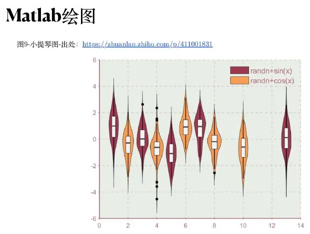
| How do groups differ? | dot plot, grouped bars, or box/violin plot |
| What is the distribution? | histogram, ECDF, density, or box plot |
| How are two variables related? | scatter plot with fit and residual view |
| What is the spatial pattern? | map with a justified projection and scale |
| Where is the optimum? | contour/surface plot with feasible region |
| How does an algorithm work? | compact process diagram |
Pie charts are acceptable for a few clearly separated proportions, but become difficult to compare when slices are similar. Radar charts can communicate profiles, but should not be used to claim precise quantitative differences.
Choosing a chart is choosing what the eye can compare
Let us give the table above a test. A café records the number of orders in each of four hours:
Now ask “Are orders more variable on Friday than Monday?” One line per day might become a spaghetti plot if you have many weeks. A pair of box plots or empirical cumulative distribution curves can show spread across comparable hours, while small multiples can show the hourly pattern without tangling every week into one panel. We must decide whether “variable” means range, interquartile spread, daily peak, or likelihood of exceeding staff capacity. That definition precedes the chart.
Suppose the café sells three products with shares of
Radar charts are particularly tempting in an evaluation model because they look like an exciting “profile.” Imagine comparing cities on cost, transit, air quality, safety, and housing. You must first make the direction and scale of each indicator comparable; lower rent and higher transit access are not automatically plotted so “farther out” always means better. Even after normalization, polygon area changes with the order of axes. Swap the order of indicators and the visual impression can change while the numbers do not. Use a radar chart to show a broad profile, not to claim a precise total ranking that the chart geometry itself has not justified.
Heatmaps encode quantity in color, which is useful when a table has many rows and columns. But color is less precise than aligned position. If a manager must distinguish a cost of
Maps carry an extra trap: physical area is visually salient even when the data are counts. Coloring a large, sparsely populated district deep red because it had ten incidents can make it dominate a small dense district with fifty. If the question is incident rate, divide by the relevant population or exposure and label the unit. If it is incident count, say count. The same records can produce two maps with different claims. Neither becomes correct merely because the colors are attractive.
Before you make a graphic, ask someone to finish this sentence: “I should be able to look at this figure and tell whether ___.” If they fill the blank with “Policy B improves high-volume intersections,” the paired-difference-versus-volume view has a job. If they say “the diagram looks professional,” they have described style, not evidence. The figure’s reading task should be concrete enough that you can test whether the finished picture accomplishes it.
Design from a claim
Write the sentence the figure must support before drawing it. Then encode the relevant quantity in position whenever possible; position along a common scale is easier to compare than area, angle, or color.
A complete scientific figure normally needs:
- an informative caption stating the conclusion;
- axis labels and units;
- a readable legend or direct labels;
- sufficient contrast in color and grayscale;
- consistent scales when panels are compared;
- visible sample size or uncertainty where relevant.
Matplotlib treats each Axes as the main plotting region and provides titles, labels, legends, scales, ticks, and annotations; this object-oriented structure is useful for building consistent multi-panel figures (official Axes guide ).
Three plots from one table, three different conclusions
Let us return to the five-road table. First draw a pair of bars: average delay under A is
Second draw the road-by-road paired differences. You now see four improvements and one worsening. That answers whether the improvement is uniform. It does not yet show whether the worsened road has high traffic or whether the size of its worsening matters to a citywide objective. Add volume as a separate panel or encode it carefully, perhaps by sorting the road labels by volume. Resist the temptation to put delay, volume, incident count, and confidence interval all into the same tiny five-point plot. Several aligned panels with clear jobs are easier to teach from than one overloaded legend.
Third draw the distribution of individual waits for one high-volume road under both policies. You may discover that the B curve is slightly better for the middle of the distribution but worse near the longest waits. That view answers a reliability question. It cannot be read as proof that the city’s overall average changed in the same direction. Every graphic supports a particular claim; a good figure does not have to answer every question, but the article around it must not make a larger claim than the axes support.
We can now choose an order for the report. Show the paired-difference plot first because it supports the main comparative result. Put the delay distribution after it because it challenges a possible hidden cost. A simple pair of means may remain in a compact table, especially if the paired plot already displays the average mark. A report with limited space does not become stronger by displaying every intermediate calculation in three visual formats.
Captions are part of the evidence. “Policy B versus A” is a title, not a caption. “Mean delay change for the same five illustrative intersections; negative values favor B; one road worsened; the displayed values are examples, not measured city results” tells a reader what is compared and how to read the sign. In a real report, replace “illustrative” with the data source, measurement period, and sample definition. If the figure uses simulated values, say so. A picture’s aesthetics cannot supply information about its origin.
Ask a classmate to interpret the plot while you cover the surrounding paragraph. If they say “blue is better,” ask what the blue represents, which direction is better, and how much it changed in the correct units. If the answer is uncertain, the plot probably needs stronger direct labels, a zero line, or a less ambiguous scale. That quick user test is often more revealing than another hour of polishing shadows and fonts.
Show uncertainty and baselines
A smooth line without uncertainty can be misleading. Depending on the model, add confidence intervals, prediction intervals, bootstrap bands, or scenario envelopes. Distinguish observed points from fitted and forecast values.
Every performance plot needs a reference: a no-change forecast, a simple heuristic, an unoptimized plan, or a known physical limit. Improvement has no meaning without a baseline.
An error bar is an answer to a particular question
People often add an error bar because a paper “should have error bars.” I want you to ask which uncertainty you mean. Suppose we measure delay at the same road on many mornings under policy B. The delays vary because traffic, weather, and chance vary. A plot of those individual delays describes variation among mornings. An interval around their average describes how uncertain we are about the average delay under the sampling procedure. An interval for a future morning is usually wider because a new day’s variability remains even if we know today’s average very precisely. Those are different questions, and they should not be drawn or captioned as if they were interchangeable.
Think of a simpler example: five waiting times of
How do we show variability when the data come from forty intersections measured on several days? Decide what the independent sampling units are. Measurements from the same intersection share geometry, traffic patterns, and signal behavior. If we bootstrap by drawing individual rows at random, copies of the same road can leak into many pseudo-samples, making the mean look more certain than it is. A road-level bootstrap draws intersections, carrying their relevant measurements together. A day-level bootstrap might be more suitable for a question about day-to-day variability. The resampling unit follows the decision and data structure, not the convenience of one line of code.
For the paired A–B comparison, calculate a difference for each matched road and time period first. Then estimate the average or median of those differences. If you bootstrap the two policies independently, the road pairing disappears and you no longer estimate the same quantity. We can see this even without a library: road three’s
There is another distinction: variation from randomness in a simulation versus uncertainty in the input parameters. Run one policy simulation thirty times with different random seeds, and you can see how much its output varies under a fixed model. But if the arrival-rate estimate is wrong by 20%, the entire simulation distribution may shift. A band across seeds does not automatically cover uncertainty about traffic demand. To show both, vary measured or plausible demand parameters and run repeated simulations inside each scenario. Label the plotted band honestly: “90% range across simulated seeds under nominal demand” is more informative than an unlabeled blue halo.
When do we use a baseline? Suppose a new algorithm reduces mean delay to 34 seconds. That sounds good only after we know the current policy’s delay, the cost of the change, and the conditions under which the comparison was made. A horizontal line for the current policy or a paired-difference zero line anchors the claim. In forecasting, the baseline might be “tomorrow equals today” or “this Tuesday equals last Tuesday.” In an optimization report, it might be the current schedule. If the sophisticated method barely beats that simple rule and has much more uncertainty, the figure should let the reader see the small gain rather than hiding the baseline in a paragraph.
Take one minute to label three hypothetical shaded regions. “Central 90% of individual observed waits” describes experience. “95% confidence interval for the mean policy difference across sampled roads” describes uncertainty in an estimated average. “Prediction interval for tomorrow’s maximum wait” describes a future outcome. Each needs a different calculation and an honest caption. If you cannot state which question an interval answers, do not put it on the plot yet; go back to the decision question and the sampling plan.
One last beginner check: more observations do not rescue systematic bias. If all forty roads are quiet suburban junctions, a narrow interval around their average tells you little about a congested downtown junction. That is a scope problem, not a sampling-size problem. Put the population and operating range in the caption. An error bar can say how uncertain you are within that scope; it cannot silently extend the scope to every road in the city.
Color is a variable
Use color deliberately:
- sequential palettes for ordered magnitude;
- diverging palettes around a meaningful center such as zero;
- categorical palettes for unordered groups;
- a single accent to direct attention.
Never use a rainbow palette for ordered measurements. Check that the plot still works for color-vision deficiencies and in grayscale. Keep text dark on light surfaces or light on dark surfaces; thin gray labels over a colored image are not readable evidence.
Build a visual hierarchy
A modeling report usually needs only a small set of strong figures:
- a data-quality or exploratory view;
- a model diagram;
- a main result comparison;
- a validation or sensitivity view;
- an optional decision-oriented summary.
Supporting plots belong in an appendix. Repeating the same result in a table, bar chart, and paragraph wastes space.
Figure audit
For each graphic, ask:
- What single claim does it support?
- Can the reader identify units and population?
- Are observed, fitted, and forecast values visually distinct?
- Does truncating an axis exaggerate a difference?
- Is uncertainty visible?
- Would the conclusion survive grayscale printing?
Use vector output (.pdf or .svg) for diagrams and line art when possible; use high-resolution raster output for images and dense heatmaps. Matplotlib supports both interactive and hardcopy backends, including PDF and SVG (official backend guide ).
Let us turn the audit into a real pre-publication rehearsal. Export your figure at the width it will occupy in the report or blog. Do not judge it only inside a large plotting window. Open the exported file and ask a teammate to read its smallest tick label without zooming. If they cannot, increase the type size or reduce clutter. A 300-dpi image with four-point labels is technically high resolution and still practically unreadable.
Next print or preview in grayscale. If policy A and B were distinguished only by blue and purple, they may collapse into one tone. Add direct labels, different marker shapes, or solid versus dashed lines. A sequential map should still indicate which end is high and which is low; a diverging map should identify its meaningful midpoint. Accessibility is not a separate decorative concern: if a viewer cannot tell which curve is which, the comparison itself is lost.
Then inspect the population and units. A road-level policy plot should say whether it covers five illustrative roads, forty sampled intersections, or the full city network. Its axis should say seconds, not merely “delay.” A map of pollutant concentration should say milligrams per litre, not “intensity.” If percentages are used, state the denominator. “10% lower risk” is ambiguous if you never define whether it is a relative reduction or ten percentage points.
Ask whether the axis choice changes the impression. Make a copy of a mean-delay plot with a truncated vertical axis and one with an honest wider scale. If the difference is small but the first makes it look huge, choose the view that communicates the decision-relevant magnitude and label any truncation. For a signed paired difference, a zero reference line is usually more direct than two bars with an awkward starting point. The comparison grammar should not reward visual drama over numerical meaning.
Finally trace the most surprising mark back to data. If road three worsened under B, find its rows in the saved tidy table, check that policies were merged on the correct road and date, and confirm unit conversions. If one map cell appears bright red, check its supporting stations and interpolation. If a neural-network heatmap claims strong attention to a word, check which tensor position that pixel denotes. A pre-publication audit is strongest when it can travel backward from figure to observation, not only forward from script to exported file.
For a blog, test on a phone as well as a desktop. A multi-panel plot that works across an entire laptop screen may be illegible at mobile width. You may use two stacked panels or a more compact direct-label layout rather than shrinking a dense landscape figure. Write meaningful alternative text for the image: “Paired delay differences for five roads; four improve under B and one worsens” teaches more than “chart.” The caption should remain visible and useful even if the reader cannot study every tiny point.
Put the audit results in a short note beside your source file: final physical size, data version, units, resampling unit for intervals, grayscale check, and the sentence the figure is intended to support. That note lets a teammate update the picture without guessing why you chose its scale. If the plotted claim changes, revise the caption and the paragraph together. A trustworthy figure is part of the written argument, not a detachable decoration.
The design rules may feel subjective until we make a plot from actual numbers. We will begin with a small table, decide what claim is worth showing, and rebuild the figure so its axes, uncertainty, and caption support that claim.
Turn a table into a visual argument
Assume a city tests three traffic-control policies at 40 intersections. The raw table contains intersection, date, policy, traffic volume, mean delay, 95th-percentile delay, and incident count. A beginner often creates one large bar chart of all observations. That picture contains data but answers no precise question.
Begin with five roads, not forty bars
Let me shrink the experiment so that we can reason without a plotting library. Imagine five intersections. The current policy A gives mean delays of
Why pair by road? A busy junction can naturally have a longer delay than a quiet one. If we draw all A values on one side and all B values on the other without showing which values belong to the same junction, variation between roads can drown out the policy change. If we compare the same road under both policies, the road’s basic difficulty is partly controlled. Our five differences add to
What figure would let a classmate see the entire answer quickly? Put road number on the vertical axis and paired difference in seconds on the horizontal axis. Draw a clear line at zero. Points left of zero improved; points right worsened. The reader can now see the one road that did not follow the group, the spread of improvement, and the average if we add a separate summary mark. A bar chart of forty averages would be harder to scan and could not naturally show the sign of each road’s change.
Pause before adding an error bar. What does each value mean? If each road was measured on just one day under A and one day under B, the difference also contains weather, traffic, and random incident effects. A thin 95% confidence interval around the five-road average would not erase that problem. We would ideally measure repeated comparable periods, perhaps alternating policies or matching days with similar volume and conditions. The design of the comparison determines what the error bar can legitimately summarize. Good visual styling cannot compensate for an unfair experiment.
Suppose the five roads had different traffic volumes. A reader may reasonably ask whether B only helps on quiet roads. Add volume beside each difference, or make a scatter plot with volume on the horizontal axis and the paired delay difference on the vertical axis. Keep zero visible. If the high-volume roads sit near or above zero, a citywide “B is better” recommendation may be too broad. If the differences remain negative across the volume range, that supports—but does not prove—a more general effect. The plot should make a real challenge to the claim possible.
Now ask a different question: might B reduce the average delay while making the worst waits longer? You cannot answer from the five means. For each road, inspect the 95th-percentile delay or the entire waiting-time distribution. Imagine that road one improves on average from 40 to 35 seconds but its 95th-percentile wait rises from 70 to 85 seconds. A busy commuter would notice that tail risk even though the mean looks better. Show a second paired plot for upper-tail delay, or an ECDF for one representative intersection. Do not reuse the mean-delay plot and call it a safety analysis; the axes would not contain the needed information.
The incident count is yet another outcome. If B increases collision risk, mean-delay improvement alone cannot justify the policy. But incidents may be rare: five roads over a few days will not support a precise safety conclusion. Rather than coloring one bar red and saying “unsafe,” explain the short exposure period and seek enough data or a carefully stated proxy. This is a good example of a figure revealing the limit of evidence rather than merely announcing a winner.
One practical rule for beginners follows from all this: write the specific decision question above your plotting notebook. For example, “Should we replace A with B at these forty roads without making high-volume or worst-case delays worse?” Every axis and panel should earn its space by answering part of that sentence. If a plot cannot tell you anything about that decision, save it for exploratory analysis or the appendix rather than treating it as main evidence.
There is one experimental-design catch that no figure can solve by itself. Suppose the city chose B only for roads that had unusually bad traffic last month. Their delays might fall this month even if B did nothing, because an extreme month often moves closer to ordinary conditions. Alternatively, if B was installed only during summer school holidays, lower traffic could create an apparent benefit. Pairing by road helps with fixed road differences, but it does not automatically control changing traffic or policy-selection rules. Put comparable dates and volumes in the table, show pre-policy trends where available, and say clearly what the study design can or cannot attribute to B. A graph can expose these patterns; it cannot transform an unfair comparison into a randomized trial.
Imagine a reviewer asking, “If policy B had not been installed, what would have happened on those same roads?” We cannot observe both versions of the same road at the same moment. We can build a comparison from alternating periods, matched roads, historical baselines, or a declared simulation, each with limitations. The caption should not say “B caused a reduction” if the data only show “B periods had lower observed delays” under potentially different conditions. The difference is a lesson in scientific honesty, not in timid wording. The strongest picture is one that makes the comparison design visible enough for a reader to challenge.
Start with three claims
Write the claims before writing plotting code:
- Policy B reduces typical delay relative to the current policy.
- The reduction is not created only by low-volume intersections.
- Policy B does not improve the mean by creating a dangerous upper tail.
The first claim suggests paired differences or a distribution plot. The second suggests delay against volume, with policy encoded consistently. The third requires quantiles, an empirical cumulative distribution, or a box/violin plot—not another mean bar.
Encode variables deliberately
Position is the most accurate visual channel for quantitative comparison, followed by length. Area, volume, and color intensity are harder to compare. Therefore use an aligned dot plot for policy means rather than circles whose areas encode delay. Use color for policy, marker shape for observed versus simulated values, and line style for forecast versus history. Do not assign three visual channels to the same variable unless accessibility requires redundancy.
When observations are paired by intersection, show that pairing. Plot
Build uncertainty into the figure
An interval must be identified. A standard-error bar, confidence interval for a mean, prediction interval for a future observation, and interquartile range answer different questions. For repeated simulations, show median and central 90% simulation range. For sampled intersections, a bootstrap confidence interval can communicate uncertainty in the population mean. State the resampling unit: resampling individual rows is wrong when many rows come from the same intersection.
Make the caption carry reasoning
A useful caption can stand alone:
Figure 2. Paired change in mean delay for 40 intersections under Policy B relative to the current policy. Negative values indicate improvement. Points show held-out observations; horizontal lines show 95% bootstrap confidence intervals obtained by resampling intersections. Improvements persist across traffic-volume quartiles, although three high-volume intersections show no reliable change.
This caption defines the population, comparison, direction, uncertainty, and exception. “Results of Policy B” does none of those things.
Reproduce the figure safely
Keep data transformation separate from styling. First produce a tidy table with one row per plotted mark; save it; then plot it. Set physical figure dimensions, font sizes, and export format explicitly. Open the exported file rather than trusting the notebook preview. Check it at the size used in the paper, in grayscale, and on a projector or phone if the blog is a target.
Practice
Take one figure from an earlier report. Write its intended claim in one sentence, list every encoded variable, identify the uncertainty shown, and rewrite the caption. Then remove any legend entry, color, gridline, annotation, or decimal place that does not help the claim. The goal is not minimalism for its own sake; it is maximum evidence per unit of attention.
Course gallery: data plots that carry evidence
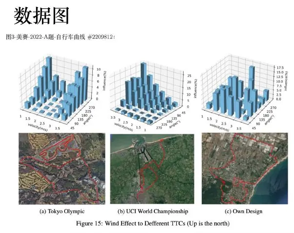
The slides begin with real competition figures rather than generic chart names. Read each example by asking what quantity is encoded, what comparison becomes easy, and what conclusion would be hidden in a table.
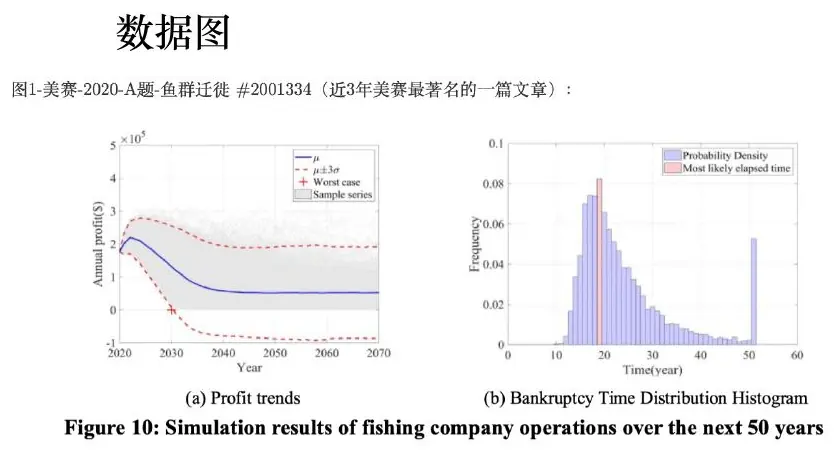
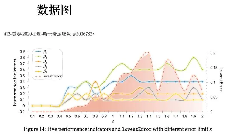
The first example distinguishes expected outcome from the probability of failure. A modeler should therefore report
Let us slow down at the profit-and-bankruptcy picture. Imagine two fishing plans for a small company. Plan A earns about
Suppose a simple scenario model gives A a 20% chance of losing
How should we draw the two plans? If we have simulated many seasons, put their profit distributions on one shared dollar axis. Mark zero prominently because it distinguishes profit from loss. Show the region below zero with a light hatch or label, and display both the mean and
Now read the gallery figure with those questions in mind. Where is zero? Do the shaded bands represent simulated outcomes, a confidence interval for the mean, or some other quantity? Can you compare the lower tails on one scale? If the graphic does not tell you what an interval represents, you cannot treat its smooth shaded region as a probability statement. A caption should say whether the distribution came from historical seasons, a calibrated stochastic model, or illustrative assumptions. That source determines how much trust the company can place in the recommendation.
The third gallery example uses three-dimensional bars. I would ask you to cover the caption and compare two bars at different depths. Does perspective make the farther bar look shorter even when its numeric height is the same? If so, flatten the scene into aligned bars or a dot plot. Three dimensions are valuable when two input coordinates and one response truly form a landscape—such as location
Framework figures: disclose the model’s logic
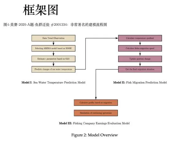
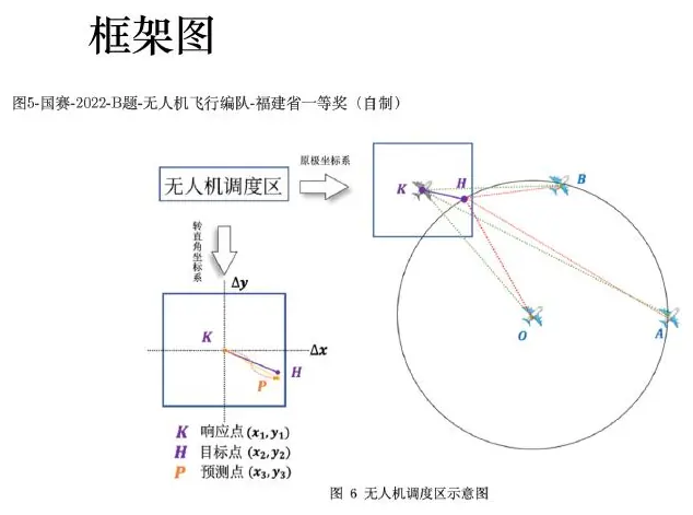
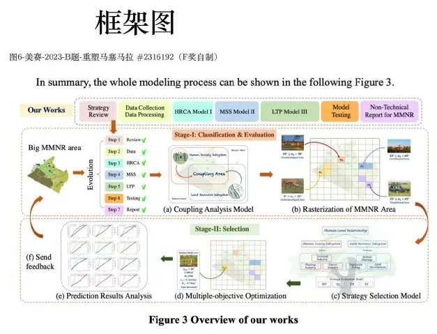
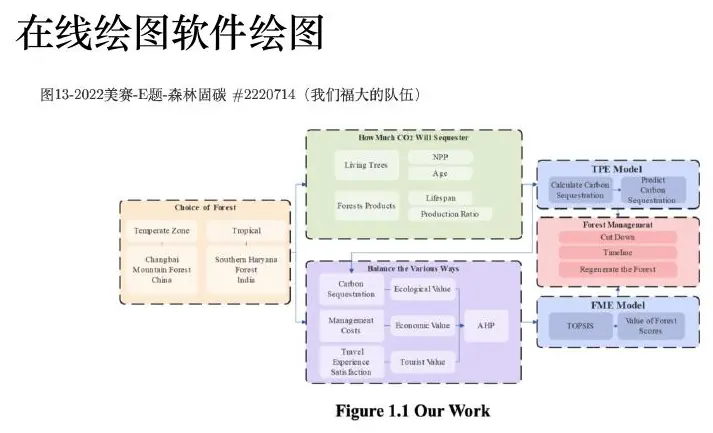
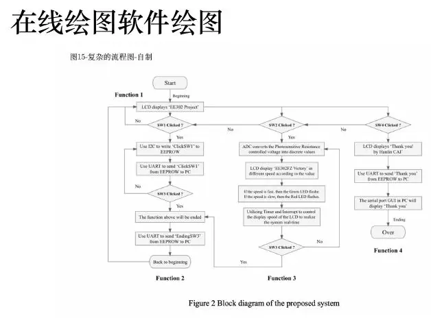
A framework figure should be isomorphic to the paper: every important box should have a matching subsection, and every arrow should correspond to data, a parameter, or a logical dependency. Crossing arrows and unlabeled feedback loops usually signal an unresolved model.
Here is a small diagram we could make from the restaurant basin in lesson one. On the left, draw boxes for measured water mass, initial water temperature, plate types and starting temperatures, and minimum acceptable temperature. Their arrows enter an energy-balance update box. An arrow labeled “predicted temperature after plate
Contrast that with a polished diagram reading “Data
The shuttle example suggests a different diagram. Draw a timeline of a student’s trip: arrival at stop, wait, board, ride, walk to classroom. Put the 9:00 deadline on the same clock axis. The timeline immediately shows why “bus reaches the last stop by 9:00” is not the same as “student reaches class by 9:00.” If you compress the timeline into one box called “travel time,” a reader may not notice that walking time was omitted. Sometimes the simplest useful framework figure is a sequence of physical events rather than an elaborate architecture chart.
Robot localization needs a more technical flow. A camera and motion sensor each provide readings with their own timestamps. Separate arrows should enter clock alignment, then coordinate alignment, then state estimation. A held-out trajectory or residual check should connect to the relevant stages, not merely sit in a disconnected “Validation” box at the far right. If a calibration parameter learned from the held-out trajectory flows back into the estimation stage, the diagram should expose that feedback. Otherwise the evaluation might look independent when it is not.
The three diagrams serve different audiences and questions. The basin diagram answers, “What quantity is updated after each plate?” The shuttle timeline answers, “Where does the on-time target occur?” The robot pipeline answers, “Which output of one module becomes the input of another, and where do we validate it?” Choose a figure type for the uncertainty you want to remove from the reader’s mind. A mind map is good for brainstorming relationships, but an algorithm flowchart is better when order and transformation matter. A geometry sketch is useful when locations, angles, or distances determine equations. A decision tree is useful only if the branches are actual alternative choices or cases.
Before exporting a framework figure, point to every arrow and speak a sentence: “This arrow carries the plate temperature in degrees Celsius,” or “This arrow carries cleaned sensor coordinates in metres.” If you cannot name the content and unit, either the arrow is decoration or a key interface has not been specified. Then point to each box and find the matching paragraph or equation in the report. If a box has no matching explanation, the diagram promises work the paper never delivers. If a major equation has no visible place in the diagram, decide whether it is an implementation detail or whether the framework is missing a stage.
Use shape and color sparingly. Rectangles can stand for operations, rounded boxes for outputs, diamonds for yes/no checks; but a legend must make that grammar clear. A single accent color can guide the eye to the final decision, while other colors distinguish data sources or modeling stages. Do not make every box a different bright color simply because the slide software allows it. When printed without color, the arrow labels and box names should still carry the logic.
Four production ecosystems
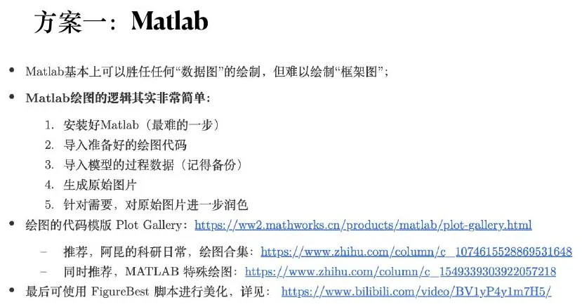
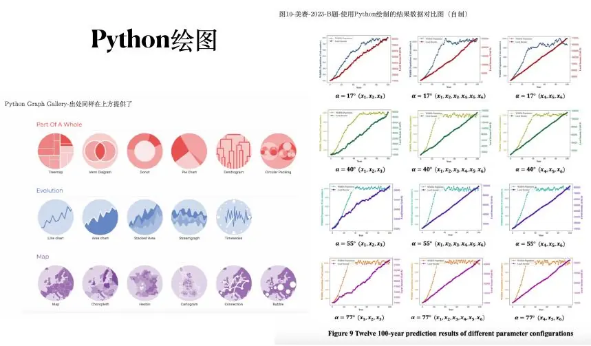
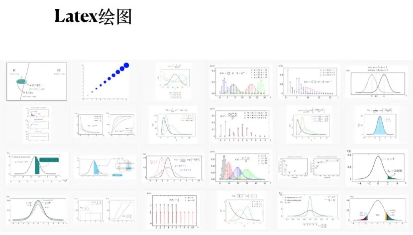
The course shows Matlab, Python, LaTeX, and browser/diagram tools because different graphics require different primitives.
If you have never made a publication figure, begin with the table, not with a design template. For the five-road example, write one row per road with the A delay, B delay, volume, and paired difference. Check that
Now choose the main view. In Matlab or Python, both capable of scientific plotting, make a simple horizontal scatter plot of the five differences with a vertical zero line. Tell the program the physical figure size in inches or centimetres, not only the number of pixels on your laptop. Name the horizontal axis “Policy B minus Policy A mean delay (seconds).” Label the roads or provide a clear ordering. Do not annotate every point with five decimal places: our invented measurements were whole seconds, and unnecessary precision would pretend that the data are finer than they are.
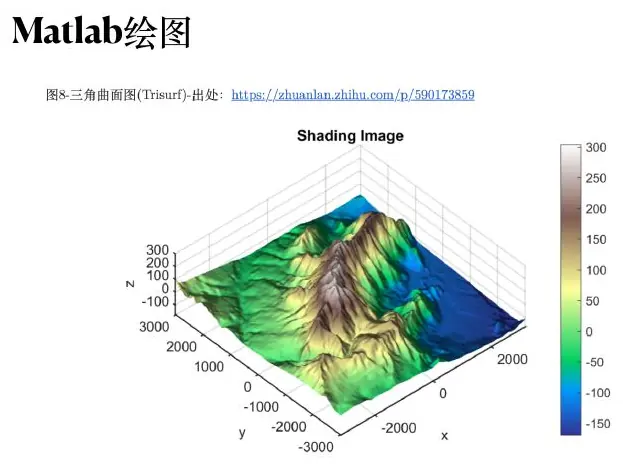
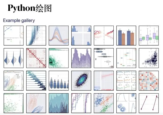
What does Matlab contribute? Its plot gallery can help you discover that a violin plot, contour map, or small multiple exists. It can also create a quick interactive view of a surface. But the gallery is like a shelf of possible tools; it cannot decide whether a 3-D surface is appropriate for a set of unordered road categories. Start with the claim, then use the gallery to find an implementation. Check every sample script for assumed data shape and units before adapting it.
What does Python contribute? A reproducible path from raw file to cleaned table to figure. You could read the road measurements, merge policies on road and comparable date, calculate differences, and render the same figure again when a corrected row arrives. That reproducibility matters more than the choice between Matplotlib and another plotting library. Separate transformations from styling: a function that calculates paired differences should be testable without knowing which color the points will be.
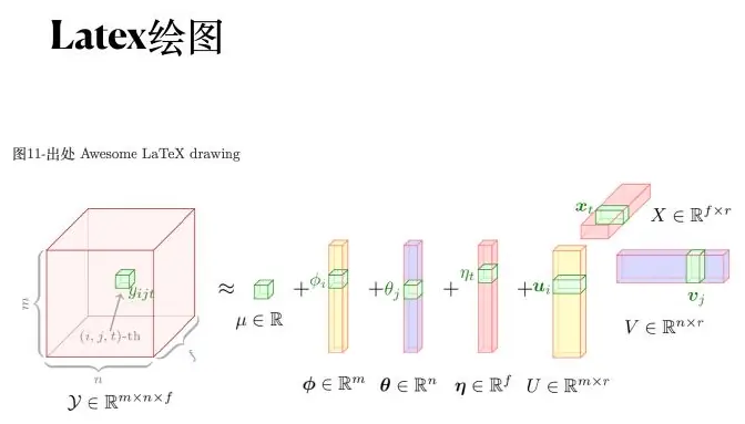
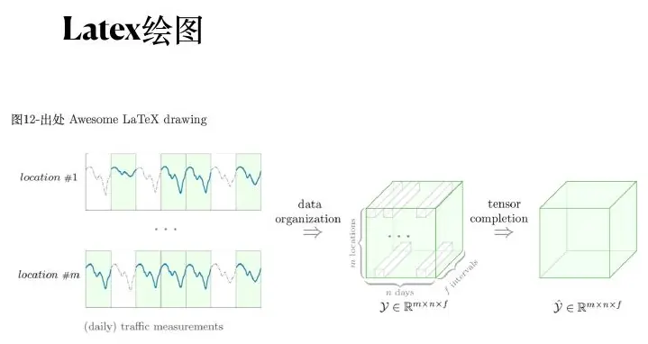
What does LaTeX contribute? When the final report has many equations and references, a LaTeX-native vector plot or an externally created PDF/SVG figure can preserve consistent mathematical fonts and crisp lines. That is especially useful for framework diagrams, geometry sketches, or line art. A raster heatmap is often fine, provided its resolution remains legible at the actual printed size. Exporting everything as a giant PNG is not a substitute for checking how it looks in the report.
What about browser diagram tools or PowerPoint? They are practical for collaborative flowcharts, aligned boxes, spatial sketches, and annotations on an image. Use a grid or alignment tools so repeated modules have consistent spacing. Group related objects so one revision does not leave an arrow pointing nowhere. Before you call the figure complete, export a file, reopen it, and zoom to the size at which a reader will see it. If the tiny labels are unreadable, increase text size or simplify the diagram; a high-resolution export alone will not make a dense design clear.
The choice of ecosystem can depend on the figure’s job. A numerical plot whose data will change tomorrow belongs in a script. A carefully edited model diagram with stable modules may be quicker in a browser or slide tool. A geometry illustration with exact mathematical notation may be easier in LaTeX. Whatever you choose, keep the source file and record the data version. If a result changes, the visual should be revisable without hand-moving dozens of marks.
Here is a useful classroom test. Make the same five-road comparison twice: once as paired dots, once as two unpaired bars showing only average delays. Give both pictures to a classmate and ask, “Which road did worse under B?” They can answer from the paired dots and cannot answer from the averages. That difference—not the elegance of a plotting package—is why we chose the first picture for the main claim.

Excellent-paper case studies
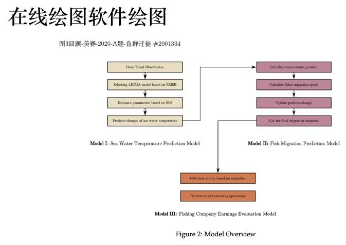
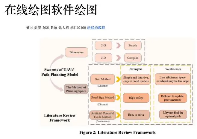
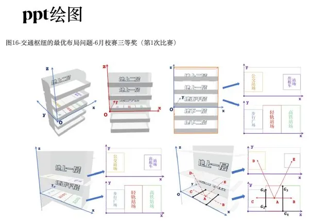
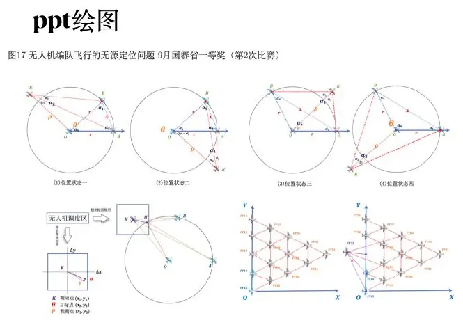
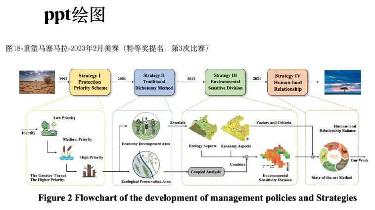
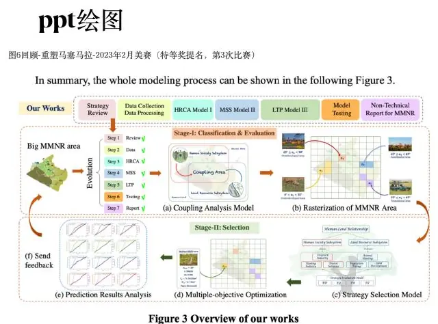
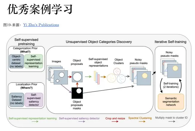
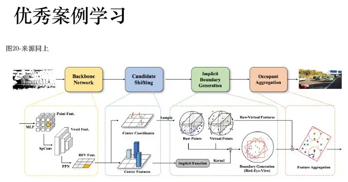
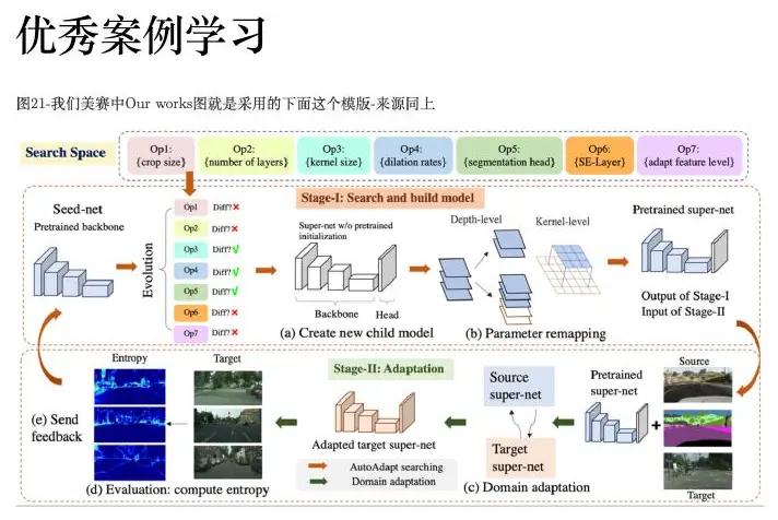
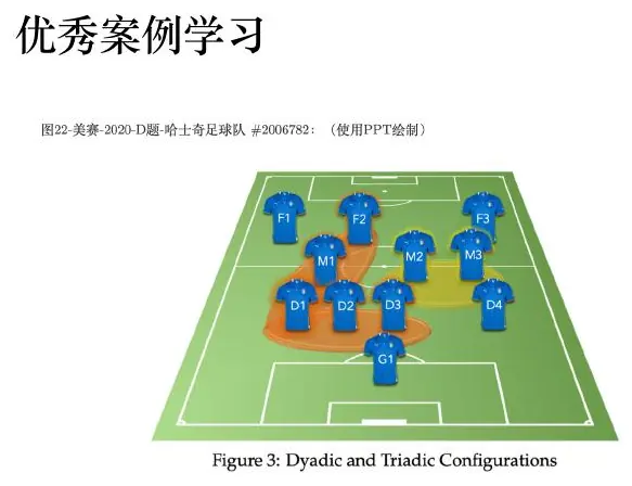
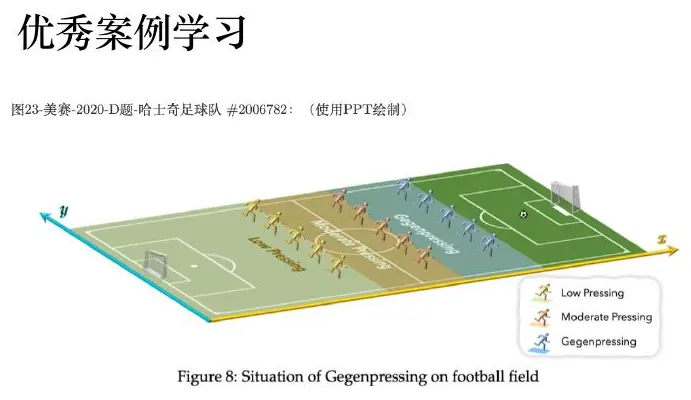
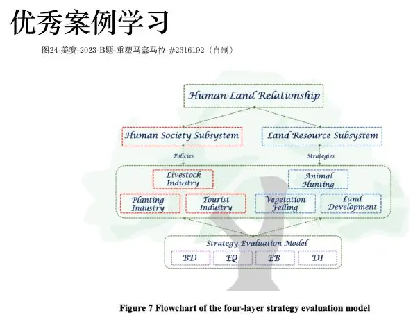
These figures demonstrate recurring strategies: an end-to-end pipeline, a domain process, a spatial mechanism, a human-system map, and a compact representation of repeated experiments.
Do not race through the “excellent-paper” images as a slideshow. Pick one and ask what an author had to know before drawing it. In an agricultural process diagram, for example, each stage should correspond to a real action or state: planting, growth, harvest, storage, transport. Which stage changes the quantity the paper predicts? If a yield model predicts harvest mass but the figure places storage loss before harvest, the temporal order is wrong. A well-designed domain process diagram can catch such a mistake before it appears in an equation.
Take a management-policy flowchart next. Its last box may be “recommended action,” but a recommendation needs an input showing the estimated state of the system and a branch showing the decision rule. Suppose a river manager closes a fishing area whenever predicted contamination exceeds a safety threshold. The figure should show observed water samples, a predictive model, the threshold comparison, and the action. If the threshold is left out, the diagram cannot tell a reader why two similar predictions lead to different policies. A flowchart is strongest when the branch describes an actual rule, not merely when boxes line up neatly.
The social-system framework raises a harder issue. Imagine a proposed policy reduces traffic congestion, which makes driving more attractive, which can increase traffic again. An arrow back from “congestion” to “driver choice” represents behavioral feedback. If the mathematical model treats demand as fixed, the figure is promising a mechanism the equations do not contain. We could either extend the model to include demand response, or label the feedback as a limitation or future pathway rather than drawing it as if it were modeled. The picture and paper must agree about what is represented.
For an integrated machine-learning framework, follow one input all the way through. A raw rainfall record may be cleaned, assembled into a temporal tensor, passed to a trained predictor, converted into a flood-risk map, then used in a location decision. At each arrow ask: Is this observed or predicted? What units or coordinate system does it have? Is it available at decision time? Where is the model trained, and where is it tested? These questions make a busy architecture diagram readable. They also stop a team from slipping test data into a training arrow simply because the boxes looked symmetric.
The geography field schematic illustrates when perspective is useful. If a model depends on the shape of a valley, elevation, or a viewing angle, a 3-D scene can show a physical relation that a flat bar chart cannot. Mark axes, angle, and scale so perspective explains geometry rather than making a high mountain appear important only because it is closer to the viewer. If the intended claim is numerical—“location A is 3.2 metres higher than B”—also give an aligned profile or a table for exact comparison.
You can turn this gallery into a thirty-minute exercise. Assign one figure to each teammate. Each person states its intended claim in one sentence, identifies every data source, and traces one arrow or visual comparison into the body of the paper. Then switch figures and let a second teammate find an unsupported promise: a box with no method, a colored region with no scale, a feedback loop with no equation, or a comparison without matched conditions. Revise the caption or diagram so the promise and evidence align. This is how we learn from strong examples without blindly copying their visual style.
I will repeat one distinction because it matters: “this figure is from an excellent paper” is not evidence that every design choice in it fits your question. Treat examples as demonstrations of possible visual grammar. The useful question is which relationship becomes easier to understand after the figure is placed beside its explanation. If you cannot name that relationship, the image does not belong in your main argument no matter how sophisticated it looks.
Machine-learning image vocabulary
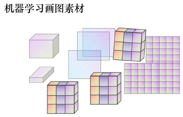
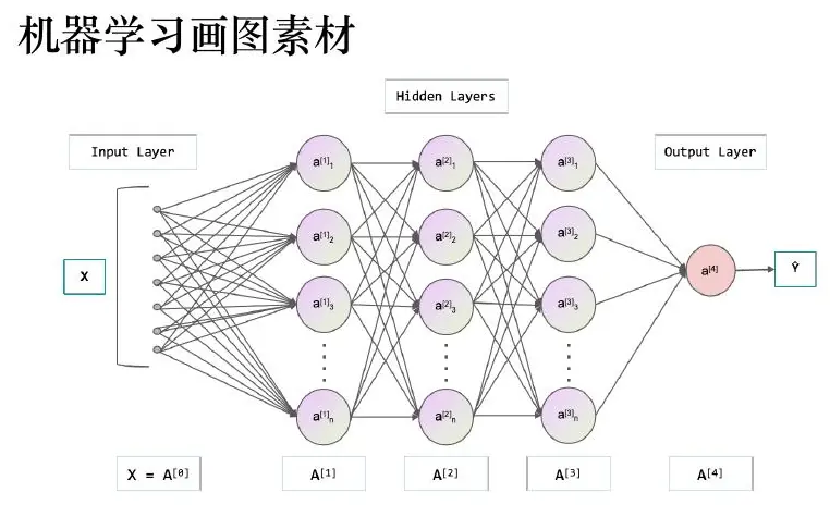
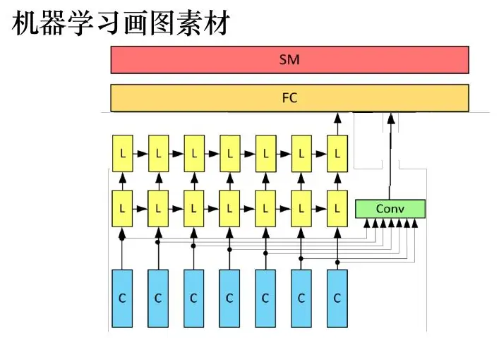
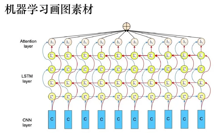
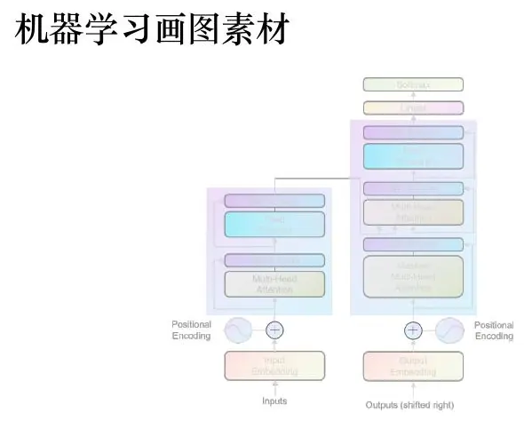
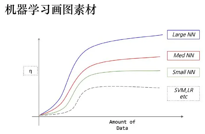
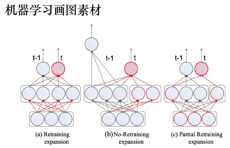
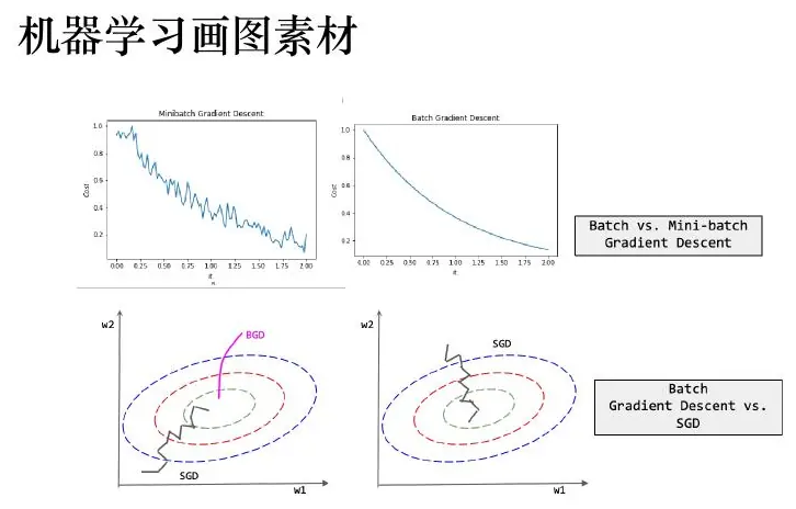
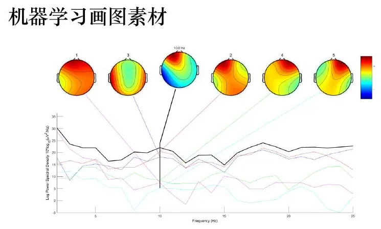
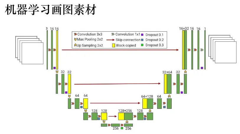
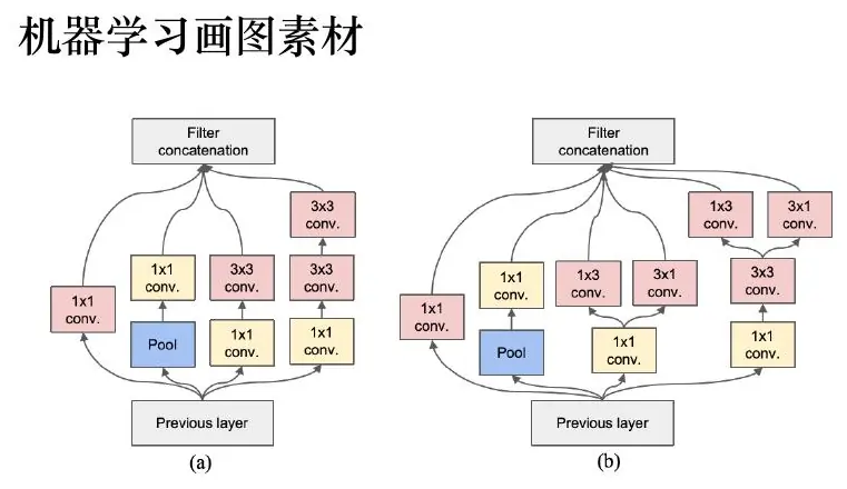
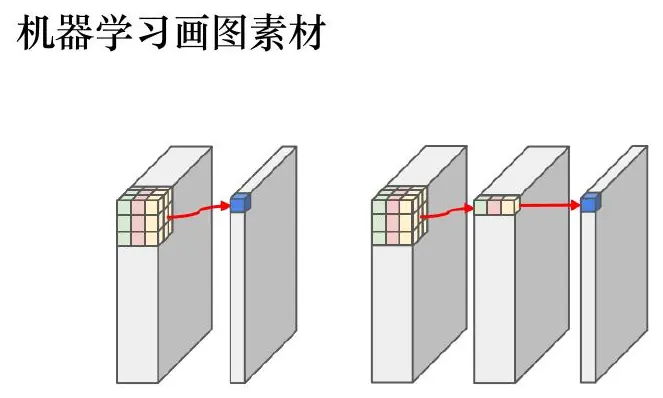
Machine-learning figures should distinguish tensors, operations, trainable modules, and temporal direction. Compare all examples below: their value lies in exposing structure rather than in using the same color palette.
Let me give you a picture-reading exercise before the gallery. A teammate says, “Our neural network has three layers and predicts flood risk.” They show three rows of colored rectangles with arrows. What do you still not know? You need to know what enters the model (rainfall history, terrain, sensor readings), what each rectangle stands for (a feature vector, tensor, operation, or learned layer), which parameters are fitted, and what comes out (probability of flooding in what area and over what time horizon). If those details are absent, the picture is a mood board, not a model description.
Suppose the input is a grid of
An architecture diagram can also mislead if it mixes training and inference. During training, observed next-hour flooding is available to compute a loss and update weights. At prediction time, the observed future flooding is not available. If the diagram has a feedback arrow from the true future map into the model and never explains that it exists only during training, a reader might assume the prediction uses information from the future. Draw separate paths or label the training-only arrow. This is a visual version of checking for data leakage.
Look at a learning curve next. The horizontal axis might be number of training examples; the vertical axis might be held-out error. If both training and held-out errors are high and similar, the model may be underfitting. If training error is low but held-out error much higher, it may be overfitting. If the held-out curve is still falling at the largest data size, more examples might help. A caption should state which split generated each curve and whether any preprocessing was fitted only on training data. Without that information, smooth lines cannot diagnose what limited performance.
Spatial heatmaps need one shared color scale when comparing methods or times. Imagine two risk maps: map A ranges from
Attention diagrams are fashionable, but a bright matrix is not automatically an explanation of why the model predicted something. Ask what rows and columns correspond to, how attention was normalized, and whether a bright entry changes when inputs are perturbed. Use the diagram to expose information flow, not to overclaim causality. A tree layout similarly needs meaningful branches and thresholds; otherwise it is only a decorative hierarchy.
For each gallery image, play a small game: cover its title and identify the input object, transformation, output object, and direction of time. If you cannot, ask which labels or visual grammar are missing. Then imagine shrinking the figure to the width of a paper column or a phone screen. A useful architecture must remain legible there, even if that means hiding a few low-level operations and placing their details in the text.

Biological and spatial image vocabulary
Biological figures should preserve material balance and compartment boundaries. Maps require projection, legend, scale, and source. I keep all course examples here as a reference library, but a competition paper should select only those that advance its argument.
Imagine you are drawing how a pollutant moves through a river and into fish. Your first diagram might have arrows from “water” to “fish” and from “fish” to “people.” What would a student need to know to understand the mechanism? Which substance is moving, at what stage, and whether each arrow represents a measured transfer, a modeled transfer, or a possible exposure. A diagram with attractive river and fish icons is not wrong, but the arrows and compartments carry the scientific claim.
Biochemical pathway illustrations follow the same logic. A pathway may show molecules, reactions, and compartments inside a cell. The viewer needs a consistent direction: if arrows indicate material flow, state what is consumed and produced; if a dotted arrow indicates regulation rather than transfer, identify the different meaning. When you see a cycle, ask whether the final product returns to the start or whether the image merely bends an arrow around to save space. A cycle in the artwork should match a cycle in the mechanism or model.
Suppose a simple compartment model has contaminant mass
Now consider a map of estimated river contamination. A map answers a where question, not automatically a why question. Show the location of monitoring stations so the reader can see where data support the colored field. Mark the river’s actual geometry, choose a map projection appropriate to the geographic extent, give a scale, and label the color bar in concentration units such as milligrams per litre. If upstream sampling is dense but downstream sampling is sparse, a perfectly smooth downstream color may be misleading. Hatch unsupported regions or display an uncertainty layer.
If we instead map a relative index, the legend should say that it is an index, not a concentration. Changing from an absolute physical unit to an index can make a figure easier to color but harder to interpret. Ask who will make a decision from the map: a field team locating a new sensor may care about uncertainty and sample gaps; a manager choosing a cleanup site may care about threshold exceedance; a researcher studying spread may need a time sequence. The same geographic data can support three different maps, each with a different claim.
The gallery also contains biological timelines, genomic tracks, geometric constructions, and grid maps. A timeline is useful when order and duration matter; align all events to one clock and distinguish observed dates from inferred ones. Genomic tracks align different measurements to a shared position coordinate; if each track uses an independent horizontal scale, a comparison becomes impossible. A geometric sketch should mark which distances or angles are measured and which are assumed. A grid classification map needs a cell size and a stated threshold, because changing either can change the visible category boundaries.
Here is a restraint I would ask of a team. Do not paste all of these gorgeous reference images into one report simply to make it look technical. Choose the one that makes the physical boundary or spatial evidence easier to understand. Put the remaining examples in your personal inspiration library. A figure belongs beside the paragraph whose claim it tests, and its caption should tell the reader what to inspect. If it has no such paragraph, either write the missing explanation or leave the image out.

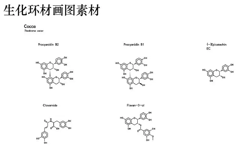
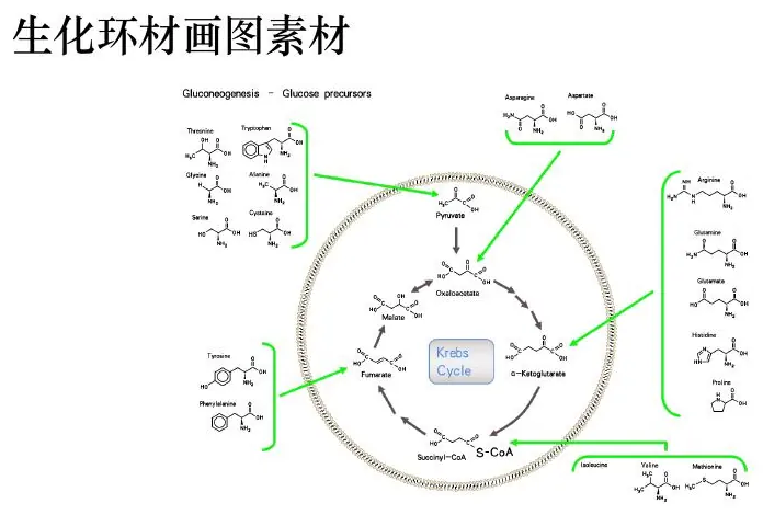


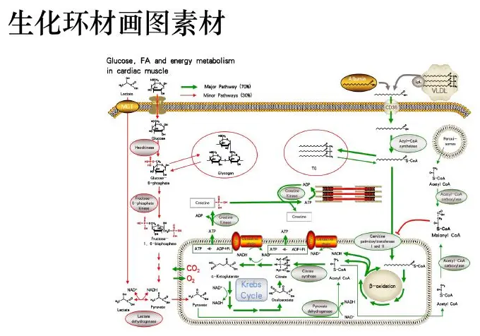
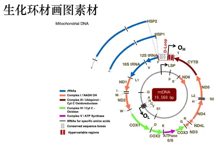
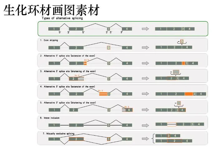
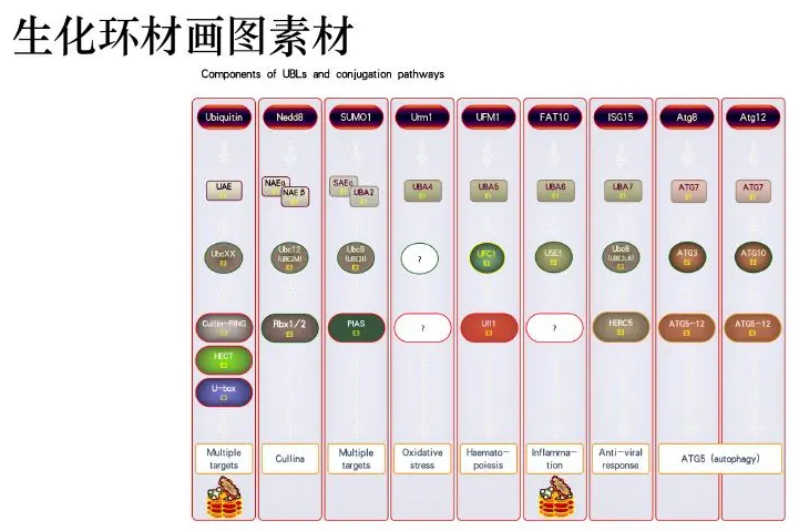

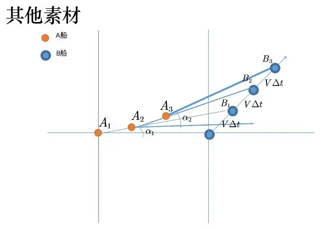
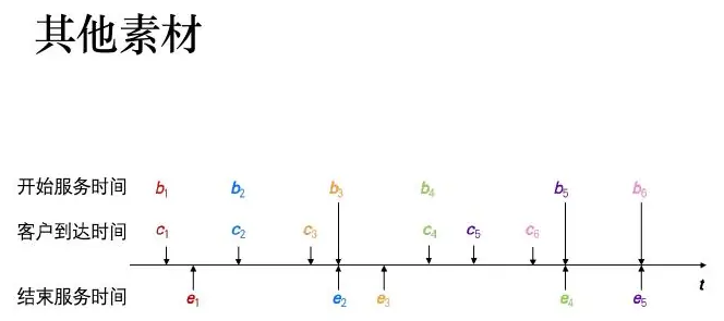
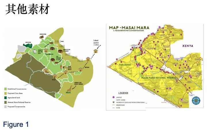
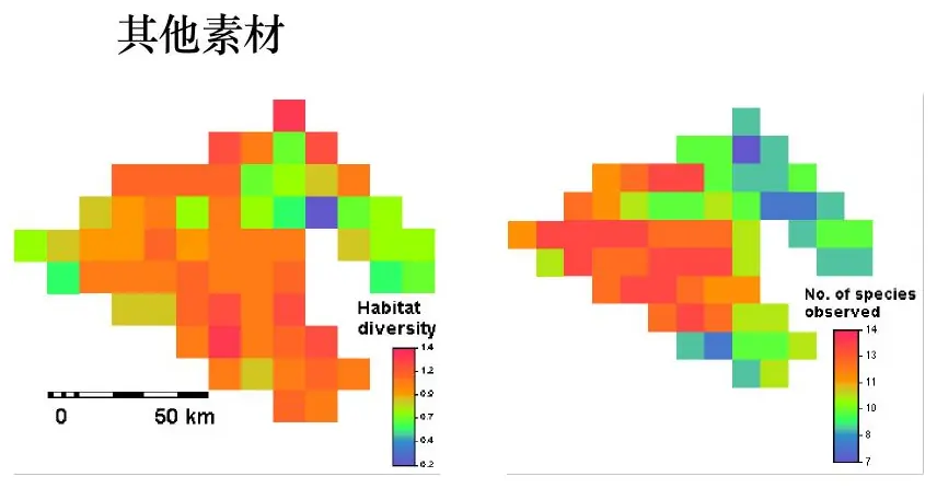
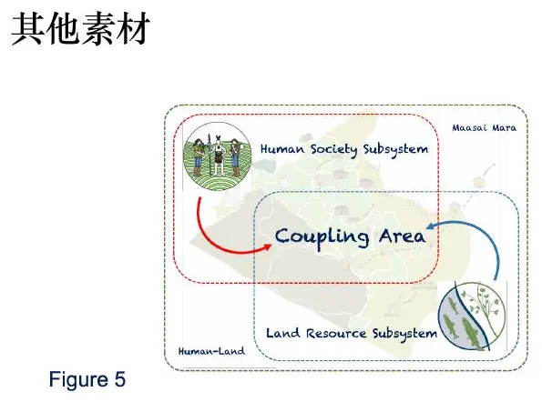
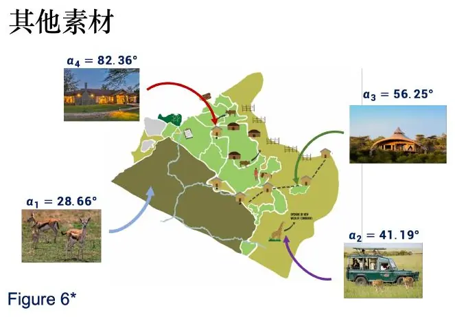
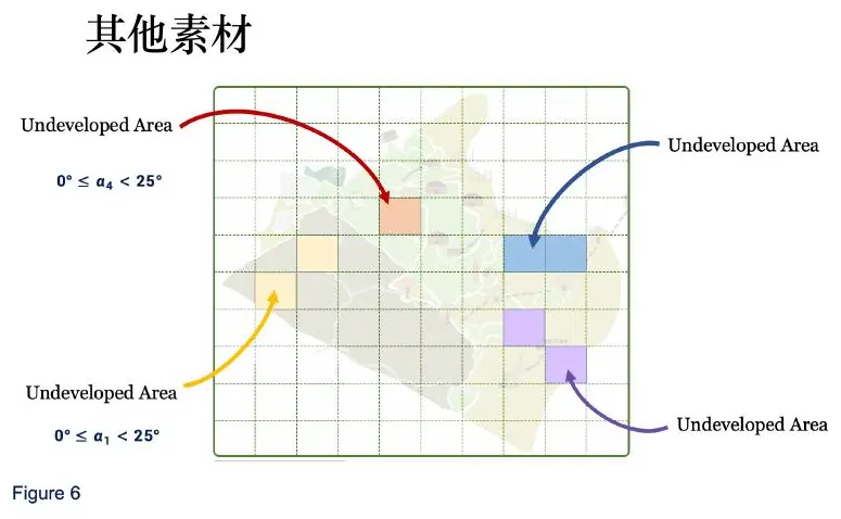
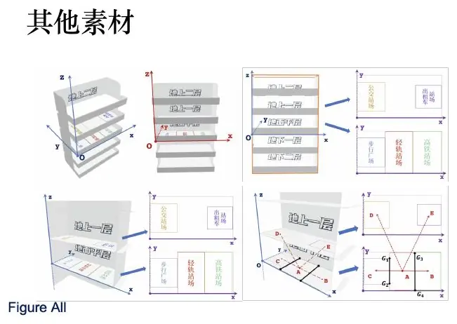
The gallery showed many visual styles, but copying their colors would miss the lesson. Let us close by examining what each image allows a reader to check—and by practicing the difference between an attractive chart and an evidentiary one.
Figure critique studio: from “pretty” to persuasive
Suppose a team shows us a line chart with two methods. The blue line is usually below the orange line, so the caption says, “Our method performs better.” I would stop the class here and ask five questions.
First, better according to which metric? If the vertical axis is runtime, lower is better; if it is accuracy, higher is better. A title cannot substitute for an axis label with units. Second, are the curves averages over repeated trials or single runs? If they are averages, where is the variation? Third, were both methods evaluated on the same instances? Pairing matters because one difficult instance can shift both values. Fourth, where is the simple baseline? Fifth, does the displayed range exaggerate a tiny difference?
Let us repair the figure. Store results in tidy form with one row per instance, method, and repetition. Compute paired differences on the same instance. Plot the distribution of those differences or show each paired observation with a connecting line. Add a zero-reference line, because zero now has a direct meaning: neither method wins. Report the median or mean difference with an interval and mention the number of independent instances in the caption.
Now the caption can carry an argument: “Across 20 test instances and 30 independent seeds per instance, Method A reduces median runtime by 18% relative to Method B; the paired 95% bootstrap interval is [12%, 23%]. The advantage narrows on the three smallest instances.” That sentence tells us the comparison, scale, uncertainty, sample structure, and limitation.
Critique a spatial map
Next, imagine an interpolated risk map colored from green to red. The map looks smooth and convincing, but the monitoring stations are not shown. What could go wrong? A large unobserved region may receive a confident-looking color only because the interpolation routine always returns a number.
The repair has three layers. Show the observation locations as points. Mask or hatch regions that are too far from supporting data. Then validate spatially by holding out stations or blocks rather than random individual rows. If nearby observations leak into both training and testing, the reported error can be much too optimistic.
Color deserves its own decision. Use a sequential palette for low-to-high magnitude, a diverging palette only when there is a meaningful center such as zero, and a categorical palette for unordered classes. Avoid rainbow maps: equal numerical steps do not appear as equal perceptual steps, and artificial boundaries can dominate the reader’s attention. Check that the figure remains interpretable in grayscale and under common color-vision deficiencies.
Critique a framework diagram
Finally, look at a pipeline diagram containing boxes named “Data,” “Model,” “Optimization,” and “Result.” It is neat, but it communicates almost nothing. Which data? What transformation? Which model output becomes which optimization input? Is validation inside or outside the training loop?
Replace vague arrows with typed information: cleaned observations, estimated parameters, predicted scenario distribution, decision variables, and validated policy metrics. Use one visual grammar consistently—rectangles for operations, documents or cylinders for stored data, and diamonds only for actual branching decisions. If a feedback arrow exists, say whether it represents iterative optimization, online updating, or human revision.
Here is the classroom test: choose one number in the final results table and trace it backward through the diagram. At each arrow, name the file or mathematical object that crosses the interface. If you cannot complete the trace, the diagram is decorating the paper rather than documenting the model.
A production routine you can repeat
Start every figure with a one-sentence claim written in plain text. Sketch the comparison on paper. Choose the visual encoding only after deciding which quantities must be compared. Generate the figure from saved data through a script; do not manually move points or recolor a single inconvenient bar. Export at the final page size, then read the printed PDF rather than trusting a large monitor.
Before submission, cover the surrounding paragraph and ask a teammate to interpret the figure. If they identify the intended comparison, units, uncertainty, and conclusion, the figure is working. If they merely say “the blue one is better,” the visual still needs context. A strong scientific figure does not just attract the eye; it reduces the amount of trust the reader must place in the author.
One last habit is worth keeping: save the exact table used to draw each figure. When a judge asks why one point is unusual, you should be able to move from the rendered mark back to the observation, transformation, and source record. Visual evidence becomes trustworthy when it is traceable in both directions—from data to picture and from picture back to data.
Capstone: one figure for the basin, from question to caption
Let us finish where the course began. The restaurant owner asks how many plates one basin can wash before its water is too cool. We built a temperature recurrence in lesson one. Now we must make a figure that a manager can read. What should it show? If the purpose is deciding when to refill, the plot should show plate number on the horizontal axis, water temperature on the vertical axis, and a clear horizontal line at the declared minimum of
Using the illustrative parameters from lesson one, a small prediction table has
Plot the modeled temperature as one clearly labeled line. If you measured actual temperature after every tenth plate, add those readings as points, not as if they were part of the model’s continuous curve. A viewer should be able to distinguish prediction from observation at a glance. If measurements stop after plate 80 but the line continues to 206, mark the later region as a model extrapolation. This is where many attractive modeling figures overstate their evidence: the viewer sees one long smooth line and assumes it was observed throughout.
Suppose three actual lunch shifts have slightly different plate mixes. You might plot three thin measured trajectories or, with enough shifts, a band that represents observed between-shift variation. Do not call a band a “confidence interval” unless you calculated one for a stated quantity. If the decision is when to replace the basin, you could show a conservative scenario with heavier plates or greater room loss beside the nominal line. State whether the scenario came from measurements or an invented stress assumption. The manager can then see not just an average crossing but how much earlier replacement might be necessary on a bad shift.
An honest caption might read: “Water temperature under a no-heater, well-mixed basin model with 20 kg of water and identical plates. The blue line is the illustrative recurrence; points are measured readings, if available. The dashed
Now test the figure on someone who has not read the derivation. Ask them three questions: What is the modeled state? Where is the decision boundary? Which parts are observed rather than predicted? If they cannot tell, improve the line styles and direct labels. If they correctly say “replace by about plate 205” but fail to mention that cleanliness may limit the count sooner, the caption must make that limitation more visible. Figure testing is not about making the reader feel clever; it is about finding where your evidence path is incomplete.
Finally, save the table of plate number, predicted temperature, measured temperature when present, and scenario label. Keep the script or spreadsheet that generated it. When the restaurant changes its basin size, you can regenerate the plot with new parameters rather than dragging the old line by hand. A traceable figure can change when reality changes; a hand-edited picture is a dead end.
This capstone gives us the bridge to the next lesson. Once a figure can stand on its own, the abstract must compress the same reasoning into a few defensible sentences: the restaurant’s question, the model and measured evidence, the conditional threshold crossing, and the limitation that temperature is not hygiene. We will practice that compression next, rather than writing “our advanced model performs excellently.”
The figure now has a job: it carries a specific claim that a reader can check. In the next lesson we will compress that claim and its evidence into the abstract without hiding the assumptions that made the picture possible.
- Title: Mathematical Modeling 2 - Visual Evidence
- Author: Gavin0576
- Created at : 2026-09-14 20:00:15
- Updated at : 2026-09-15 07:06:54
- Link: https://jiangpf2022.github.io/blog/2026/09/14/Mathematical-Modeling-02-Visual-Evidence/
- License: This work is licensed under CC BY-NC-SA 4.0.