
Mathematical Modeling 12 - Time Series Foundations

A model of changing populations assumes that we know when observations were taken. Real data are less tidy. Suppose a shop records daily sales, but some dates are missing, a holiday creates a spike, and a row labeled Monday actually contains Sunday’s total. Would you forecast next week’s demand before fixing the clock? That is the first question in time-series modeling.
We will inspect the observational interval, look for trend and seasonality, decide whether apparent anomalies are errors or real events, and split training from testing in chronological order. The aim of this lesson is not to produce the most elaborate forecast. It is to make sure a future prediction uses only information available at the time it would really be made.
Time-series observations are ordered and dependent. Randomly shuffling them destroys the structure we want to learn and can leak future information into the past.
Components and sampling
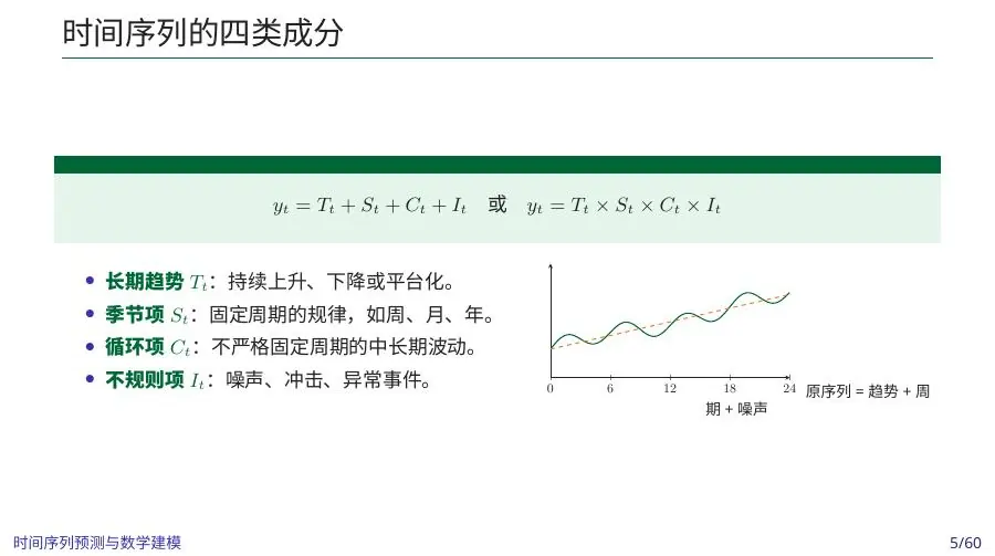
A series may contain trend
while multiplicative structure is appropriate when seasonal amplitude scales with level.
Record timestamp convention, timezone, sampling frequency, aggregation rule, and measurement unit. An hourly average and an hourly total answer different questions.
A time-series model begins before the forecast formula: when was each observation made, what was its interval, and what could have been known at the prediction date? The components we just named are only meaningful after the clock is trustworthy.
Seasonality is a clock rule; a cycle is a changing story
The lecture separates seasonality from broader cycles, and that distinction matters for what we may forecast. A weekend demand rise repeats because the calendar reliably places Saturdays and Sundays; we know those dates before issuing next week’s forecast. A two-year rise and fall tied to neighborhood construction or economic conditions is less regular. Even if one historical cycle lasted eighteen months, we cannot assume the next will last exactly eighteen. A fixed seasonal lag can be a good baseline for weekly repetition, but copying a loosely periodic business cycle into the future without mechanism or uncertainty is risky.
Think of a student cafeteria. Demand drops every winter break because campus attendance falls at known dates; that is seasonal or calendar-driven structure. Demand may also decline while another cafeteria is renovated and then rise when it reopens; that is an external regime event with dates that must be documented. A graph can show both as valleys, but their forecasts differ. The winter-break indicator is known each year, while renovation timing or competing service may require a scenario. If we call every valley “seasonality,” a model will incorrectly repeat one-off construction effects next year.
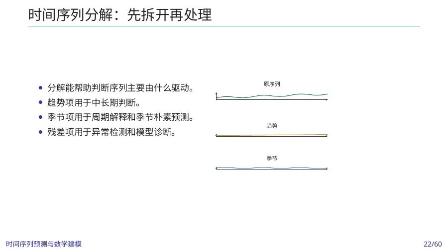
Irregular variation does not always mean disposable noise. An extreme weather day may be rare but exactly the day when food delivery or power planning is hardest. A shop’s promotion may be a controllable event. A sensor failure may be an instrumentation event. A policy change may create a new stable baseline. The decomposition notation bundles these into an irregular remainder only after more systematic components are described; it does not tell us whether to erase, model, or stress-test each one. Annotated plots and records from the domain often explain more than a mechanically computed component series.
This is a natural point to ask what “stationary enough” means for the intended horizon. For next-day sales during one stable semester, a local mean and weekly pattern may suffice even if the shop grew over several years. For a two-year expansion plan, that same local approximation cannot simply be extended unchanged. Choose a training window and model class for the decision scale. The plot’s long-term trend, repeated seasonal clock, and uncertain cycles each have different implications for how far we can extrapolate. The clearest model is not the one that decomposes every pixel of a line; it is the one that says which mechanism a decision can rely on.
A shop’s rows have a meaning before they have a pattern
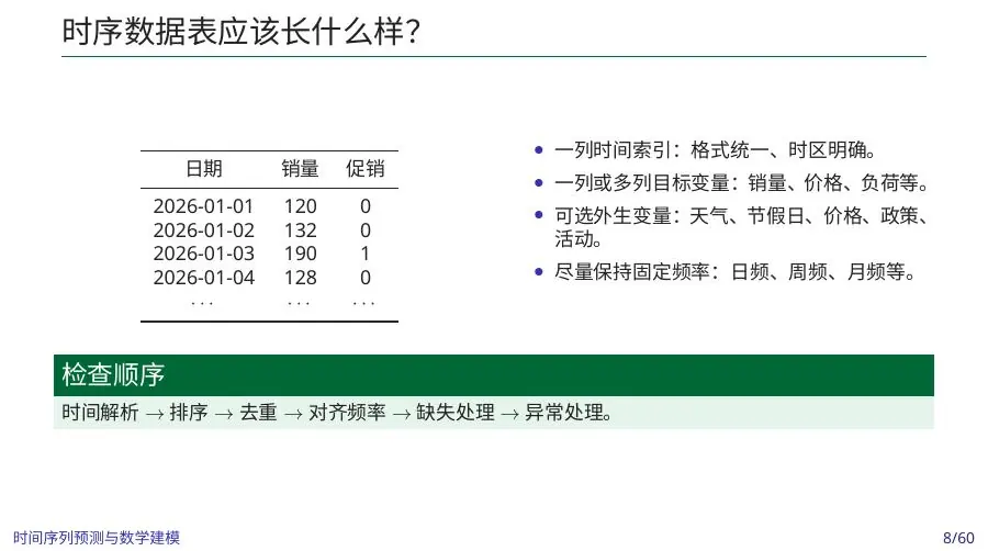
Imagine a small shop sells lunch boxes. Its spreadsheet has a row 2026-01-03, 190, promotion=1. Before drawing a curve, ask what 190 counts. Is it orders placed during January 3, boxes delivered that day, or money collected? The slide’s sample table uses daily sales and a promotion indicator, but those fields need a real definition in an actual project. If a late-night order placed at 23:55 is delivered next morning, order count and delivery demand land on different dates. A staffing forecast should use the date on which work occurs; a marketing analysis may use the order date. A neat date column cannot settle that choice for us.
Let us make a tiny illustrative sequence: Thursday 120 boxes, Friday 132, Saturday 190 during a promotion, and Sunday 128. A tempting calculation is the four-day average,
The lecture decomposes a series into trend, seasonality, cycle, and irregular variation. Trend is a longer-term baseline change: the shop grows from about 100 to about 150 ordinary boxes per day over a year. Seasonality is a recurring calendar pattern: weekends or holidays. A cycle is a longer fluctuation without one exact fixed period, perhaps local economic activity. Irregular variation includes ordinary noise and surprises such as the promotion spike. This is a way to ask questions of a plot, not a claim that four hidden components can be uniquely recovered from four observations. With one week we cannot separate weekly seasonality from a special event; we need repeated weeks and promotion records.
Additive decomposition says a seasonal effect is roughly the same number of boxes at low and high business levels. Suppose Saturdays usually add 20 boxes whether weekday baseline is 100 or 150; additive structure is plausible. Multiplicative decomposition says the effect is roughly a proportion: Saturdays might be 20% above baseline, adding 20 when baseline is 100 and 30 when it is 150. Compare weekly profiles from periods at different levels. If seasonal amplitude rises with level, additive 20 may understate future Saturday demand. Decomposition is diagnostic; multiplication alone does not explain why weekends matter. Store hours, neighborhood traffic, and promotions remain business mechanisms.
Time-series prediction often feeds a later decision. If the shop schedules cooks for next week, a daily forecast alone is not enough: underestimating by 30 boxes on Saturday may cost sales and service quality, while overestimating by 30 on Tuesday may waste ingredients. We will eventually evaluate errors against that asymmetry. First make the clock reliable, identify what the target measures, and preserve which signals were available before scheduling. That is why this lesson starts with observational meaning rather than the newest forecasting algorithm.
Audit the time index
Before modeling:
- sort timestamps and resolve duplicates;
- detect missing timestamps, not only missing cells;
- determine whether intervals are regular;
- align multiple data sources without looking ahead;
- mark policy changes, outages, promotions, and sensor replacements.
Pandas provides dedicated time indexes, date ranges, periods, resampling, and timezone operations (official time-series guide ).
Missing dates are not the same as empty cells
Return to the lunch-box spreadsheet. Suppose it contains rows for Monday, Tuesday, Thursday, and Friday, but no Wednesday row. If we simply sort the four rows and call them four consecutive days, a one-day lag for Thursday will point to Tuesday. A model may treat a two-day gap as a one-day change and learn a false rate. First construct the calendar we intended—every operating day or every calendar day—and join observed rows to it. Wednesday then appears explicitly as a missing timestamp or missing target. Only after that can we ask whether the shop was closed, its recorder failed, or there were genuinely zero orders. A closed Wednesday may belong in the data with a closure flag; a recorder failure may have an unknown order count. Those are different mechanisms.
Duplicate dates also require interpretation. Two rows for Thursday could be two cashier registers whose order counts should be summed; they could be an original file and a corrected re-upload where only the latest version should be kept; or they could be morning and afternoon totals whose intervals do not cover the same period. Dropping duplicates by “keep last” without a source rule can lose real orders. For a temperature sensor, multiple readings during one day might be averaged for a daily mean or summarized by maximum for overheating risk. A daily sum of Celsius readings would be meaningless. The lecture’s ordering “parse time, sort, deduplicate, align frequency, then handle missingness” is a workflow for asking these semantics, not a one-line automatic cleaning recipe.
An hourly electricity example makes timestamp meaning even sharper. A record at 15:00 might be the average power from 14:00 to 15:00, the energy consumed during that interval, or instantaneous power at 15:00. Power in kilowatts and energy in kilowatt-hours are not the same unit; summing hourly average power numbers without multiplying by interval duration can misstate total energy. If a 15:00 value summarizes the following hour, a feature labelled “current temperature at 15:00” may contain information from a time after the forecast origin. Ask when a value became available, not just what its row label says.
Timezones are also a modeling variable when data sources meet. A New York shop’s local midnight is not UTC midnight. If website traffic is logged in UTC but sales in local dates, joining rows on textual date could shift promotion response to the wrong day. Daylight-saving changes can create a repeated local hour in autumn and a missing local hour in spring. A 24-hour assumption on those days may be false. One practical solution is to store unambiguous instants in UTC and a separate local calendar feature for business interpretation; another is to use timezone-aware local indexes with explicit treatment of repeated and nonexistent times. The appropriate choice depends on what the decision uses, but pretending the issue does not exist can generate fake anomalies.
Finally make a small “availability ledger.” For each candidate predictor, write when it is actually known. Tomorrow’s public-holiday indicator is known in advance; yesterday’s boxes sold are known after closing; tomorrow’s observed temperature is not known today, though a forecast may be. A promotion plan might be known a week ahead, but a last-minute promotion is not. When we later build features or split training windows, this ledger will decide which columns are legal. Time-series leakage often enters through a perfectly named feature whose information arrived too late, rather than through an obvious random shuffle.
Daily totals and daily averages give different evidence
Suppose the shop’s lunch-box counter logs each transaction, while a temperature sensor logs once each hour. For daily lunch-box sales, summing order counts across the day’s transactions is meaningful. Averaging those counts per transaction would answer a different and usually useless question. For daily outdoor temperature, averaging hourly readings may summarize thermal exposure, while maximum temperature may be the relevant feature for afternoon cooling demand. Summing Celsius values across hours has no physical meaning. The aggregation rule follows the quantity’s unit and the decision: total boxes for ingredient purchases, peak kilowatts for capacity, average temperature for baseline heat load, or maximum temperature for overheating risk.
Frequency changes can hide patterns. If hourly electricity load peaks every weekday morning, a daily energy total may not reveal whether peak demand exceeds a transformer rating. Conversely an hourly shop-sales record may be too noisy for next-month ingredient budgeting. Choose the target frequency based on the action and retain enough raw data to revisit it. Aggregating before correcting duplicate timestamps can double-count some intervals; aggregating after replacing missing hours with zero can understate energy. The order of parsing, deduplication, gap detection, and aggregation matters because each step changes the meaning of the next.
There is an especially subtle issue with averages and varying interval length. A sensor may report one value after 30 minutes and another after 90 minutes. Their simple arithmetic average weights both equally, even though one describes three times as much elapsed time. If the target is mean exposure over two hours, a time-weighted average is more defensible. Around daylight-saving changes, a local day may have 23 or 25 hours; a daily total can still be meaningful, but an “average over 24 hours” would be wrong if the denominator is fixed blindly. These details are mundane compared with ARIMA or neural nets, yet they can change a capacity or risk estimate more than model choice does.
When two sources have different frequencies, alignment should respect when each datum arrived. If a weather forecast updates at 09:00 and 15:00, the 12:00 demand forecast cannot use the 15:00 update. If a daily price is effective at midnight but published the previous afternoon, its date label alone may not reveal availability. Merge by known publication times or explicit intervals, not by the nearest row chosen without regard to future. A polished combined dataset can leak precisely because different systems record time differently.
Missing values and anomalies
Zero is a measurement, not a universal missing-value replacement. Choose a method from the generating mechanism:
- short smooth gaps: interpolation;
- state that persists until updated: forward fill;
- seasonal process: same-season estimate;
- long gaps: model-based imputation or explicit missing indicator;
- impossible values: correct from source or mark missing;
- real shocks: preserve and explain.
Fit imputation rules using training data only. The official pandas guide distinguishes missing sentinels and provides detection and filling operations (missing-data guide ).
A missing Wednesday can tell three stories
Suppose we learned that Wednesday’s sales value is blank but the shop was open. A clerk might have forgotten to upload the register file. If neighboring ordinary weekdays sold 125 and 130 boxes, an interpolation near 127 could be a reasonable temporary estimate for a smooth operational summary. It is not a measured truth. Store a missingness flag and, if the decision is important, recover the original register data. If Wednesday was a national holiday and the shop was closed, the true boxes sold might be zero, but inserting 127 would invent demand that could not occur. If the register went offline during a promotion, the gap may coincide with unusually high sales; interpolating from ordinary neighbors would systematically erase the event. The same blank cell calls for different treatment according to its cause.
Forward filling can be useful for a state that persists until changed. For example, an inventory status measured at closing might remain the latest known state through a short reporting gap if no transactions occurred. It is usually wrong for daily boxes sold: copying Tuesday’s 125 boxes into Wednesday claims 125 new sales happened without evidence. Seasonal filling can be useful when several past Wednesdays under comparable conditions exist, but it must be learned from data available before the blank day if we are simulating a real-time forecast. For long gaps, show an interval or mark the period unusable for a particular evaluation instead of manufacturing a long flawless curve. The filled points should remain visibly distinguishable from observations.
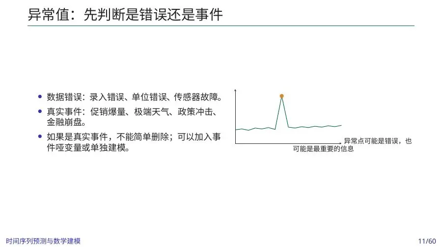
An anomaly also has three possible stories. The 190-box promotion Saturday could be a real high-demand event. A row of 1,900 might be a misplaced zero or a unit conversion problem. A sudden sustained rise from 120 to 200 after a new office opens nearby could be a regime change rather than one outlier. Plot the raw values, inspect logs and context, and ask whether the point is plausible under store capacity. Deleting a genuine promotion spike because it lies beyond three standard deviations would remove the very event a staffing plan needs to survive. Keeping a proven data-entry error as though it were a demand shock would train the model to anticipate a day that cannot happen.
The distinction also changes how we test models. A forecaster used for ordinary weekdays may be judged separately on ordinary days and special-event days. If staffing must cover promotions, forecast error on those days matters even if they are rare. We might add a known-in-advance promotion flag to predict the change, then evaluate whether it improves held-out promotions. We cannot add a flag that was created only after seeing the unusual demand and claim that it would have been known when the schedule was set. Event documentation, not hindsight, determines predictor availability.
Cleaning should be inside the validation process. Suppose we calculate a “typical Wednesday” from the entire year, including the quarter later used as test data, then fill a missing training Wednesday with it. Information from the future has entered the past through preprocessing. A forecast can appear accurate even if the forecast model itself never saw future rows directly. Learn imputation rules on each training window, apply them to what is legitimately known at that origin, and describe their uncertainty. A deliberate missingness flag can help a later model learn that outages are informative rather than pretending every time point was equally observed.
This is why zero should never be a universal placeholder. A true zero order day, a blank recorder entry, and a closed shop share a numerical appearance after careless filling but imply different operations. If one conclusion depends heavily on how we fill five missing dates, the correct next step may be data recovery, not a more sophisticated time-series algorithm. The quality of the clock and missingness story places a ceiling on the quality of any forecast built above them.
A sensor replacement can imitate a new trend
Imagine an electricity meter replaced on July 1. The old meter reported hourly energy to the nearest 10 kilowatt-hours; the new meter reports to the nearest one and uses a different timestamp convention. A plot may show July values creeping upward or downward relative to June. That could be a true change in load, but it could also be calibration or interval alignment. Before differencing away the apparent break or fitting a new trend, compare overlap readings if available, inspect replacement logs, and confirm units and interval endpoints. A statistical model cannot tell the difference from numbers alone when instrumentation and physical load changed at the same time.
An equipment change has a different validation implication from a demand shock. If the meter definition changed permanently, data before July may need a conversion or separate regime label; a sliding recent window may outperform a long expanding window because old values are not directly comparable. If the old data can be recalibrated with a known conversion, preserving more history might help. We should test both on later periods and show the assumption. An algorithm that selects July as a change point is pointing to a question, not establishing whether the cause was equipment, behavior, or both.
For the lunch-box shop, a new register system could similarly change whether “sales” counts accepted orders or completed deliveries. A model trained on accepted orders may suddenly seem to underpredict deliveries if the target column’s meaning changed. The forecast error is then partly a data-definition error. A simple data dictionary with target definitions, system versions, store hours, and promotion logs is part of the time-series model’s evidence. When we later report an ACF or error metric, readers should know that the same measured quantity existed over the whole period.
This example is why an anomaly should be researched before it is clipped. A one-day wrong unit can be corrected; a lasting measurement redesign may need an explicit break; a real hot-weather surge should be retained for stress testing. All three can draw a dramatic line on a chart. The causal explanation determines which intervention makes a forecast honest.
Transformations
Log or Box–Cox-like transformations can stabilize variance for positive data. Differencing removes level changes:
Too much differencing amplifies noise and makes forecasts unstable. Apply each transformation for a diagnosed reason and invert it carefully when returning to the original scale.
What a transformation changes—and what it cannot repair
Suppose shop sales grew from about 100 to 200 boxes per ordinary day, and Saturday uplift also grew from 20 to 40 boxes. A log transformation may make the seasonal effect more like a stable proportion:
Logs require positive input. A zero-sales day gives
Differencing asks a different question. Define first difference
Seasonal difference
The slide also mentions Box–Cox and financial returns. Box–Cox is a family of transforms for positive values, with a tunable exponent; its log case is a limit. Fit the exponent only on training history, then apply the same rule to validation and test periods. For prices
Finally standardization—subtracting a mean and dividing by a standard deviation—may help machine-learning models that combine predictors of different units. If we learn the mean and standard deviation using all observations, test-period level information leaks into training. Refit them within each historical training window. Keep the original unit alongside transformed values so that a decision-maker receives boxes, kilowatt-hours, or currency, not an unexplained z-score. A modeling report should be able to say in one sentence what the transform is meant to fix and how the final forecast was returned to the decision scale.
A filled value should carry a question mark
Return once more to the unrecorded Wednesday in week two. Our interpolation suggested 130 boxes, but the original transaction file is missing. If we later compute a seven-day average including that 130, the forecast will treat it like any measured day unless we preserve a flag. If actual Wednesday demand had been 160, the week’s mean would differ by
One practical uncertainty check uses several justified alternatives. Calculate the forecast after filling Wednesday with 125, 130, and 160 boxes, or after omitting that week from a certain calibration step. Compare the resulting Monday forecast and ingredient order. If order quantity stays the same under all plausible treatments, we can report that missing Wednesday was not decision-critical in this example. If one treatment calls for one cook and another for two, recovering the register file is more valuable than tuning a new model. This is sensitivity analysis applied to preprocessing, not just to model coefficients.
Long gaps deserve an even stronger warning. Suppose a shop’s register is missing for two full weeks while a new delivery service starts. A seasonal mean from earlier ordinary weeks will erase the transition; a straight interpolation between the gap’s endpoints invents a smooth path we never observed. We can model the gap as an unknown interval or use external records such as ingredient purchases, payments, or delivery logs with their own errors and timestamps. If no independent information exists, state that forecasts across the transition are weak. A result that becomes certain only after imaginary data were filled is not genuinely certain.
Missingness itself can be informative. A sensor that fails during extreme load or a register that goes offline on very busy days will bias a dataset toward quieter periods. Even a sophisticated imputer learned from the observed rows may reproduce that bias because the unseen peak mechanism is absent from its training data. Plot when gaps occur, compare with known outages and events, and include a missingness indicator where appropriate. The goal is not a table with no blank cells; it is a defensible record of what was measured, what was estimated, and what remains unknown at the forecast origin.
The same honesty applies to anomalies. If we correct a 1,900-box typo to 190 using a verified original receipt, label the correction source. If we merely guess it was a misplaced zero, keep the raw value and record the proposed correction as a scenario until it can be confirmed. Forecasting begins with evidence stewardship. Readers may disagree with a model choice and still trust a transparent analysis; they cannot audit a dataset whose uncertain rows were quietly transformed into facts.
Stationarity and dependence
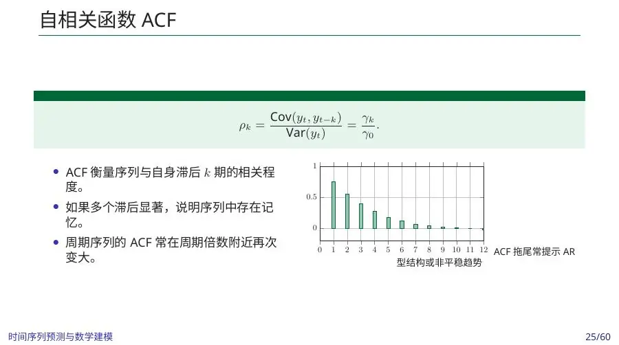
Weak stationarity requires constant mean and variance and autocovariance depending only on lag. Examine rolling statistics and use tests such as ADF and KPSS as complementary evidence, not automatic truth.
The sample autocorrelation at lag
ACF shows total lag correlation; PACF isolates direct correlation after accounting for shorter lags. Seasonal peaks suggest periodic dependence, while slow decay often indicates trend or nonstationarity.
After cleaning and transforming a series, we must test prediction without seeing the future. A random train–test split would destroy chronology; here we let earlier observations teach the model and later ones judge it.
A stable average is not enough to call a series stationary
Imagine two periods of shop sales, each averaging 140 boxes per day. In the first, ordinary days lie between 135 and 145; in the second, days alternate between 80 and 200 because large promotions and closures have become common. Mean is unchanged, but variance and dependence are not. Weak stationarity asks for a constant mean, constant variance, and a covariance pattern determined by lag rather than by calendar date. Real sales with gradual growth or a new neighboring office may violate these conditions. We use stationarity as a working approximation for certain models, not as an edict that the raw business must never evolve.
A rolling mean can show whether level drifts; a rolling variance can show whether volatility rises. But choose window length with care. A seven-day rolling mean in daily sales may reduce weekday noise, while a two-day mean may mostly follow it. A 365-day window can hide a sudden regime change for months. Rolling summaries at the end of the dataset use different amounts of available history depending on implementation; a centered rolling window used as a forecasting feature includes future data. For a diagnostic plot after the fact, a centered smoother can help reveal shape if clearly labelled. For an operational predictor at time
Autocorrelation is a way to ask whether today resembles a day
The partial autocorrelation function, PACF, answers a more conditional question: how much does lag
ADF and KPSS tests approach stationarity-related hypotheses from different directions. They can complement a plot, but their outputs depend on how trend or intercept terms are specified, sample length, and breaks. A single p-value is not a cleaning command. Suppose a policy change permanently increases shop baseline in July. A stationarity test on the whole year may reject one model assumption; differencing might reduce the break’s effect but can also turn it into a one-time huge jump. A segmented model, event flag, or moving training window might better match the real business history. Explain the break before selecting the statistical remedy.
After fitting a baseline or forecasting model, inspect residuals—the observed minus predicted values—over time and by weekday. If residuals remain high every Saturday, the model missed seasonality. If errors cluster during promotions, it missed event information or uncertainty. If residual ACF has a strong lag seven peak, a predictable weekly component remains. Ideally residuals no longer carry easy-to-use structure, though a practical forecast may still have irreducible shocks. A smooth original fit is less informative than whether the model left a pattern that a simpler seasonal baseline could exploit.
Three consecutive values do not prove a seasonal pattern
Autocorrelation can be made less mysterious with a tiny sequence, although a real ACF needs many more points. Suppose daily values are 10, 12, 14, 16, and 18 boxes. The mean is 14. The deviations are -4, -2, 0, 2, and 4. Adjacent deviations tend to have the same sign, so lag-one correlation is positive under the sample ACF calculation. But the series is just an upward trend. We have not discovered that “yesterday’s sales cause today’s sales.” If we take first differences, they are 2, 2, 2, and 2, a constant rise in this toy data. Removing the trend can eliminate the slow ACF tail. This illustrates why a dependence plot should be interpreted alongside level, trend, and business events.
Now consider seven weekdays of a shop that sells more on weekends. A lag-seven ACF cannot be calculated meaningfully from only one week: there are almost no paired values exactly seven days apart. We need several repeated weeks, with promotion and closure marks, to see whether the same-weekday pattern survives. A seasonal profile—average or median sales by weekday across training weeks—can be a clearer first view for a beginner than an unexplained ACF spike. If Wednesday is always closed, that is not a “mysterious correlation at lag seven”; it is a calendar rule to encode explicitly.
Use uncertainty bands carefully. An ACF estimated from 20 observations is noisy, and scanning dozens of lags creates chances for a few tall bars even without a meaningful mechanism. A narrow confidence band drawn from a standard approximation may also be inappropriate for a series with trends or changing variance. The best question is not “which bar is tallest?” but “does a recurring lag improve held-out forecasts after the calendar, trend, and known events are accounted for?” Residual ACF after fitting a baseline can reveal remaining structure. A lag-seven peak in raw sales is expected; the same strong peak in residuals says we still left predictable weekly variation behind.
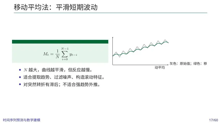
The slide’s moving-average picture is another reminder that every diagnostic changes perspective. A trailing seven-day average smooths daily noise but lags behind a sudden rise. During a promotion week, the average stays elevated for days after the promotion ends because those past high values remain in the window. A centered average is attractive in a hindsight plot but uses later days; it is illegal as a contemporaneous feature for a forecast issued before those days. Show raw and smoothed lines together, label window length and alignment, and ask what pattern is clarified and what event is delayed or hidden. Diagnostic convenience should not become operational leakage.
Split by time
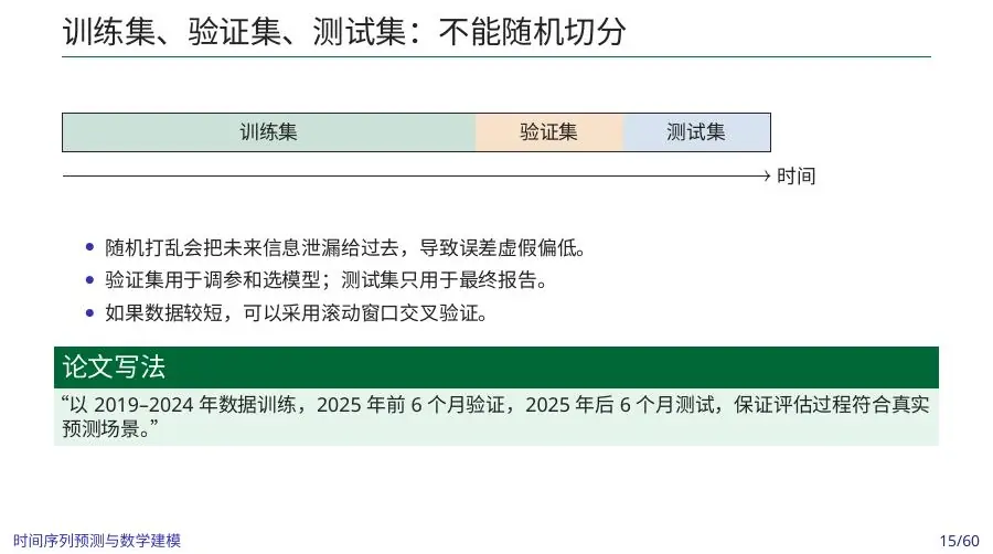
Use training, validation, and test intervals in chronological order. Rolling-origin evaluation repeatedly trains on the past and evaluates the next horizon. Match the evaluation horizon to the decision: a one-day forecast test does not validate a quarterly planning model.
A forecast has an issue date, not just a target date
Suppose the lunch-box shop must order ingredients on Friday evening for the following Monday. The target is Monday boxes sold, but the forecast origin is Friday evening. At that origin, Thursday sales, Friday’s partial sales, the Monday holiday calendar, and a weather forecast may be available; actual Saturday and Sunday sales are not. A model validated as though Sunday sales were known when placing Friday’s order has used information from the future. That error can enter through a lag column, a rolling average, a data-cleaning step, or a promotion flag whose plan was decided after Friday. Write the issue date and variable availability before building features.
Random train-test splits are particularly deceptive here. If days from March appear in training and a February day appears in test, the model has learned later business levels and perhaps future promotions before “predicting” February. Randomly mixing rows can be sensible for some independent-data tasks; for ordered dependent data it does not simulate the operation we care about. A first chronological split might train on January through June, choose methods using July and August, and reserve September as untouched test history. Each period should represent the kind of future the decision faces. If a new shop opened nearby in August, a September test will also reveal whether a model trained only before that change adapts.
Rolling-origin validation gives more than one historical forecast attempt. Train through week 10, issue week-11 forecasts, record errors; then train through week 11, issue week-12 forecasts, record errors; and repeat. At each origin, repeat preprocessing, scaling, and feature calculations using only the information available then. This may sound laborious, but it is the honest simulation of weekly planning. An expanding window retains all past data; a sliding window keeps only recent weeks when the regime drifts. Compare them on the same forecast origins and horizons, not on convenient different slices.
Horizons matter. A model that predicts tomorrow using yesterday’s observed demand may fail to predict the next seven days issued today, because the later forecast cannot use actual future daily demand as a lag. Recursive forecasting feeds earlier predictions back as lags, accumulating errors; direct forecasting builds a separate mapping to each horizon. Either can be tested, but both must be judged at the true issue date. A one-step MAE of five boxes does not validate a weekly ingredient purchase forecast if days six and seven are far worse. Report error by lead time and weekday, and note which day of the week the forecast was issued.
The final test set should be used once for the chosen workflow, not visited repeatedly to tune choices. If we compare dozens of methods and select the one with the smallest September error, September has become another validation period. To estimate future performance after selection, we need another later holdout or more principled nested historical evaluation. For a beginner project, the simplest safe discipline is to reserve one late period, document model choices from earlier rolling tests, and show the late result whether it flatters the method or not. This prevents an accidental search for the one model that got lucky on one month.
Baselines and metrics
Always include naive
Inspect residuals over time and by season. Forecast errors should not retain predictable structure. A model that beats no baseline or leaves strong autocorrelation is not finished.
Beat the forecast someone could make on a napkin
Before fitting ARIMA or a neural network, ask what an honest simple forecast would do. For a steadily operating shop, “tomorrow will sell what today sold” is a naive baseline. With a strong weekly pattern, “next Monday will resemble last Monday” is a seasonal-naive baseline. For an upward drift, a simple linear trend or average recent weekly change may be another reference. The baseline must use only observations available at the issue time. If a complex model cannot beat last week’s same weekday on held-out weeks, complexity has not earned operational trust. It might still provide an interpretable uncertainty range or an event mechanism, but a lower error claim would be false.
Let actual next-week ordinary sales be 100, 120, and 140 boxes on three chosen days, while a candidate forecast gives 110, 110, and 150. Errors are +10, -10, and +10 boxes; mean absolute error, MAE, is
MAPE divides each absolute error by actual demand. If actual demand is zero because the shop was closed, the percentage is undefined; if actual demand is one box, a ten-box miss becomes a huge percentage. Reporting a single MAPE for a series with many zeros or near-zeros can mislead. MASE scales model MAE by the in-sample naive forecast’s average error, making comparisons across series more interpretable when the scale exists and is calculated consistently. If model MASE is below one, it outperformed that naive scale on average under the given construction. But a metric is a lens, not a verdict; inspect where errors occur.
Consider two staffing models with the same MAE of 10 boxes. Model A misses by ten on ten ordinary Tuesdays; model B is exact on ordinary days but misses by 100 on the single high-demand promotion day. If promotions require advance preparation, the same average error hides a very different risk. Break error down by weekday, promotion, holiday, season, and forecast horizon. Plot predicted versus observed values with units and mark known events. For a shop, also inspect whether forecast intervals cover actual demand often enough. A point estimate of 140 with no uncertainty cannot tell the owner how many extra ingredients to keep for a high-variance Saturday.
Metrics should align with the downstream optimization. If forecasted demand feeds a production plan with a hard capacity of 150 boxes, an error near that threshold may change staff count or lead to lost orders while an equally sized error on a quiet day may not. We can test the entire “forecast to schedule” pipeline against held-out weeks: apply each forecast to the same scheduling rule, then compute actual shortage, waste, cost, and service. Forecast accuracy is necessary but not always sufficient for a good decision. This is a central modeling-course point from the slide: forecasting can be only one intermediate step before optimization and risk analysis.
A leakage-safe starting notebook
1 | import pandas as pd |
The exact boundary convention matters: no timestamp should appear in both sets. For long-horizon rolling validation, rebuild the forecast at each origin using only information available at that origin.
Read the notebook as a sequence of promises
The code sorts dates, removes duplicate date rows by keeping the latest, places observed values on a complete daily frequency, then splits at a fixed date. Each line is a promise that should match the data contract. “Keep latest” assumes later duplicate uploads are corrections; if duplicates are separate cash registers, we must aggregate instead. .asfreq("D") inserts calendar dates that were missing; if the shop is open only on weekdays, those weekend dates need a closure rule. Interpolation with a limit of two days assumes short gaps can be estimated smoothly; that may be defensible for temperature but not for promoted sales. The code is a starting illustration, not an automatic cleaning oracle.
There is also a boundary detail worth inspecting. The training selection includes the split date, and the test selection explicitly drops that same first row. This avoids overlap in the example, but a real pipeline should assert that train and test timestamps are disjoint. If the split date is missing, if timezones disagree, or if the date column includes times of day, a textual slicing rule may behave unexpectedly. Print first and last timestamps for each period, count them, and compare with the intended forecast origins. A one-row overlap can create an optimistic evaluation without any sophisticated leak-detection system noticing.
The seasonal-naive loop repeats the final known seven-day pattern across the test span. That is legitimate for a multi-day forecast issued at the end of training if no test observations are used to update it. If we evaluate a rolling-origin forecast, we should rebuild the pattern at each origin using the latest then-known seven days. Do not silently let the model use actual demand from earlier test days unless the operational setting would have received it before the next issue date. For a one-time weekly ingredient purchase, no midweek update may be allowed; for a daily replenishment process, updates might be exactly what the business does. The evaluation should reproduce the decision schedule.
Code comments such as “learn or justify missing-data treatment from training history” express a larger rule: preprocessing parameters are also learned parameters. A same-weekday fill value, a z-score mean, a Box–Cox exponent, or an outlier cutoff derived from the whole series can know the future. Within each rolling window, fit the rule on past observations, preserve flags for imputed values, and apply it without looking at later target values. This may produce somewhat worse measured accuracy than a global cleaning pass. That worsening is valuable: it reveals the true challenge the forecaster will face when tomorrow has not happened yet.
Finally check that the output’s unit matches the decision. The MAE printed by the example is in the same unit as value: boxes if value counts lunch boxes, kilowatt-hours if it counts electricity, or dollars if it counts revenue. A MAE of 10 means something only after we name that unit and scale. If the original data were log-transformed, calculate a metric after inverse transformation when the manager’s loss is on the original scale. The notebook’s order is a trustworthy skeleton when every promise is verified; its shortness is not an excuse to omit the data story.
The notebook above gave us a safe order of operations. We will now walk through a small series and decide, at each plot or statistic, what it tells us and what it cannot yet justify.
Diagnose a series before forecasting
Suppose hourly electricity demand spans two years. Before fitting a model, define the timestamp: start of interval or end, local time or UTC, average power or energy consumed during the hour. Daylight-saving transitions create repeated or missing local hours. A perfectly fitted model can be conceptually wrong if the index is misunderstood.
Establish frequency and availability
Create a complete hourly index and join observations to it. Mark missing intervals rather than silently compressing time. Plot missingness by hour, weekday, and month. Missing demand during outages is not random and should not automatically be interpolated. Record which weather forecasts, prices, and calendar variables would truly be known at each prediction origin.
Electricity makes frequency an operational choice
Suppose a campus engineer needs to plan tomorrow’s hourly electricity load. The target might be average power in kilowatts for each hour, or energy consumed in kilowatt-hours during each hour. If the meter reports cumulative energy at 14:00 and 15:00, the difference gives energy consumed between those readings; treating each cumulative reading as a separate hourly demand would make demand appear to grow endlessly. Before any decomposition, inspect how the meter produces values. A one-hour interval ending at 15:00 should be labelled consistently, and weather values should refer to the period they can help predict.
At an issue time of 18:00 today, tomorrow’s calendar is known, but tomorrow’s actual temperature is not. A weather service may have issued a forecast by 18:00, and that forecast can be a legal external predictor. To validate the model historically, we need archived weather forecasts as they were available at those historical issue times; substituting later observed temperatures creates an unrealistically easy test. If archived forecasts are unavailable, test with a stated approximation and report that the validation understates weather-input uncertainty. The difference between a known future calendar and an uncertain future weather variable is a common source of hidden leakage.
Hourly load often has more than one seasonality. Buildings have morning startup, afternoon occupancy, and overnight decline within a day; weekdays differ from weekends within a week; summer cooling and winter heating create longer annual shifts. An ACF peak near 24 hours may reflect yesterday’s same hour; a peak near 168 hours may reflect last week’s same weekday and hour. A baseline of “same hour yesterday” and one of “same hour last week” should both be considered. On a holiday Monday, the last-week Monday may be a bad reference, while the recent Sunday may be more similar. Calendar events do not obey one fixed lag perfectly.
Consider one invented hour: load at Monday 14:00 is 1,200 kilowatts, last Monday 14:00 was 1,100, and today’s forecast high is much warmer than last week. A seasonal-naive prediction would be 1,100 kilowatts. A weather-aware forecast might predict 1,250. We cannot say which is better from one case; we need many held-out warm and ordinary hours. If the weather-aware model reduces average error but occasionally underpredicts extreme heat by 300 kilowatts, a capacity-planning decision may still need an upper quantile or stress scenario. Report both forecast skill and the reserve decision it would imply.
Missing meter hours are not a minor cosmetic problem. If a logger fails during a blackout, the missingness is related to the event we may most need to understand. Interpolating a smooth line through the outage can erase the load drop. If it fails during high demand because hardware overloads, missingness may bias estimates of peaks. Plot a missingness calendar by hour, weekday, and season; compare with outage logs; use explicit flags; and decide whether affected hours can be included in a fair test. Filling routine gaps and erasing operational failures are not the same task.
The engineer should also know whether the decision is day-ahead generation scheduling, real-time control, or an annual budget. A method validated on one-hour-ahead forecasts with actual prior-hour load available does not automatically support day-ahead scheduling. The horizon changes which lags and weather information are available, how errors accumulate, and what reserve is prudent. Time-series foundations are therefore not a preliminary chore we can skip once a model is fitted; they are the contract under which a prediction becomes usable.
Decompose patterns
Think of
Use additive structure when seasonal amplitude is roughly constant and multiplicative structure when it scales with level. Plot hourly profiles by weekday and monthly profiles by year. Multiple seasonality—daily, weekly, annual—requires more than one seasonal lag.
Autocorrelation at lag
Understand stationarity
Weak stationarity means constant mean, constant variance, and autocovariance depending only on lag. It is a useful local approximation, not a requirement that raw real-world demand never changes. Differencing removes certain trends; seasonal differencing
Use ADF or KPSS tests as supporting evidence, not automatic switches. Their power depends on sample size and deterministic terms. Always pair tests with plots, mechanism, and residual diagnostics.
Engineer leakage-safe features
At origin
1 | features = pd.DataFrame(index=series.index) |
Fit imputers and scalers separately inside every training window. A global normalization knows the future distribution.
Which rolling features are legal at 18:00?
The feature code shifts the sales series before taking a rolling mean. Why? Suppose we issue tomorrow’s sales forecast at 18:00 today, and today’s final order count will not be known until 22:00. A rolling seven-day average that includes today’s final total is unavailable at the issue time. If the code uses .rolling(7).mean() without a shift on a series whose row label is the target day, the feature for tomorrow may include tomorrow’s target or today’s still-unavailable final count depending on how rows are aligned. We need a feature availability ledger precise enough to tell the code whether one-day, two-day, or another shift is needed.
Imagine a centered three-day mean for Wednesday computed from Tuesday, Wednesday, and Thursday values. It is useful for a hindsight chart because it places the smoother visually near the middle. But if we use that Wednesday mean to predict Wednesday sales, it contains Wednesday itself and Thursday’s future value. A machine-learning model can exploit the leaked target so effectively that its validation score looks extraordinary. The remedy is not simply “never calculate centered means.” Use them only as retrospective diagnostics, label them as such, and build a separate trailing feature from observations known before the forecast origin.
Calendar variables have a different availability story. Tomorrow’s weekday and a scheduled public holiday are known before tomorrow happens, so they can be used without a lag. A confirmed promotion plan may also be known ahead. Actual tomorrow weather is future information; an archived weather forecast issued today can be used, but it carries forecast error. Today’s final sales may or may not be known at 18:00; a partial counter reading might be known, but it is not the same target as a full-day total. Feature legality is about the production process and issue time, not whether the data table happens to contain a column.
Rolling-window statistics can also hide missingness. If one of the last seven days was unrecorded, a software mean may silently average six values and label it “seven-day average.” We should decide whether to require seven observed days, impute one with a flag, or calculate both average and observed-count features. For irregular event-time records, a seven-row window is not necessarily seven days. A time-based window may be more appropriate, but we must still define interval boundaries and availability. If the feature changes when a missing day is filled, test how much the final forecast and staffing decision move.
The elementary hand check is to pick one forecast origin and list the raw rows that feed each feature. If the target is next Monday and the origin is Friday evening, circle only sales known by that Friday evening. Recompute one lag and one rolling mean from those circled rows, then compare with the model’s feature matrix. This is not a repeated classroom “challenge”; it is an implementation verification that catches wrong shifts before we trust a low error score. Most leakage problems are visible in one carefully chosen row when timestamps and row meanings are clear.
Design rolling evaluation
Choose expanding windows when all history remains relevant and sliding windows when regimes drift. At each origin, issue the same horizon required operationally. Aggregate error by horizon, weekday, season, and demand quantile. Compare with naive, seasonal-naive, and perhaps temperature-adjusted baselines.
Practice
Create a timestamp audit, missingness calendar, seasonal profiles, ACF, and rolling-origin split diagram. Build a feature availability table showing when every predictor becomes known. Implement seasonal-naive forecasts for 1, 24, and 168 hours and calculate MAE and MASE by horizon. Do not fit a sophisticated model until this notebook is complete.
The workshop turned the diagnostic questions into decisions. The lecture figures now provide a second pass: match each displayed pattern to the particular issue—trend, seasonality, missingness, or dependence—it is meant to reveal.
Put the lunch-box story through the whole diagnostic chain
Imagine two illustrative weeks of recorded boxes, Monday through Sunday. Week one is 100, 120, 125, 130, 132, 190, and 128; week two is 105, 125, missing, 135, 140, 150, and 130. We also know week-one Saturday’s 190 was a promotion, week-two Wednesday’s register file was not uploaded, and week-two Saturday was an ordinary day. With fourteen intended calendar dates and thirteen measured values, the first task is to make the missing Wednesday visible. We should not compress week two into six consecutive rows. Nor should we replace the blank with zero: the shop was open.
What does the raw line plot reveal? Ordinary weekdays in week two may be a little higher than their week-one counterparts, but two weeks are too short to call that a durable trend. Week-one Saturday is unusually high relative to the ordinary week-two Saturday; the promotion flag offers a candidate explanation. Sundays are close at 128 and 130, but two Sundays are too few to establish a stable seasonal rule. The first plot is therefore a map of hypotheses and data questions, not a decomposition that magically determines four components. We might recover Wednesday’s register file before evaluating any model sensitive to that date.
Suppose the file cannot be recovered before a preliminary forecast. A training-only same-weekday estimate for week-two Wednesday is weak because there is just one earlier Wednesday at 125. Interpolating between Tuesday 125 and Thursday 135 would give 130 boxes under a smoothness assumption; that may be an honest flagged placeholder for a graph, not a fact. If a Wednesday promotion occurred, the estimate would be wrong. We could report forecasts under 125, 130, and 160 as plausible low, central, and stress values to see whether the next week’s ingredient order changes. If it does not, exact imputation may not be decision-critical; if it does, data recovery deserves priority.
For a week-three forecast issued after week two ends, a same-weekday baseline for Saturday uses ordinary week-two Saturday 150, not promotion Saturday 190, if the planned week-three Saturday is ordinary and week-two observation is the latest comparable one. A naive “last day” baseline would use Sunday 130 for Monday, which may or may not be closer. A promotion-aware model could use the known promotion plan, but two weeks do not estimate a reliable promotion uplift: one spike is confounded with weather, local events, and random variation. The correct conclusion is not “we need a deep model”; it is that a small dataset supports a modest baseline and broad uncertainty. In a competition paper, showing this limitation may be stronger than reporting a false three-decimal uplift coefficient.
If later we collect three months of comparable weeks, we can compare raw weekday profiles, mark promotions, evaluate multiple rolling origins, and see whether the seasonal-naive Saturday forecasts are biased. We can also inspect whether the ordinary baseline is drifting, perhaps because the shop gained regular customers. A pattern that survives across many out-of-sample weeks is more credible than one noticed in the training plot. This little example connects data cleaning to model selection: every statistic or fill rule should be justified by what the shop and clock actually did, then tested at the issue times of the intended orders.
Complete diagnostic sequence from the slides
The course begins with a data contract: target, frequency, timestamp meaning, horizon, forecast origin, and variable availability. Before filling a missing value, distinguish a missing timestamp from a timestamp with a missing measurement. Reindex to the intended frequency, preserve a missingness flag, and fit any imputer only on past training data.
Outliers require mechanisms. Recording error may be corrected; an intervention should be encoded; a genuine shock belongs in validation; a regime change may require a new window. Winsorizing every extreme destroys the events a decision model may care about.
Transformations and stationarity
Log or Box–Cox transforms can stabilize scale-dependent variance. Standardization helps regularized and machine-learning models but its mean and variance must be learned on training history. Differencing removes changing level:
Over-differencing adds noise. Use plots, domain logic, and tests such as ADF/KPSS together; a test decision does not replace inspection of structural breaks.
For weakly stationary
Baselines and metrics
Always include mean, last-value, drift, and seasonal-naive forecasts as appropriate. MAE is easy to interpret; RMSE emphasizes large errors; MAPE fails near zero; sMAPE has its own asymmetry; MASE compares error to a naive scale. Report metric by horizon and important regimes, not one grand average.
From a demand forecast to next week’s ingredient order
Suppose the shop predicts 140 boxes for next Monday but has uncertain demand: a quiet outcome of 110, ordinary 140, and busy 180. If ingredients for each box must be ordered beforehand and leftovers spoil, the owner does not merely ask which number is the point forecast. They ask how shortage and waste costs compare. Imagine ingredient cost is
To recommend an order quantity, we need probabilities or a robust range for the scenarios, a capacity limit, and a clear accounting of ingredient and sale values. A model that produces a good average forecast but understates busy-day tails can recommend too little stock. A prediction interval—say a calibrated range for a stated coverage rate—helps the owner see uncertainty, but it is not automatically an optimal stock rule. The downstream choice depends on the cost of each type of error. This is why the lecture says time-series prediction can be an intermediate step before optimization or risk control.
Now imagine the shop buys weekly ingredients on Friday. A Monday forecast can legally use the known public-holiday calendar and the promotion plan. It cannot use Sunday’s actual sales unless there is a later replenishment order. If the owner also makes a daily top-up order each evening, the two decisions have different forecast origins and horizons. One might use a week-ahead baseline for the fixed purchase and a next-day model for the top-ups. They should be validated separately. A forecast error table whose rows omit issue time would conceal this operational distinction.
A cautious pilot could compare two honest baselines on several later weeks: last same weekday and a recent trailing average, each constructed at the correct issue date. For each historical forecast, apply the same order rule and calculate realized waste and shortage. If a new time-series model beats those baselines on MAE but creates more shortages on promotion days, inspect whether event flags, interval calibration, or decision asymmetry are the cause. If it predicts promotions well only because promotional sales were used to define the flag after the fact, its advantage is not real. The full validation chain is “available information to forecast to order to observed outcome.”
There is a human communication step too. The owner needs a brief statement: “On ordinary Mondays the last-same-weekday baseline has typical error about this many boxes; on promotions uncertainty is wider; for this Friday’s order, the known plan and recent trend suggest this range, and a shortage costs more than a leftover.” That sentence is far more usable than a coefficient table without units. We can still supply formulas and residual plots for audit, but the decision summary should state what is supported by held-out results and what is a scenario assumption. In a modeling competition, this is often the difference between a predictive calculation and a persuasive recommendation.
One final distinction makes the lesson portable. The shop and electricity numbers above are invented instructional cases; the slide diagrams and preprocessing topics come from the course. A reader should reuse the questions—what exactly does a timestamp mean, what was available at issue time, what caused a gap, and which baseline should be beaten—without reusing our illustrative values as empirical evidence. In a real modeling project, document source files, system changes, units, closure days, forecast origins, and transformations well enough that a teammate can reconstruct one historical prediction. If that reconstruction is possible, the later forecasting methods have a trustworthy foundation. If it is not, a more powerful model can only hide the uncertainty behind more parameters.
After diagnosing frequency, trend, seasonality, dependence, and leakage, we can compare forecasting models without giving them information from the future. The next lesson builds that comparison from a naive baseline outward.
- Title: Mathematical Modeling 12 - Time Series Foundations
- Author: Gavin0576
- Created at : 2026-09-14 20:00:05
- Updated at : 2026-09-15 07:06:54
- Link: https://jiangpf2022.github.io/blog/2026/09/14/Mathematical-Modeling-12-Time-Series-Foundations/
- License: This work is licensed under CC BY-NC-SA 4.0.